Village Resale App
A parent-to-parent resale marketplace · iOS · UX Design

THE CONCEPT
It Takes a Village
The phrase “it takes a village to raise a child” surfaces constantly in parenting communities — on TikTok, on Mumsnet, and in conversations between parents who feel the absence of that support network.
Village is a children’s clothing resale marketplace built around that idea: not just a place to buy and sell, but a community of like-minded families whose wardrobes and values align with your own. Parents build their own Village — a personalised feed shaped by the brands, sizes, and styles that matter to their family.
The core hypothesis came from an observation I made while working at thortful. Customers remained loyal to competitors like Moonpig — not because the product was superior, but because they had invested time upfront setting up occasion reminders and saved dates. That effort became an anchor.
I wanted to test whether the same principle could apply here: if parents invest a small amount of effort building their feed, will they feel more invested in the result and come back more often?
Many resale platforms prioritise frictionless conversion. But frictionless experiences can also be forgettable. The effort creates investment.
01 · RESEARCH & PROBLEM DEFINITION
The Problem Isn’t Supply
Marketplace problems rarely exist on just one side. To understand why existing resale apps feel frustrating, I examined the problem from both the parent’s perspective and the business model behind the platform.
For the user
Efficient but impersonal
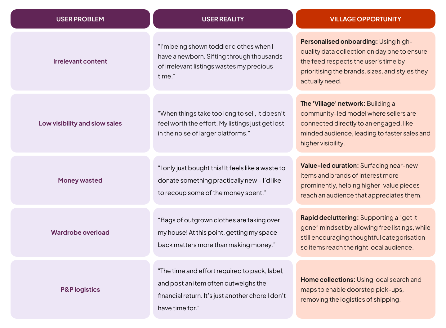
Existing apps are efficient but impersonal. Listings get lost, and parents sift through irrelevant content that doesn't reflect their family's needs.
For the business
Transactions over engagement
Prioritising transactions over engagement creates forgettable experiences. Parents want to feel a connection to the community they buy from.
Research
Initial research combined qualitative interviews with secondary analysis of parenting communities online. I distilled research into five primary pain points that defined the requirements for Village.
Personas
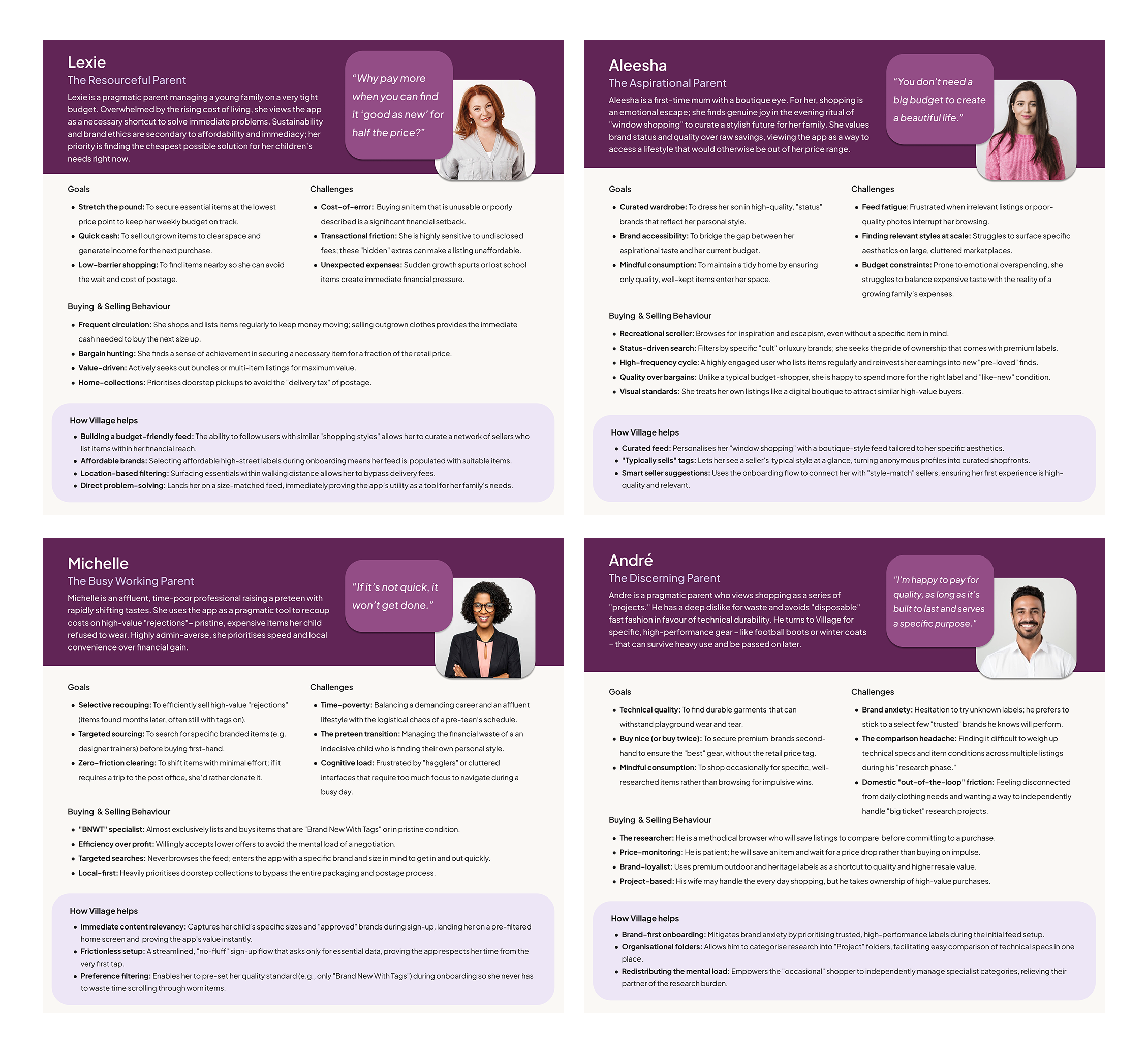
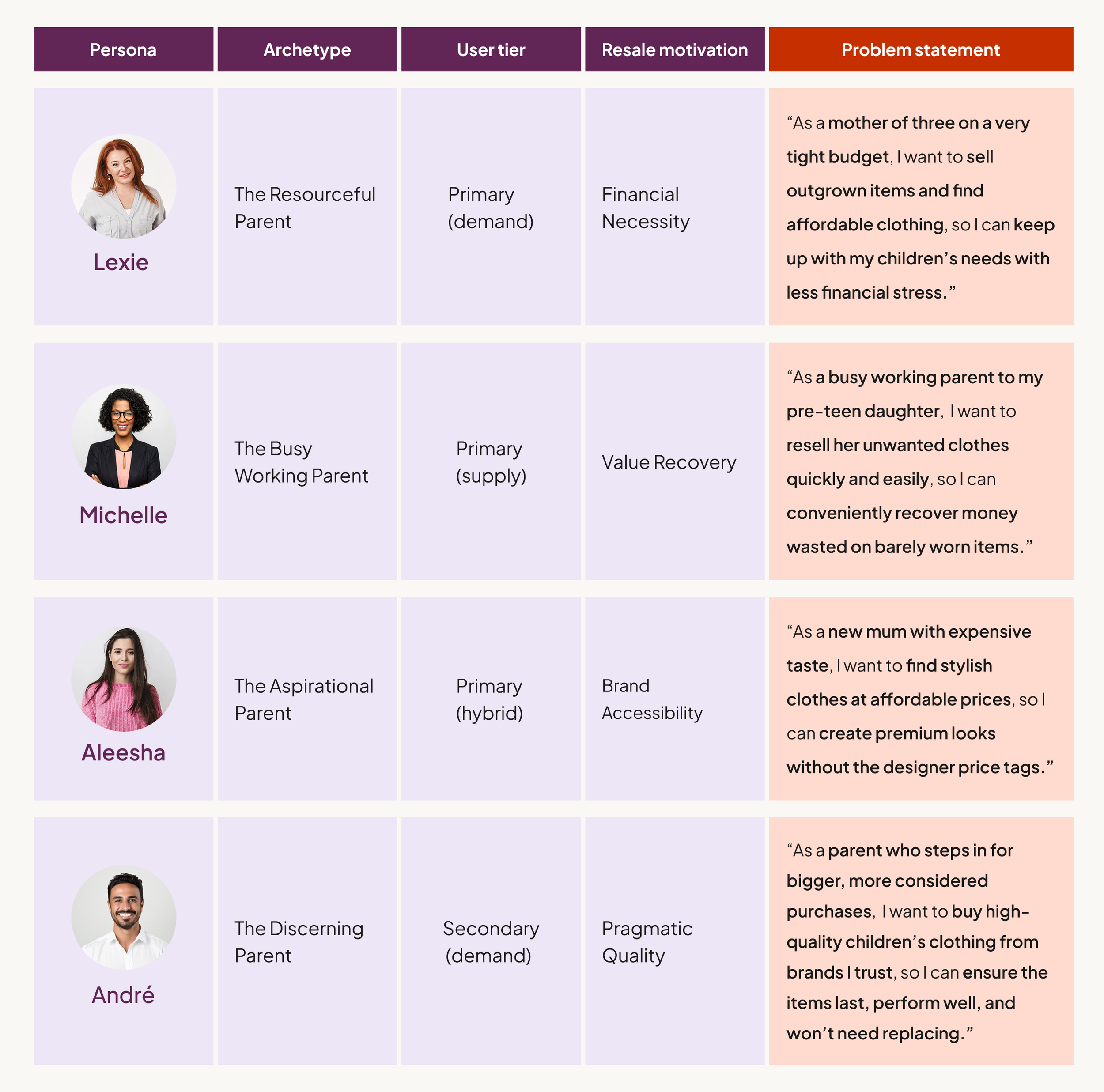
I defined four archetypes representing a spectrum of motivations: financial necessity (Lexie), aspirational brand accessibility (Aleesha), value recovery (Michelle), and pragmatic quality (André).
Journey Mapping
Mapping Lexie’s experience across current resale platforms revealed where the market consistently fails parents. Across both buying and selling journeys, the same pattern appeared: high effort with uncertain payoff.
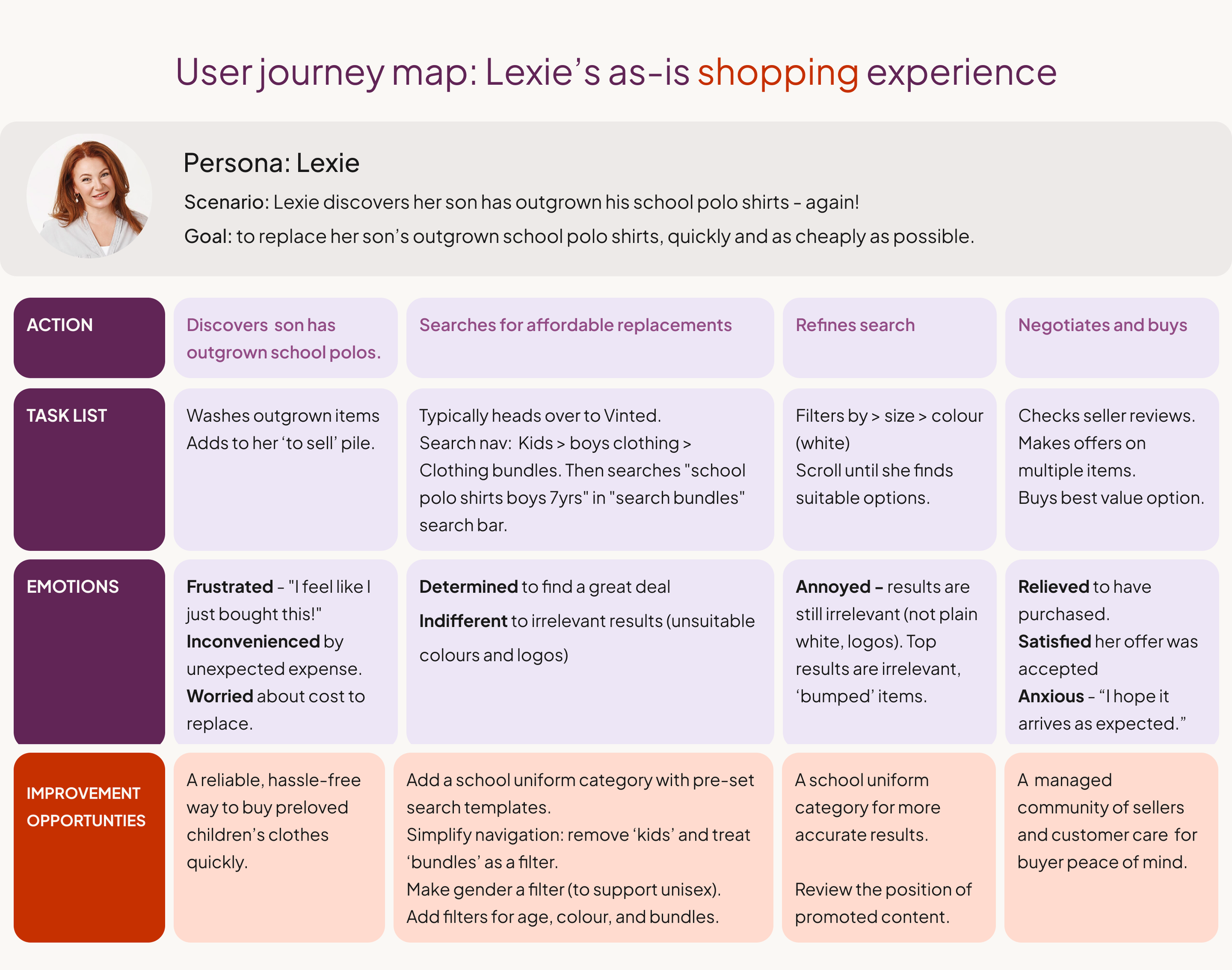
The maps confirmed that convenience on existing platforms comes from scale, not suitability, and that selling feels high-effort with uncertain returns. Both problems pointed toward the same solution: relevance established before discovery, not after it.
Competitor Gaps
A scan of Vinted, eBay, YoungPlanet, and KidChing identified four consistent gaps: minimal seller context, non-parent-centric browsing categories, time-heavy listing flows, and visual convergence around sustainability greens that makes platforms indistinguishable from each other.

02 · PRODUCT DIRECTION
From Better Search to Pre-Curation
The journey maps initially pointed toward familiar IA improvements (better filters, clearer categories, more accurate search results.) But I identified a deeper issue: even with perfect filters, parents would still be entering a noisy, anonymous marketplace. The problem wasn’t purely technical, it was social.
The problem wasn’t just how parents searched, but who they were searching among.
This reframe became the foundation of the product strategy: rather than improving how parents search within a marketplace, I explored whether discovery could be filtered socially before it begins.
The initial hypothesis was a social-commerce hybrid: a feed shaped by who a parent chooses to follow, alongside their size, brand, and style preferences.
Lexie follows parents with similar budgets, keeping her feed affordable
André follows parents with similar quality standards, ensuring trusted condition
Aleesha follows parents with a matching aesthetic, creating a more curated edit
Discovery becomes personal before a single search is made., before items ever appear.
03 · LO-FI TESTING AND THE CRITICAL PIVOT
Social Features Need Timing, Not Emphasis
I ran a moderated usability study with five participants, including frequent resale shoppers and more occasional users, to test whether the social-first onboarding felt like a rewarding setup or a barrier to entry.
The finding was clear: participants wanted to experience value before forming social connections. Asking them to follow strangers before they'd seen a single listing felt presumptuous.
The social mechanics weren't wrong; they were in the wrong place.
"Build Your Village" during onboarding
Social following introduced upfront, alongside preference setting. The assumption: start building community immediately to establish relevance from the first session.
Result: participants felt social obligation before the product had earned it.
"Build Your Village" post-discovery
Social features moved to a banner within the home feed, accessible after browsing. Onboarding collects preferences only — following happens when the user is ready.
Result: utility first, community when earned. The right sequence.
Two additional pivots came from the same study: location sharing hesitation disappeared once the benefit (local school-run pickups) was made explicit; and the generic profile setup was replaced with a dedicated location step that explains the value before asking for the data.
04 · INFORMATION ARCHITECTURE & DESIGN SYSTEM
Structure & Style
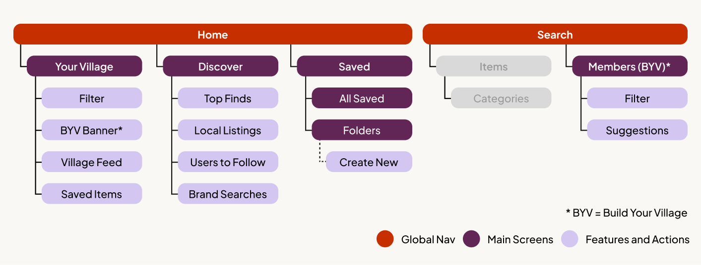
Information Architecture
With the pivot confirmed, I expanded the IA to ensure Village features felt integrated rather than bolted on. The home screen offers a clear choice between two browsing modes: Your Village (a curated feed shaped by who you follow) and Discovery (broader marketplace browsing).
This structure allows users to move fluidly between social curation and traditional browsing, without forcing commitment to either. Social features remain visible but optional — present at the top of the feed, never blocking access to listings.
Design System
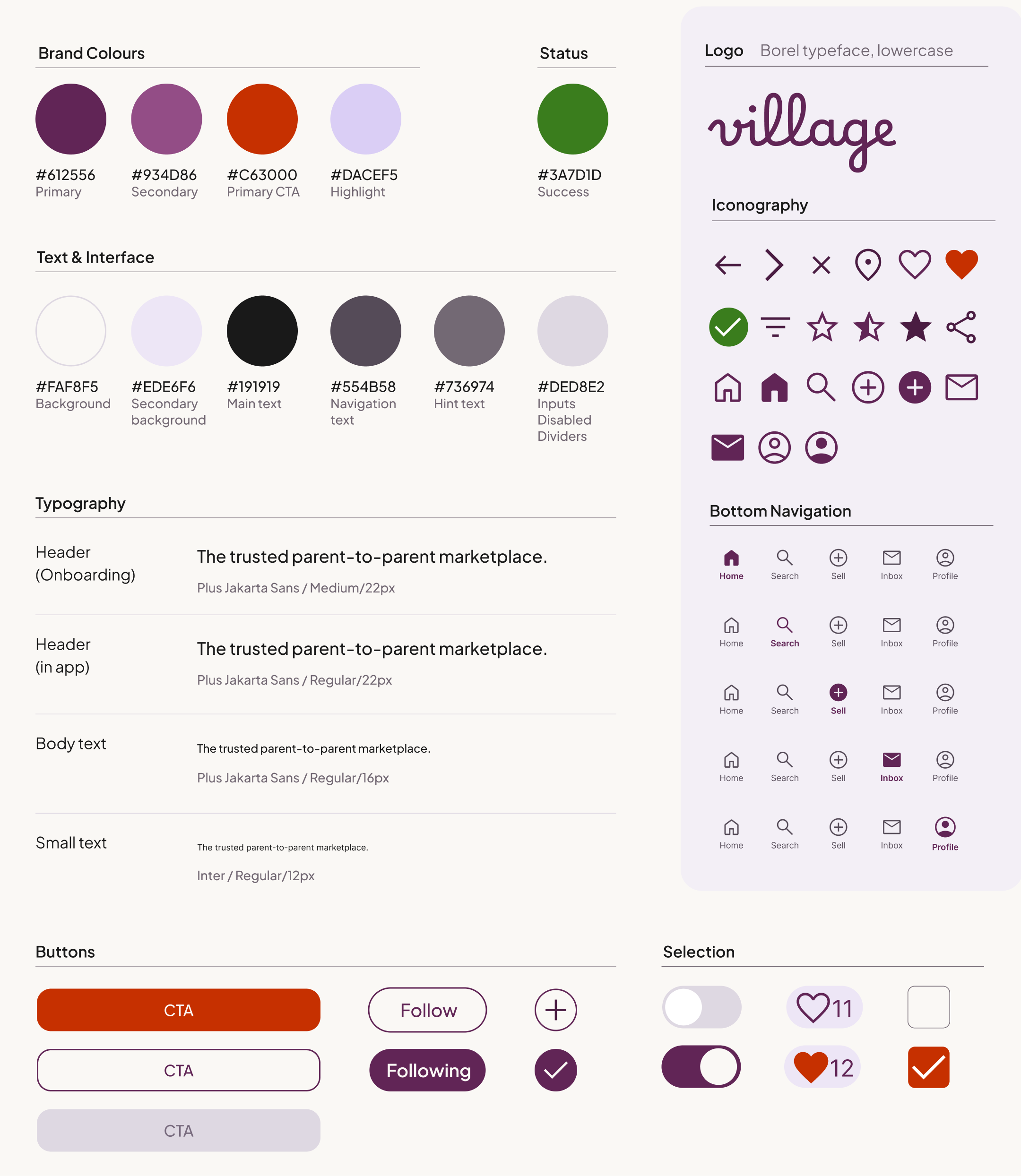
The visual identity was built to differentiate Village from the cold greens and clinical blues that dominate competitor platforms. Deep purples with warm accent tones signal emotional warmth — appropriate for a product whose primary audience is mothers, without leaning so feminine that it alienates male users. The aesthetic deliberately avoids the juvenile "baby app" look, positioning Village as a trusted, premium marketplace.
05 · HIGH FIDELITY DESIGNS
Four Screens That Define the Experience
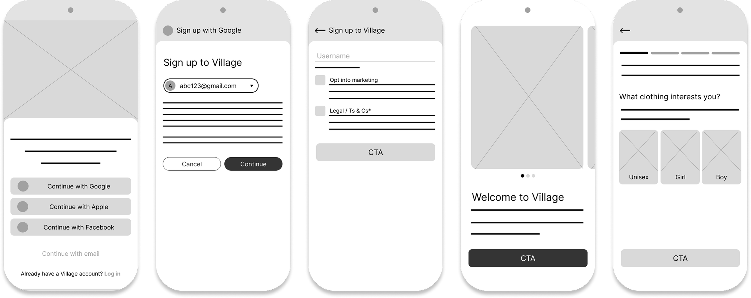
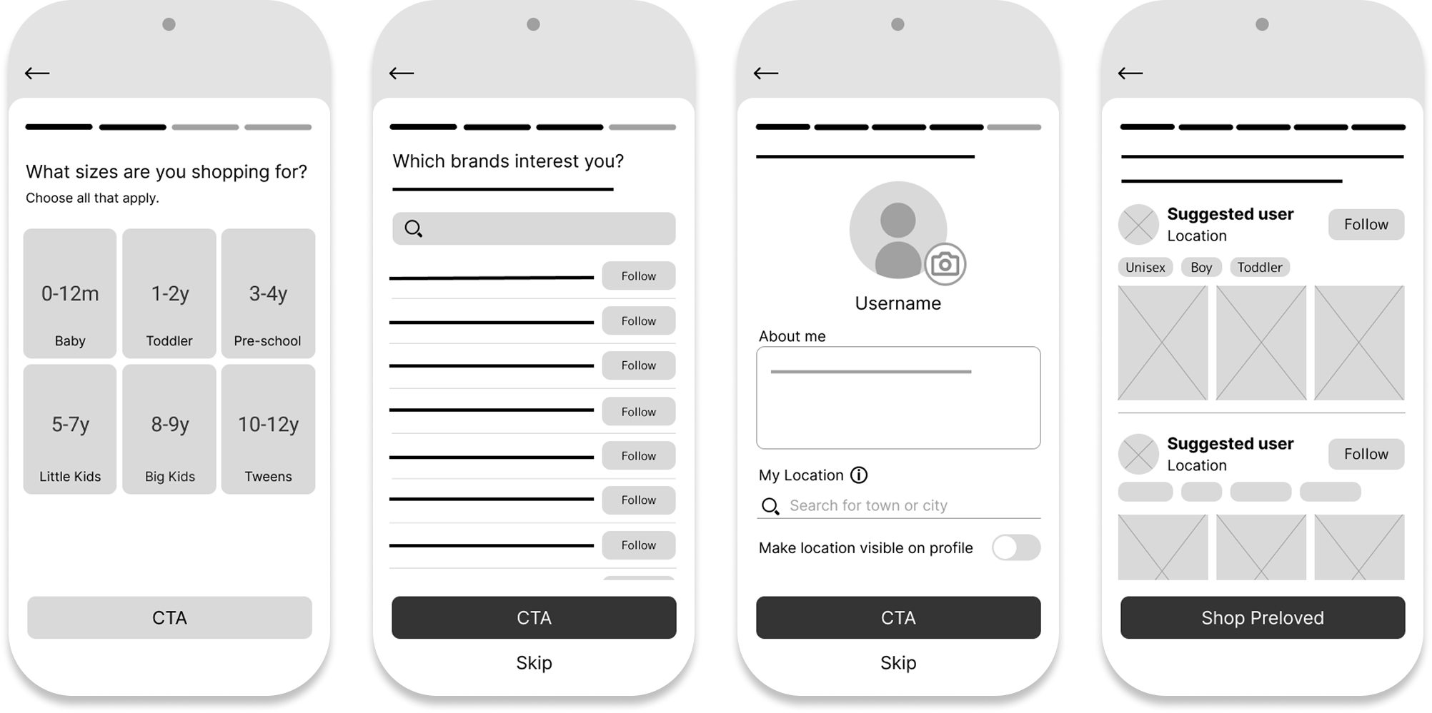
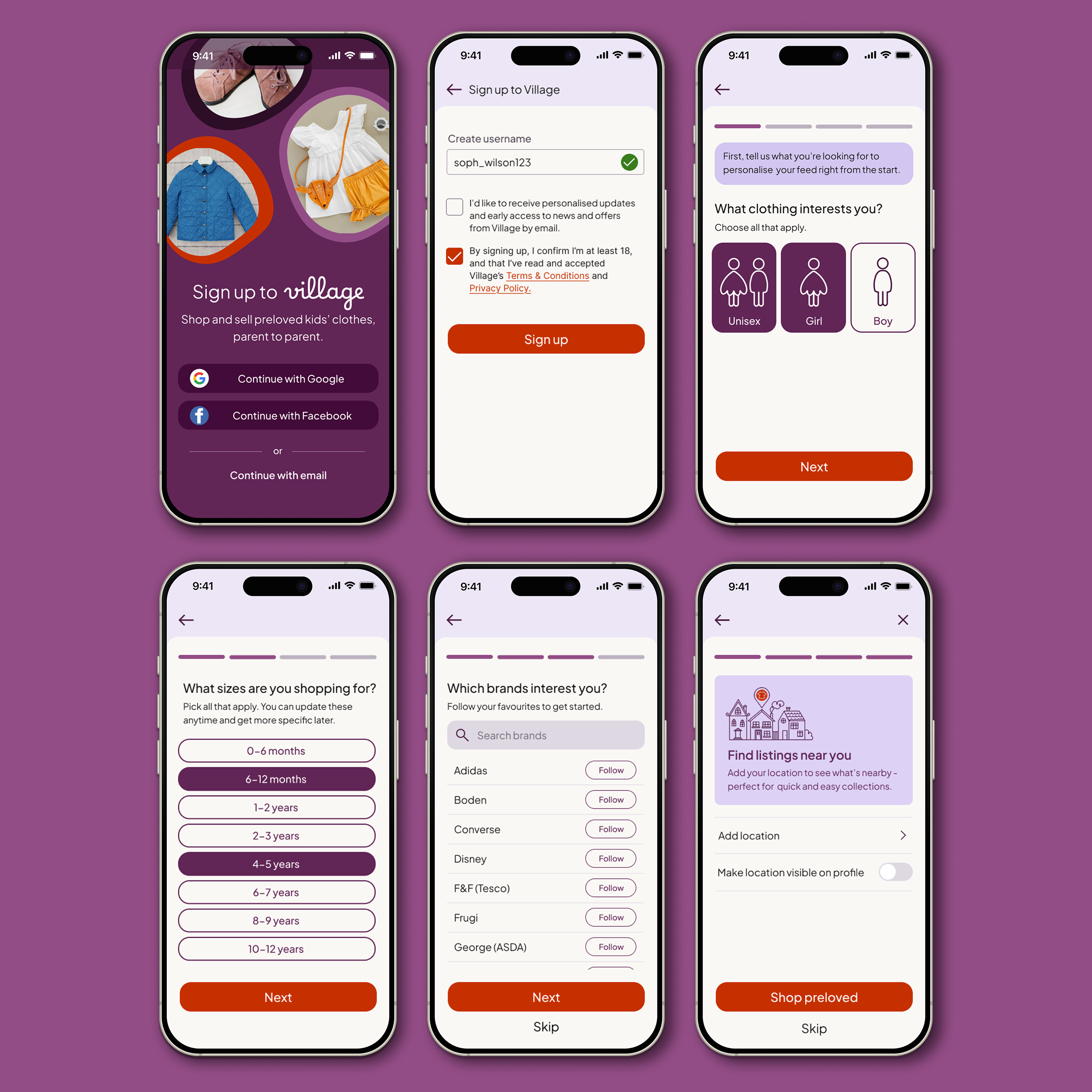
Onboarding
A fast, low-friction setup that collects meaningful preference data without feeling like form-filling. One-tap sign-in, inclusive gender defaults (including Unisex to avoid rigid binary filtering), and optional location sharing framed around a specific benefit rather than a data request.

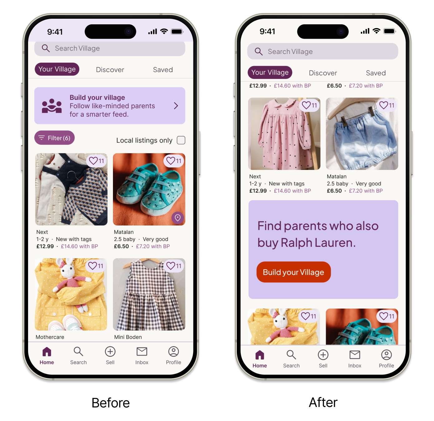
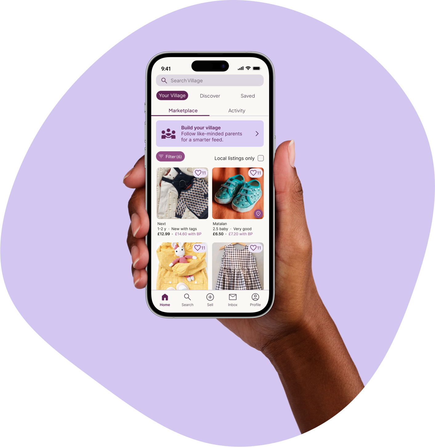
Home/Your Village
A tabbed feed that keeps social curation genuinely optional — Your Village populates as you follow, Discovery is always available. The "Build Your Village" banner sits at the top of the feed as a persistent but non-blocking invitation. Testing revealed a key refinement: the static banner was ignored by 3/5 participants (banner blindness), so I replaced it with a dynamic, behaviour-driven hero card that surfaces contextual prompts based on browsing activity.
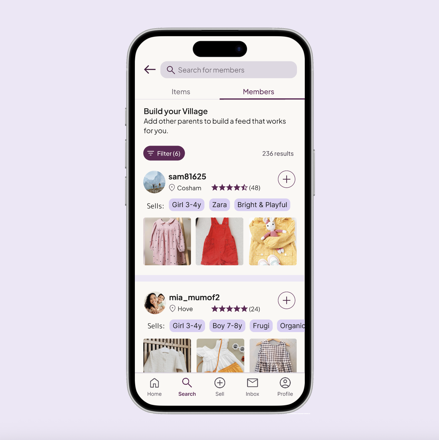
Build Your Village
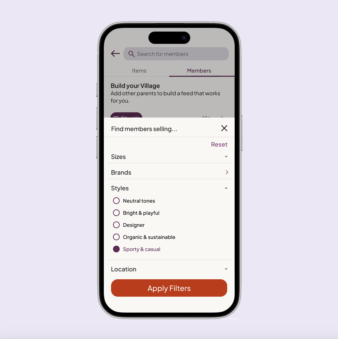
Moved from onboarding to Search → Members — accessible when users are already in a browsing mindset rather than a setup mindset. Member cards surface location, ratings, and "Sells" tags so parents can assess style compatibility at a glance without opening a profile.
User Profiles
Profiles are trust-building screens first, listing pages second. "Sells" tags in the header allow instant compatibility assessment. Verified reviews and historical data provide the evidence base parents need before deciding to follow a stranger.

06 · USABILITY TESTING
What the Numbers Said
Final round moderated testing with five participants validated the complete journey from onboarding through to discovery and social following.
Completed onboarding without assistance
Average onboarding completion time
Felt social friction from the + icon
Additional findings:
4/5 participants opted into location sharing when the benefit was made explicit.
3/5 participants specifically praised "Sells" tags as the most useful element for making a confident follow decision.
All participants said they could imagine using Village in a real-world context — and male participants noted the UI felt welcoming rather than overtly "mum-focused."
07 · ACCESSIBILITY
Designing for Real Contexts of Use
Accessibility was built in from the start rather than audited at the end. The primary context — a parent browsing one-handed while holding a child — shaped three foundational decisions: touch targets sized for one-handed use with primary actions within thumb reach; high-contrast typography with key information always reinforced through text labels rather than colour alone; and consistent layouts using plain British English copy to reduce cognitive load for users with varying literacy levels.
As an independent designer without access to specialist testing groups, I focused on strong foundations rather than claiming comprehensive coverage — and identified screen reader and voice-to-text testing as a clear next step before any live product launch.
08 · REFLECTIONS
What I learned
Evidence over assumptions
As a non-parent, testing was essential. The most valuable insights came from off-script moments — casual comments that revealed real needs no brief could have anticipated. Creating space for open conversation is as valuable as structured testing.
Context matters as much as functionality
Even strong features fail at the wrong moment. Moving Build Your Village from onboarding to the feed wasn't a fix — it was the insight. Designing for a user's current mindset, not just the intended outcome, is the difference between a feature that lands and one that creates friction.
Language is design
The + vs Follow finding confirmed that copy choices carry as much weight as layout decisions. "Follow" imported an entire social model Village wasn't trying to replicate. One word change, zero friction. That's the kind of detail that separates good UX from careful UX.
PROTOTYPE
Try It Yourself
The high-fidelity prototype covers the complete new-user journey: from onboarding through to the dual-mode feed, Build Your Village, and user profiles.