Pass It On:
Community Gifting
A free-cycling feature extension for the Village marketplace. iOS App & Web

THE CONCEPT
When Selling Isn’t The Point
Village is a resale marketplace. Pass It On is for when the item isn't worth selling, but is still worth something to someone nearby. It's a free-cycling feature built into the Village ecosystem, letting parents clear space, support their local community, and close the loop on outgrown clothing without the effort of listing, pricing, or posting.
The feature emerged from a pattern in the Village research: parents accumulate outgrown clothing faster than they can sell it. Low-value essentials (baby grows, school polo shirts, seasonal costumes) aren't worth the admin of a listing. They end up in a pile, then a bin bag, then landfill. Pass It On gives that pile somewhere useful to go.
The strategic centrepiece
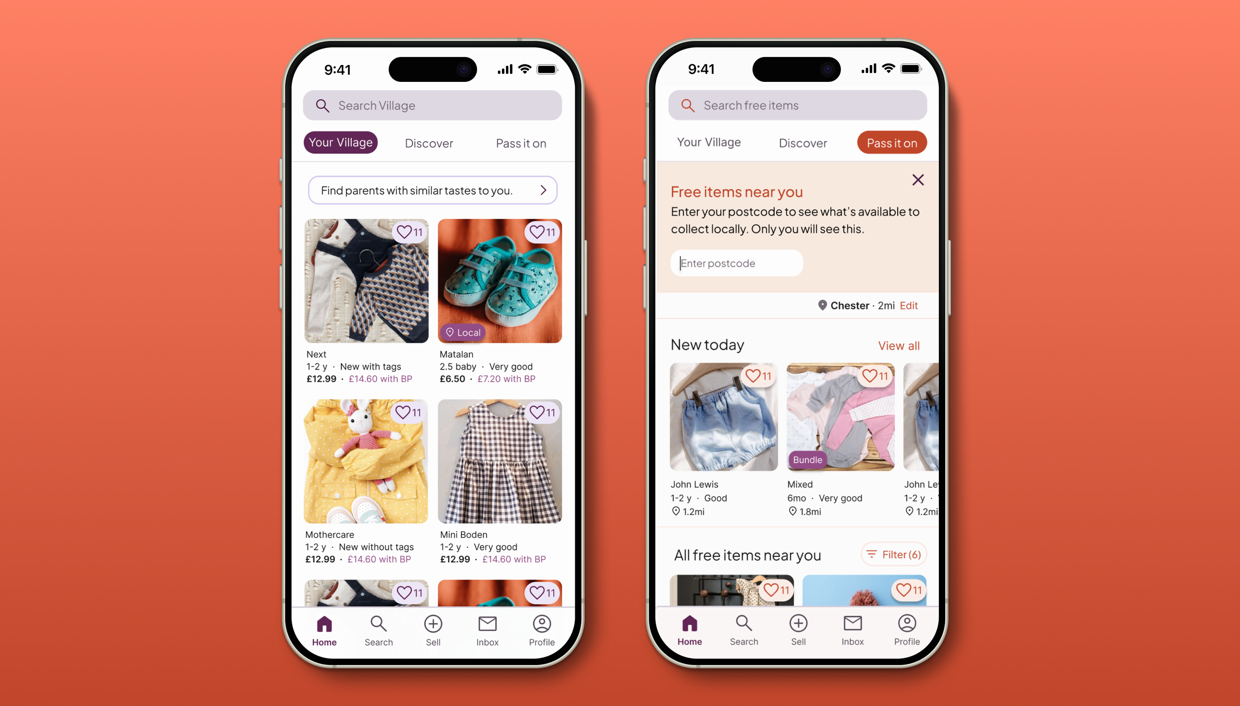
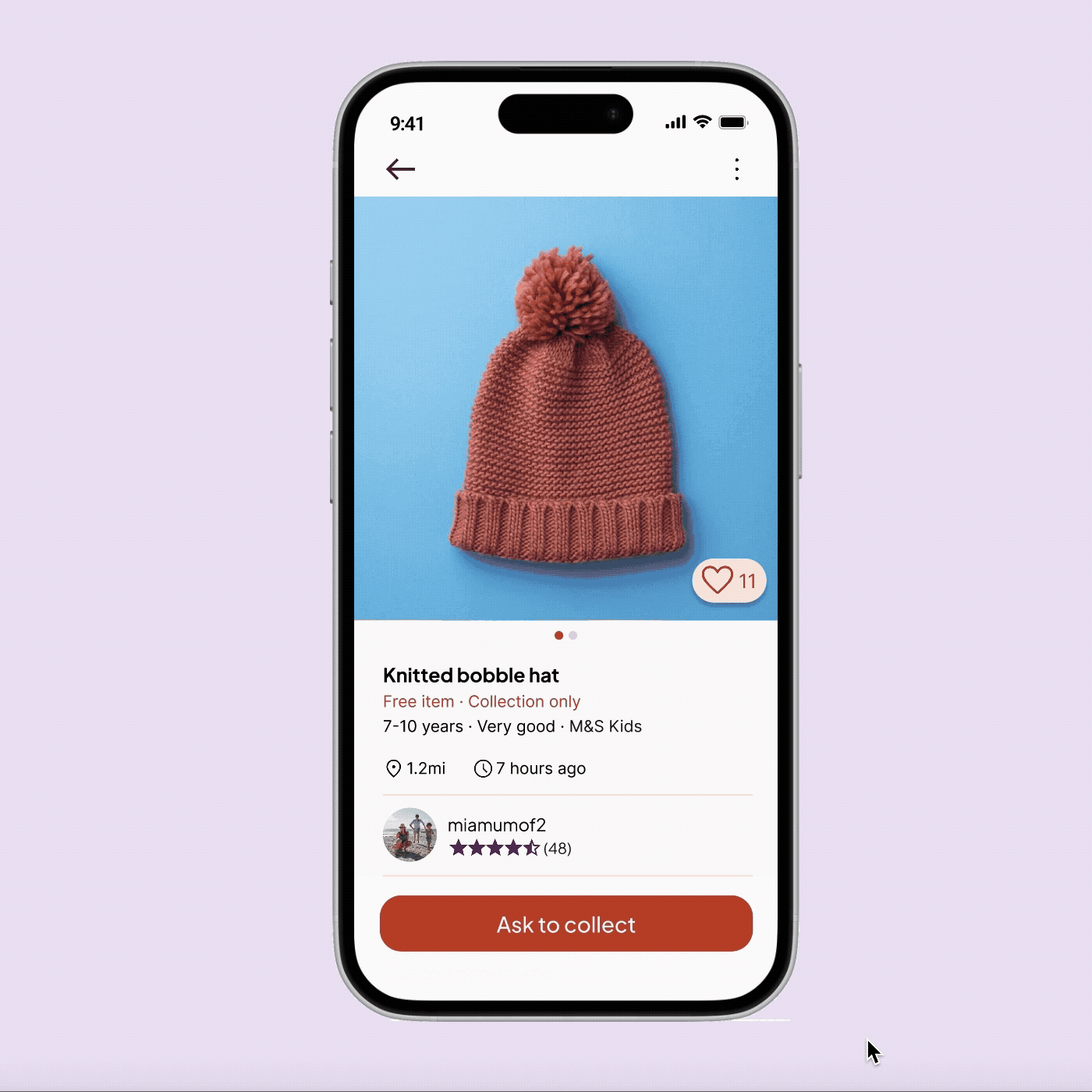
The heart of Pass It On is a one-tap conversion: unsold Village listings can be converted to free items with a single action. A failed sale becomes a community win, and the feed is populated with high-quality, pre-photographed items without any additional listing effort from the parent.
RESEARCH FOUNDATIONS
Who It’s For and What They Need
Because Pass It On is a feature extension rather than a new product, I built on the existing Village research rather than starting from scratch — appropriate for the realistic constraints of a three-week sprint. I revisited the personas and research through the lens of free-giving rather than resale.
I focused on three of the four Village personas. Aleesha, whose motivation is aspirational brand access, doesn't align with the community-driven, zero-transaction nature of free-giving. Excluding her was a deliberate scoping decision, not an oversight.
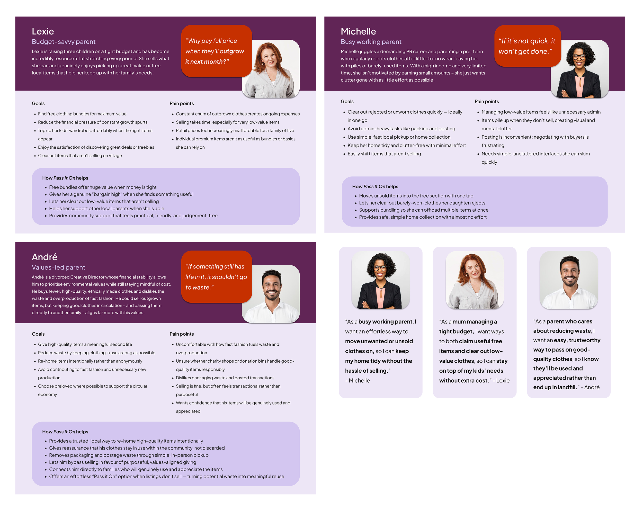
Six themes from the research shaped the feature requirements:
Competitor Gaps
A quick scan of Olio, Trash Nothing, and YoungPlanet confirmed four consistent gaps across the freecycling market: no clothing-specific discovery filters, minimal trust signals for local pickup, coordination that relies entirely on unstructured messaging, and cluttered or dated interfaces that feel unreliable. Pass It On addresses all four by building on Village's existing design system and trust infrastructure.
DESIGN DECISIONS
Two Decisions That Define the Feature
01 . The Mode Shift: Clay over Purple
Pass It On lives inside Village but needs to feel distinct from it. I introduced a muted clay accent palette that signals a shift in context — from marketplace to community — without breaking the Village brand. The red CTA colour that drives commerce in Village carries urgency and conversion energy. The softer clay colour carries warmth and generosity. The difference is intentional and psychological.
Village is the boutique. Pass It On is the community noticeboard.
Deep plum and CTA red. Curated, premium, personal. Designed to drive confident buying and selling decisions.
Commerce · Conversion · ConfidenceMuted clay accent on a warm neutral base. Practical, generous, neighbourly. Designed to feel straightforward and inviting.
Community · Generosity · Ease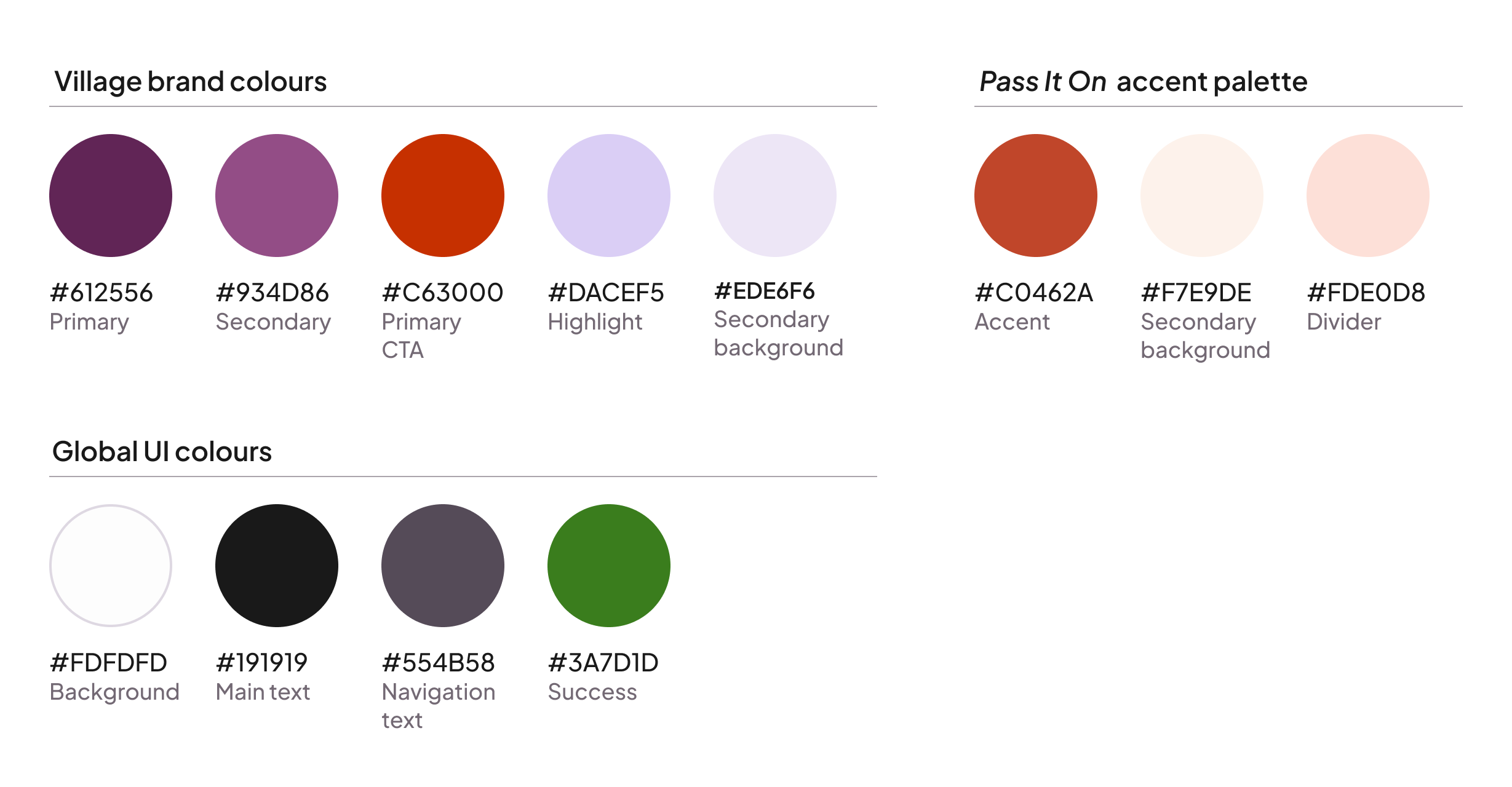
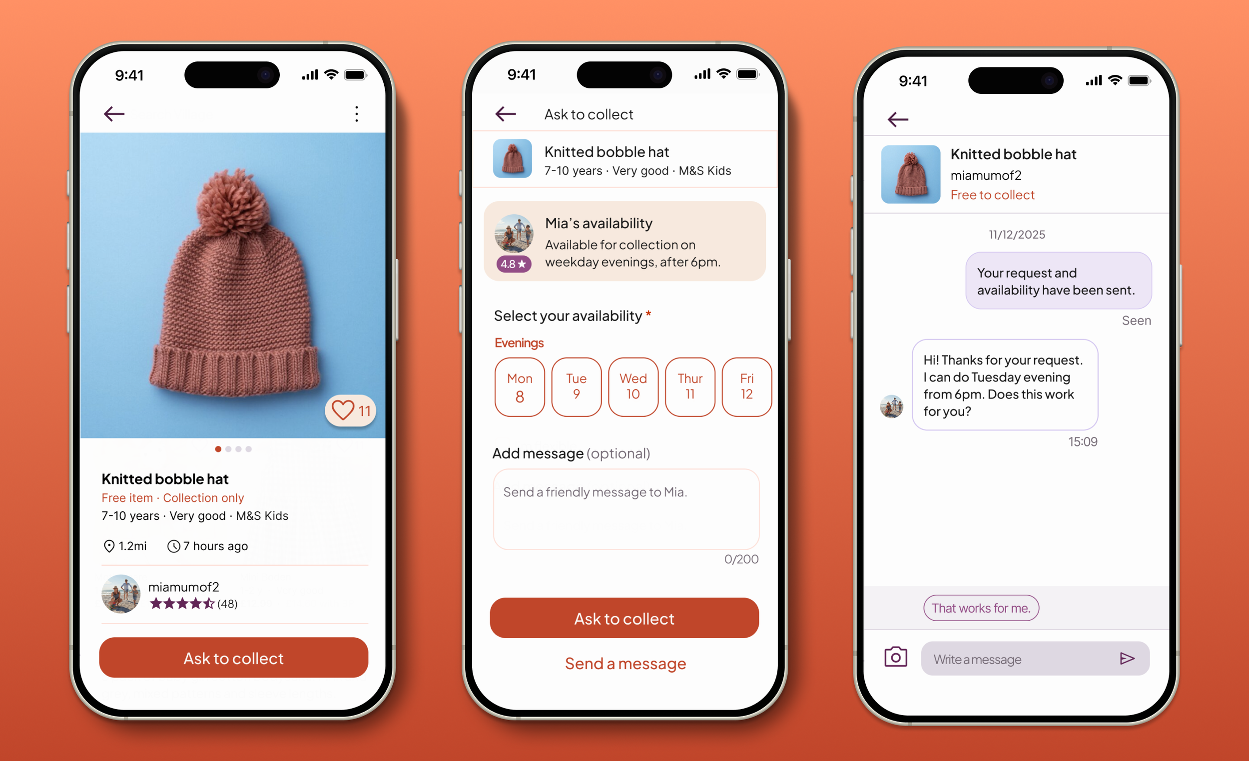
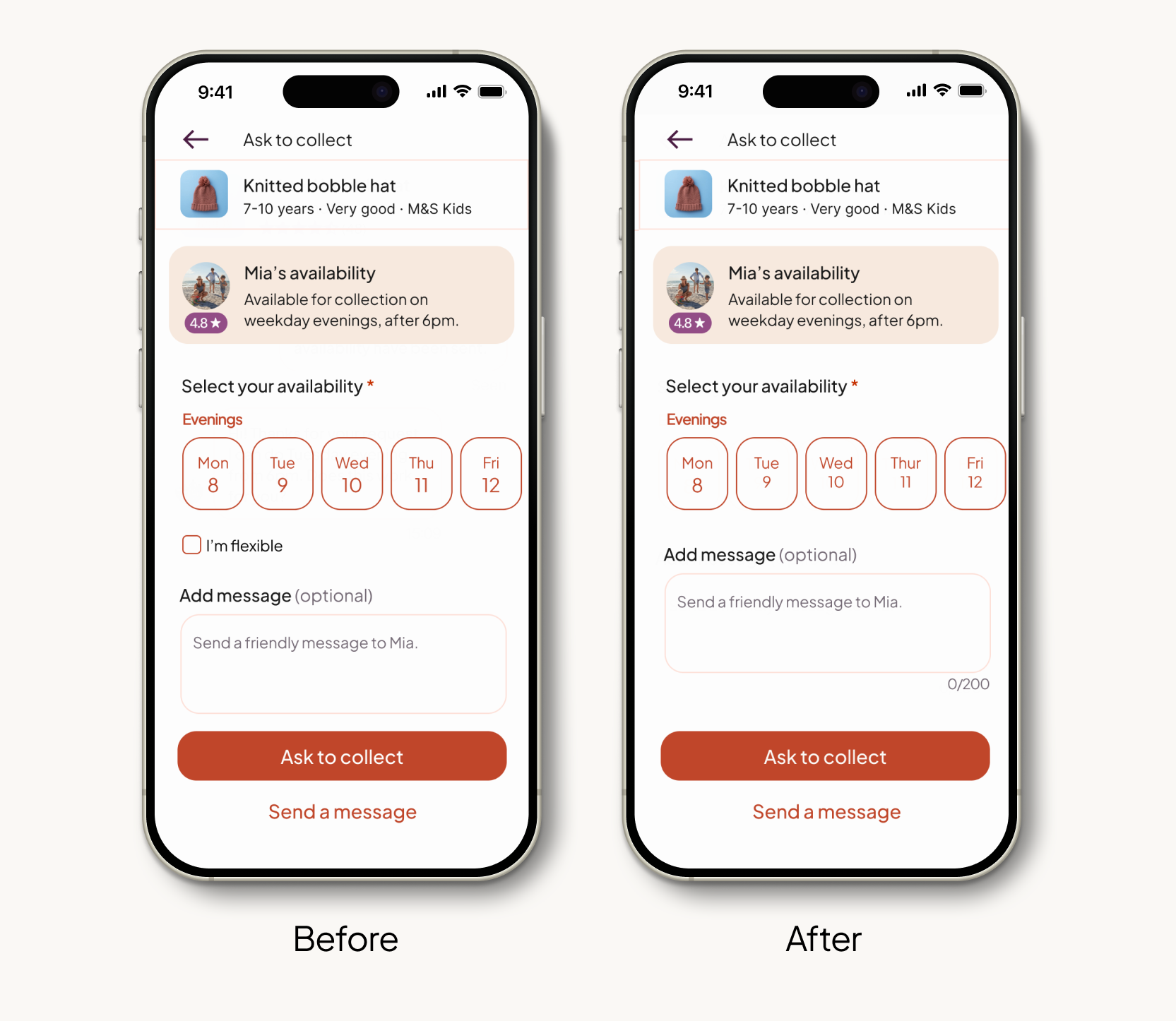
02 . The Flexi-Window: structured scheduling over open chat
Existing freecycling platforms all coordinate collection through unstructured messaging — an open chat that requires back-and-forth negotiation before anything is agreed. For time-poor parents, this is the kind of admin that can make free-cycling feel more trouble than it's worth.
I designed the Flexi-Window: a structured availability system built directly into the collection request. Listers set broad availability windows (e.g. "Weekday evenings"). Collectors select a matching window at the point of requesting. The conversation starts with logistics already agreed, so that chat becomes confirmation, not negotiation.
The goal was to turn a multi-message negotiation into a two-tap confirmation. Coordinate first, chat later.
USABILITY TESTING
What testing revealed
I conducted moderated in-person testing with four participants — non-parents, recruited to isolate UI logic from domain behaviour. The scenario: find a free item, coordinate a collection time, and close the loop via chat and review. All four completed the journey without assistance.
Participants treated the request flow as a formal social contract — they felt "locked in" once they'd asked to collect.
→ Retained the deliberate multi-step flow. "Ask to Collect" should feel like a high-intent action — it protects listers from time-wasters.
A gift icon originally featured in the navigation reinforced a "reward" mental model that didn't match the feature's intent. One participant expected points or credits.
→ Removed iconography entirely. Naming and contextual copy carry the concept without visual ambiguity.
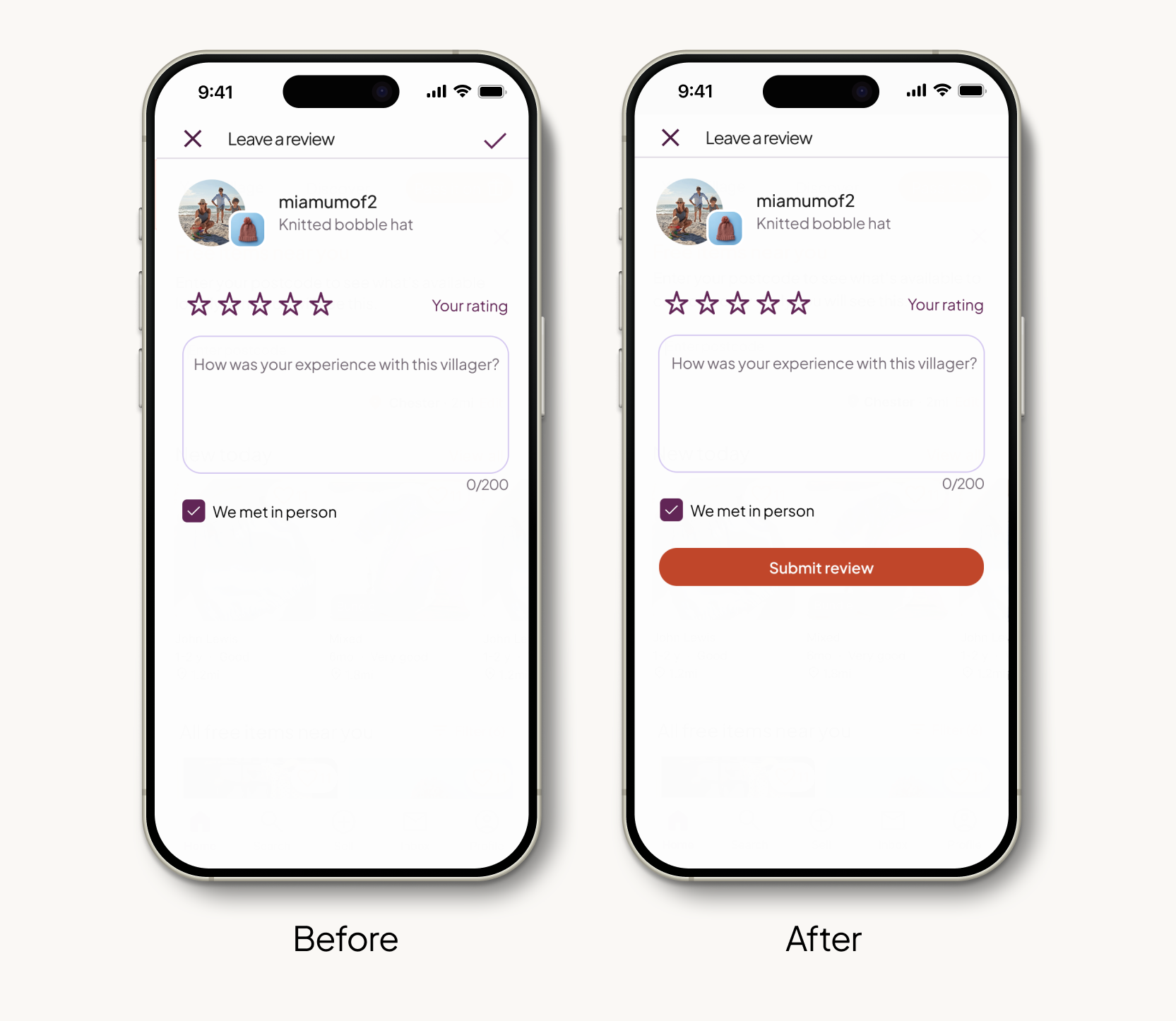
3 of 4 participants paused after writing their review, eyes scanning for the submit action before awkwardly reaching to a small tick icon in the top-right corner.
→ Moved the final action to a full-width "Submit feedback" button at the base of the screen. The last step of the journey should be the easiest.
Participants selected specific windows and ticked "I'm flexible" simultaneously, using the checkbox to signal cooperativeness rather than to bypass date selection.
→ Removed the checkbox entirely. It added cognitive load without reducing effort. Natural flexibility happens in the message field.
Refinements
Submit button to the thumb zone
Moved the review submission from a small top-right icon to a full-width button at the base of the screen. Physical accessibility matters most at the moment a journey concludes.
3/4 participants struggled with the original placement
Removed "I'm flexible" checkbox
Stripped the checkbox from the Flexi-Window flow. Users were treating it as a social signal rather than a functional shortcut; it was adding a decision without removing effort.
4/4 participants used it incorrectly
PROTOTYPE
View the Collection Journey
The prototype covers the complete collector's journey — from discovering a free item through to the Flexi-Window request, chat confirmation, and post-collection review.
WEB ADAPTION
Scaling to Web
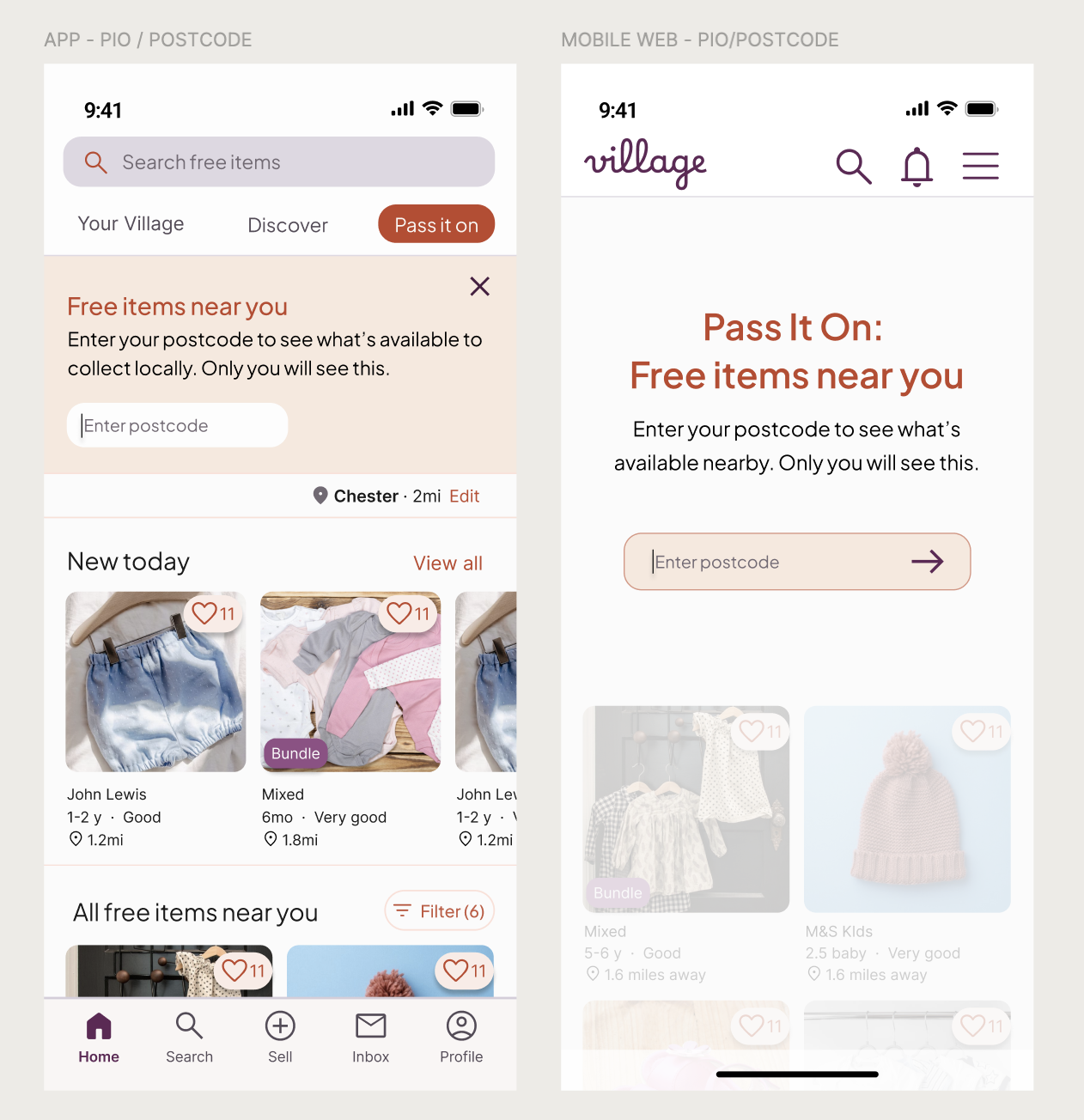
To demonstrate how Pass It On extends across the wider Village ecosystem, I designed key screens for mobile web and desktop. Rather than documenting every screen, I focused on the four moments where the responsive shift is most significant.
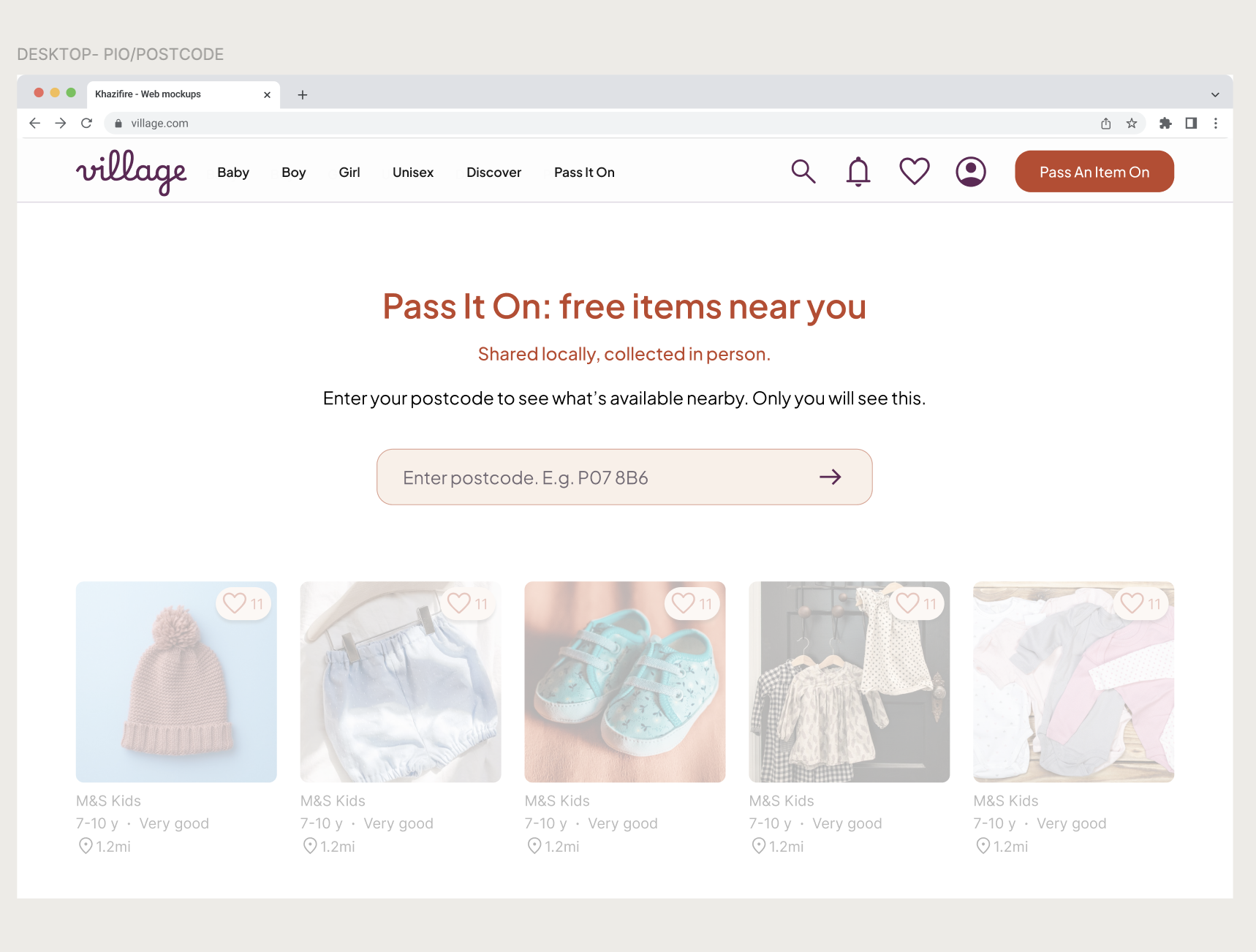
Postcode Entry
Web visitors arrive without saved location data. A dedicated entry state requires a postcode upfront — preserving the local-only value proposition from the first interaction.
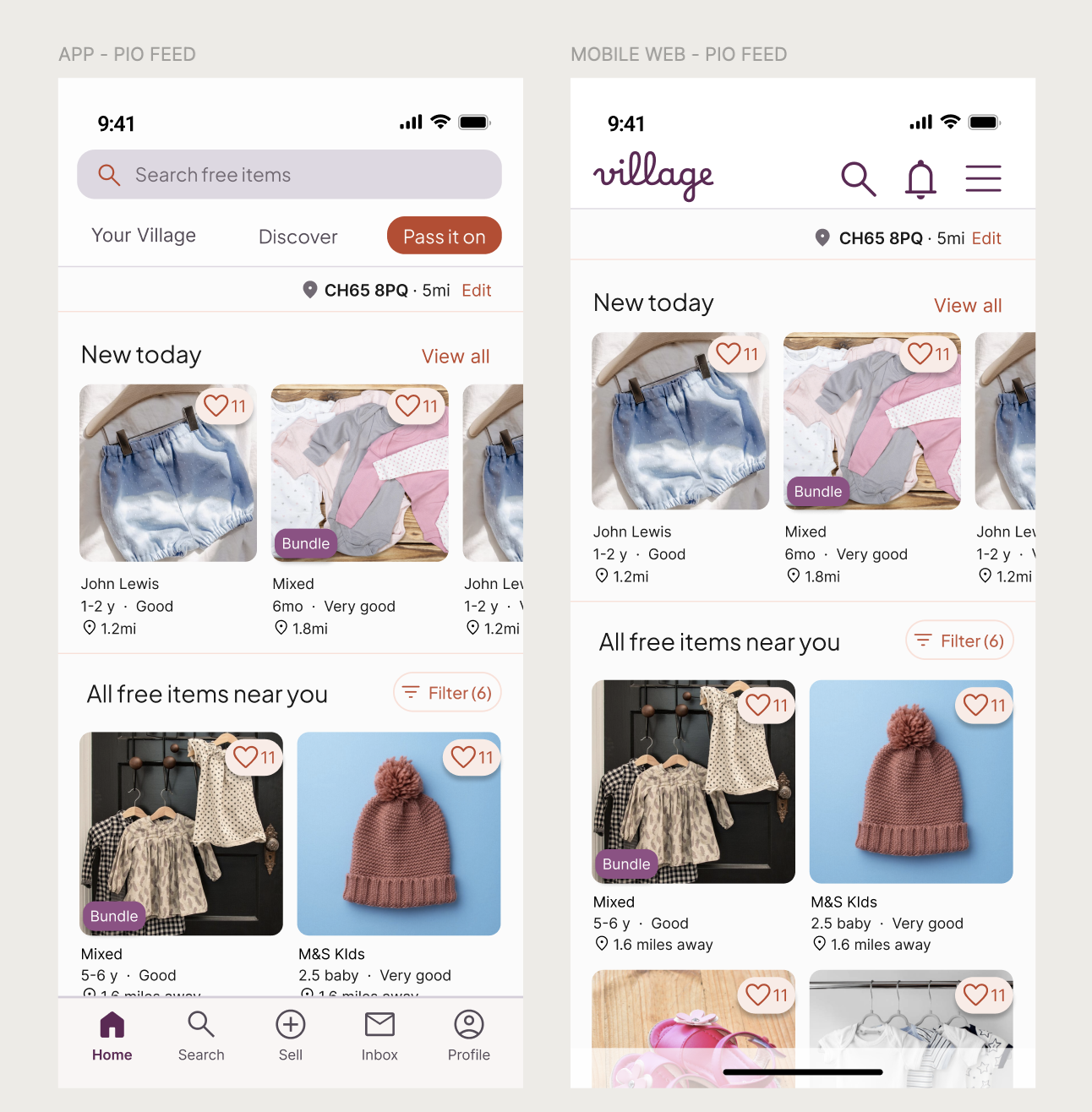
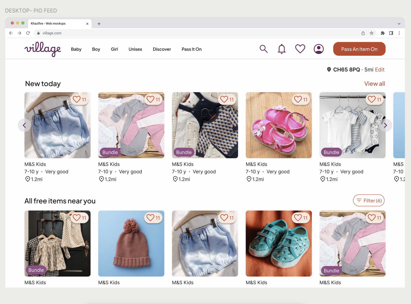
The Feed
Two-column mobile grid scales to multi-column desktop. Navigation moves from bottom bar to top header. Desktop prioritises discovery over conversion.
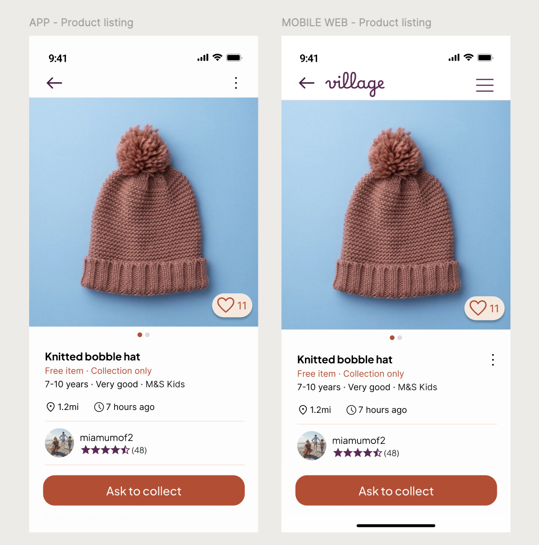
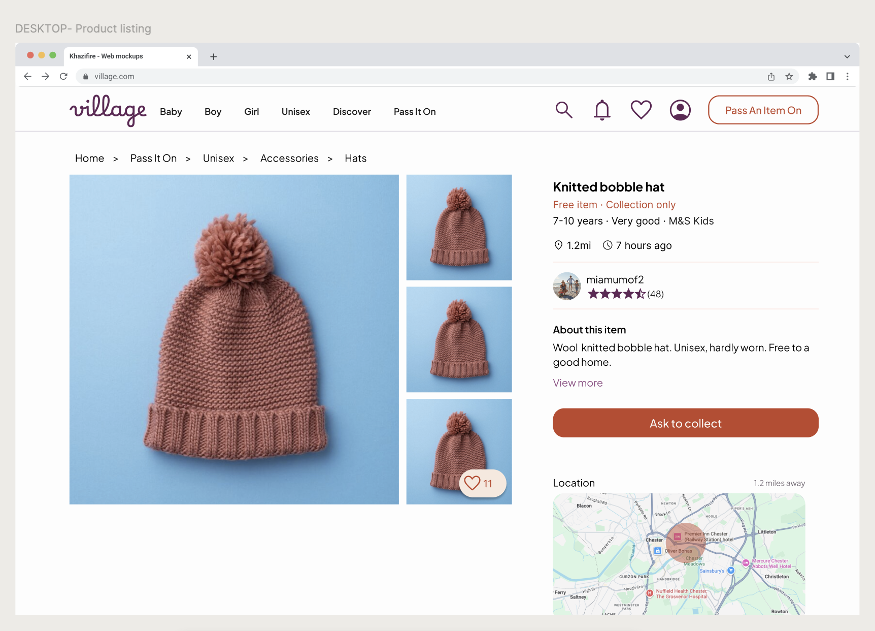
Product Listing
Trust signals stay consistent across devices. Mobile keeps focus on the primary action. Desktop prioritises clarity over density.
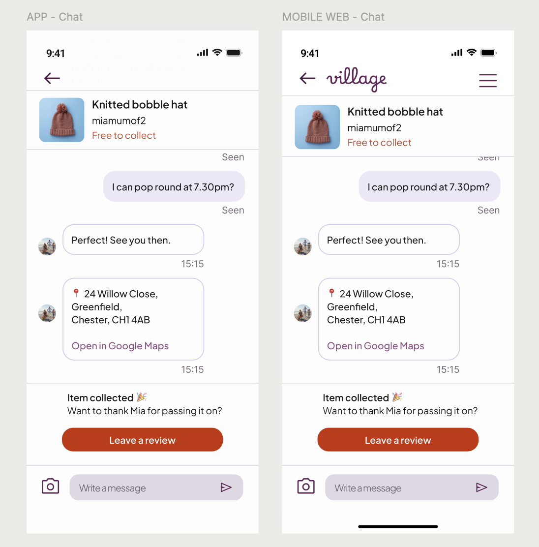
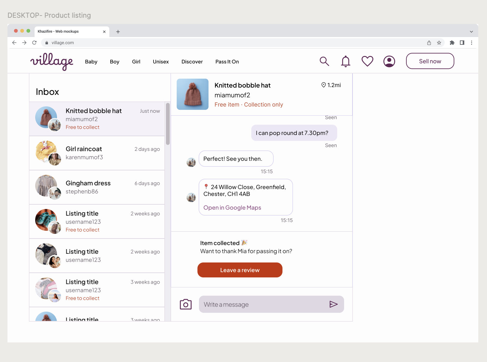
The Inbox
Desktop uses a split-pane view with deliberately constrained message width, as wide text bubbles feel impersonal. System actions remain visually distinct to anchor logistics within the conversation.
Behaviour reveals intent
The "I'm flexible" finding was the most unexpected insight of the project. Participants weren't using the UI as designed, they were using it to communicate something social. That gap between intended and actual behaviour is where valuable design decisions live.
Structure reduces effort
The Flexi-Window confirmed that the right constraints actually reduce friction rather than creating it. Giving parents a structured set of options felt less effortful than an open text field, even though it required more decisions.
Trust is the product
Every decision in the collection flow — the intent-gating, the structured request, the Flexi-Window — was ultimately about making parents feel safe enough to participate. A feature that parents don't trust won't get used, however well-designed the UI is.
REFLECTIONS