Village: Scaling for Web
Adapting a native app experience for responsive web
THE CHALLENGE
Same Product, Different Mindset
The Village app was designed for committed users; people who had downloaded the app, invested time in setup, and were ready to build their community. Bringing Village to the web meant designing for a fundamentally different kind of visitor.
The insight that user intent inverts between platforms drove every design decision in this project. The challenge wasn't scaling the UI. It was redesigning the experience around a different behavioural starting point.
Has downloaded the app and chosen to engage. Happy to complete a setup flow because the payoff — a personalised feed is immediately apparent.
→ Onboarding firstOften arriving from search or social media, focused on a specific item. A mandatory setup flow is a barrier, not an investment.
→ Browse firstRestructuring the Architecture
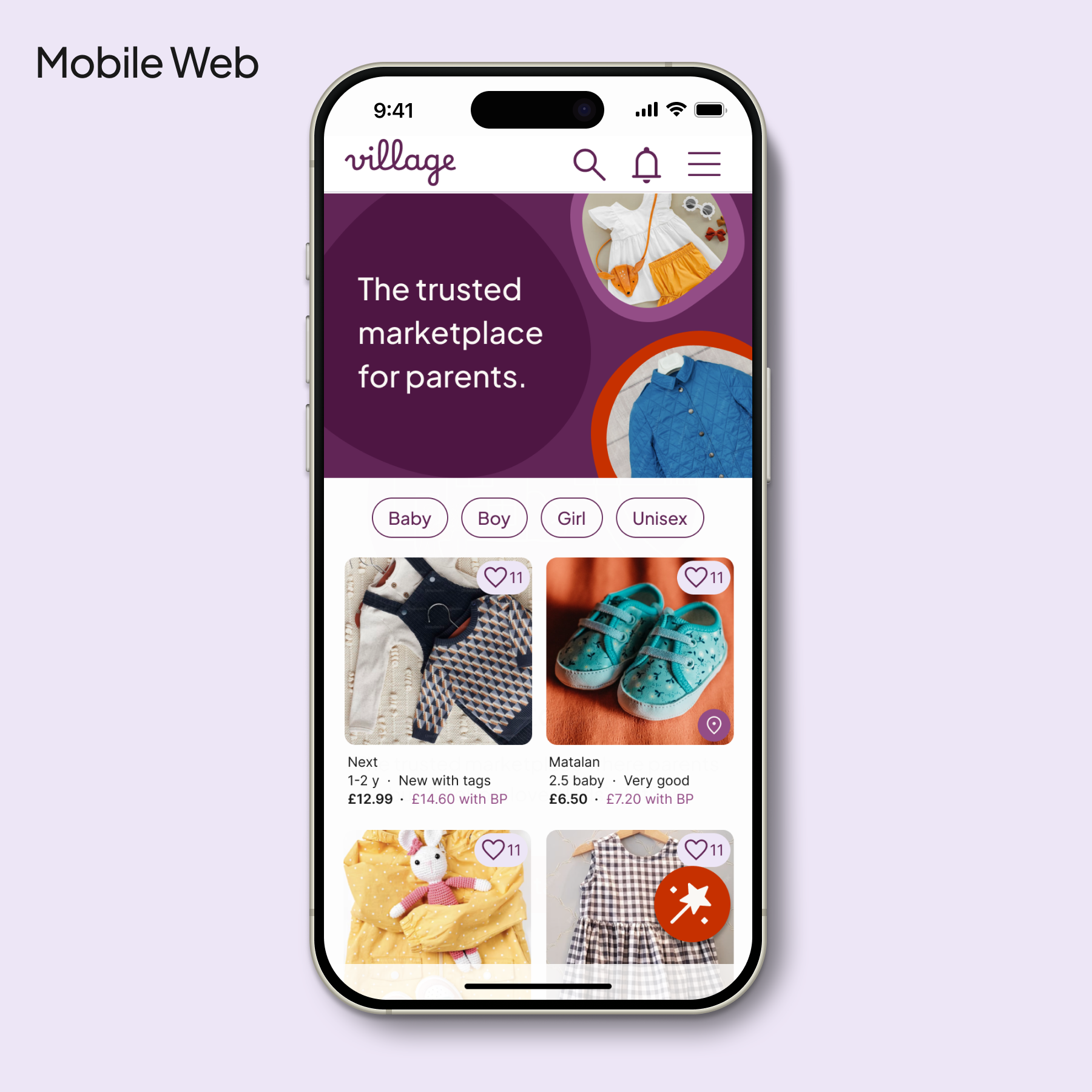
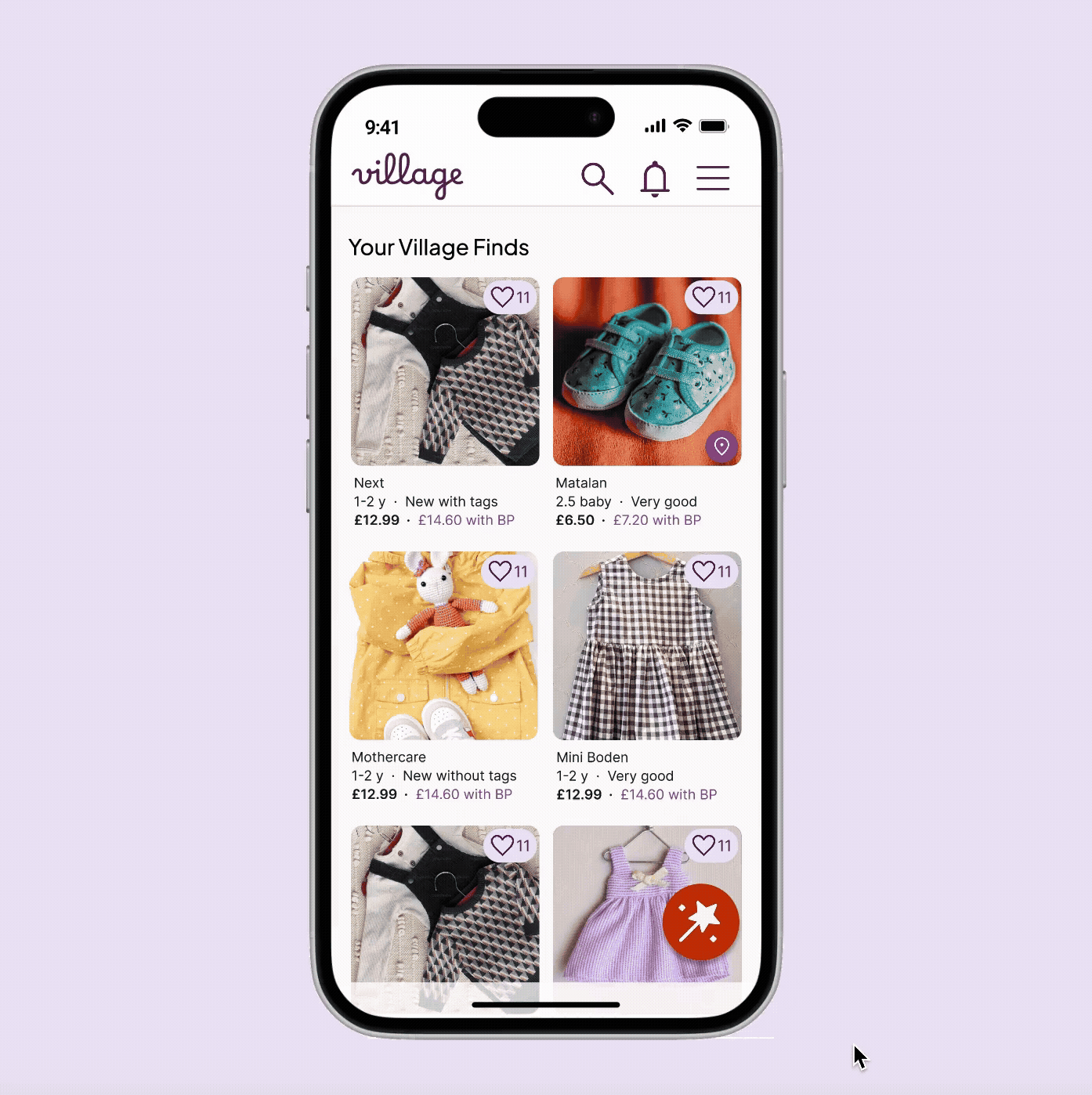
Before any screen design, I restructured the IA to reflect the browse-first model. The mobile tab bar gave way to a standard web header, with utility actions (Sell, Inbox, Profile) moving into the global navigation to align with web mental models and making better use of desktop real estate.

DESIGN DECISIONS
Four Key Decisions
Rather than documenting every screen, these are the four decisions that defined how Village translates to web — each one a direct response to the intent model above.
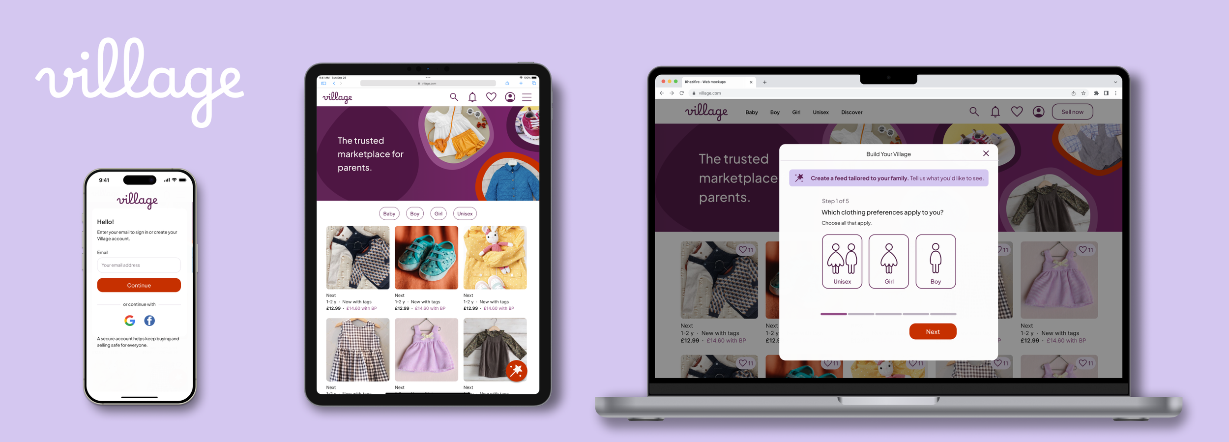
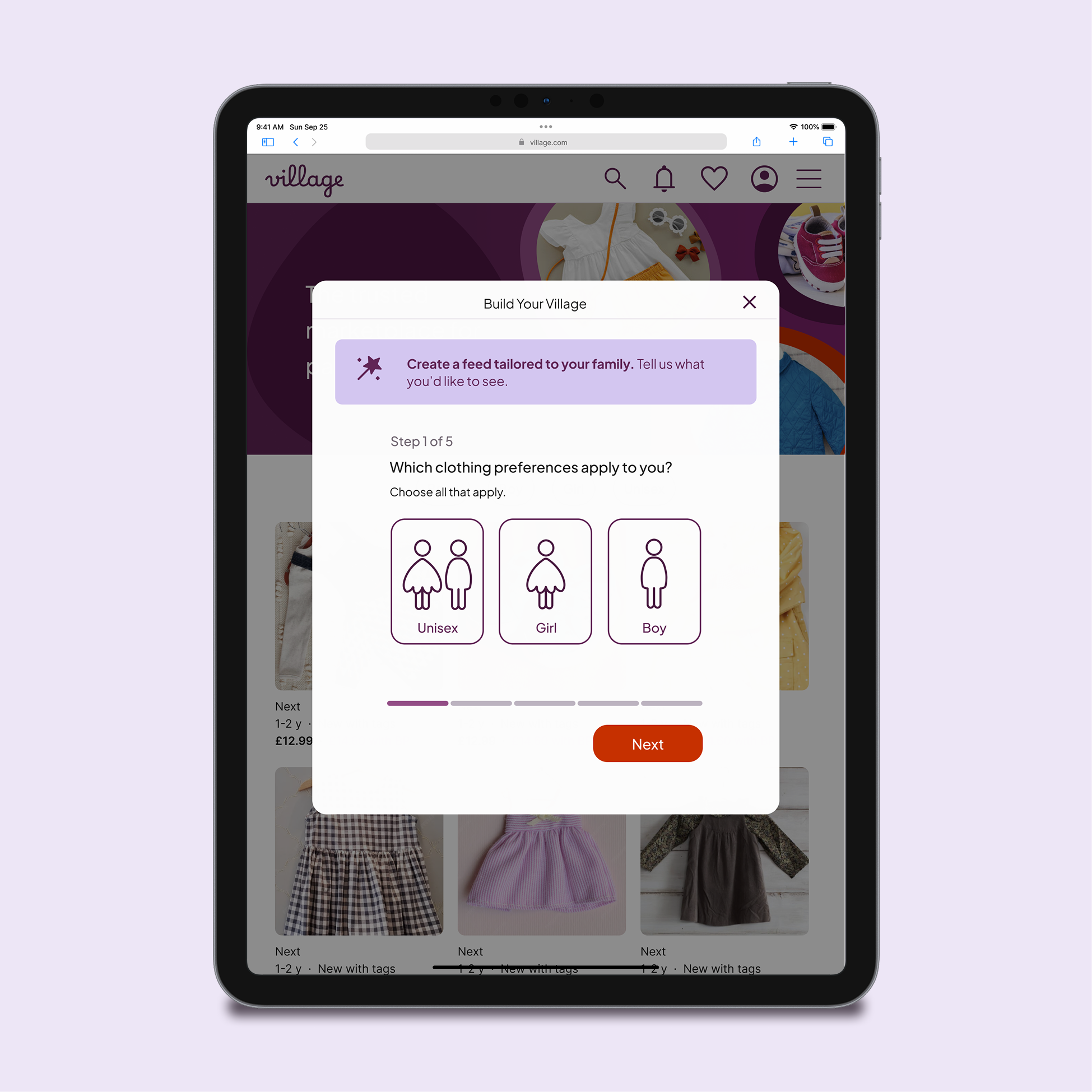
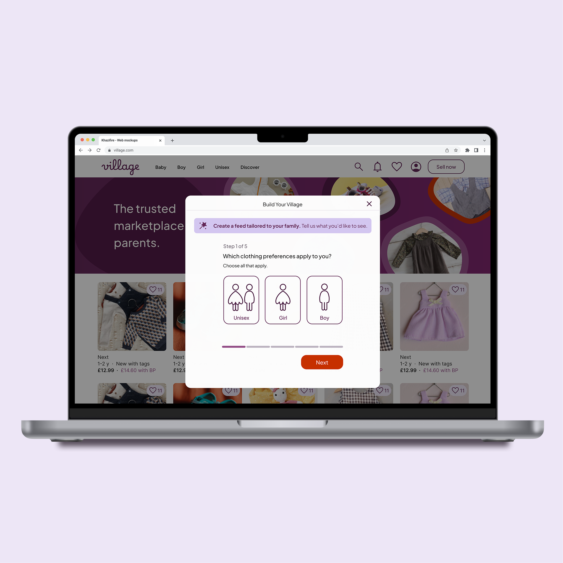
01. Mandatory onboarding → optional overlay
On the app, a full-screen onboarding flow works because the user has already committed. On the web, the same flow becomes a barrier. I replaced it with a dismissible overlay that’s triggered by user action (clicking "Build Your Village") rather than appearing automatically. Personalisation becomes a feature to discover, not a gate to pass through.
The "Build Your Village" prompt is visible and valuable, but never interrupts the browsing flow.
App
Full-screen onboarding
Works because commitment is already established. The setup feels like an investment, not an obstacle.
Web
User-initiated via sticky CTA
Opened via the persistent “Build Your Village” button, positioned within thumb reach. Sticky placement keeps the tool accessible without disrupting browsing.
02 . Full-screen flow → context-preserving modal
On mobile, a full-screen personalisation step makes sense as it's the native pattern. On tablet and desktop, the same treatment felt disruptive and effortful. I moved to centred modals on larger screens, keeping the browsing context visible behind a dimmed backdrop. This reassures users they can return to their search instantly — personalisation is an optional layer, not a mode switch.
Keeping the modal compact prevents the task from appearing heavy. The calm, focused feel of the mobile-first flow is preserved without decorative padding.
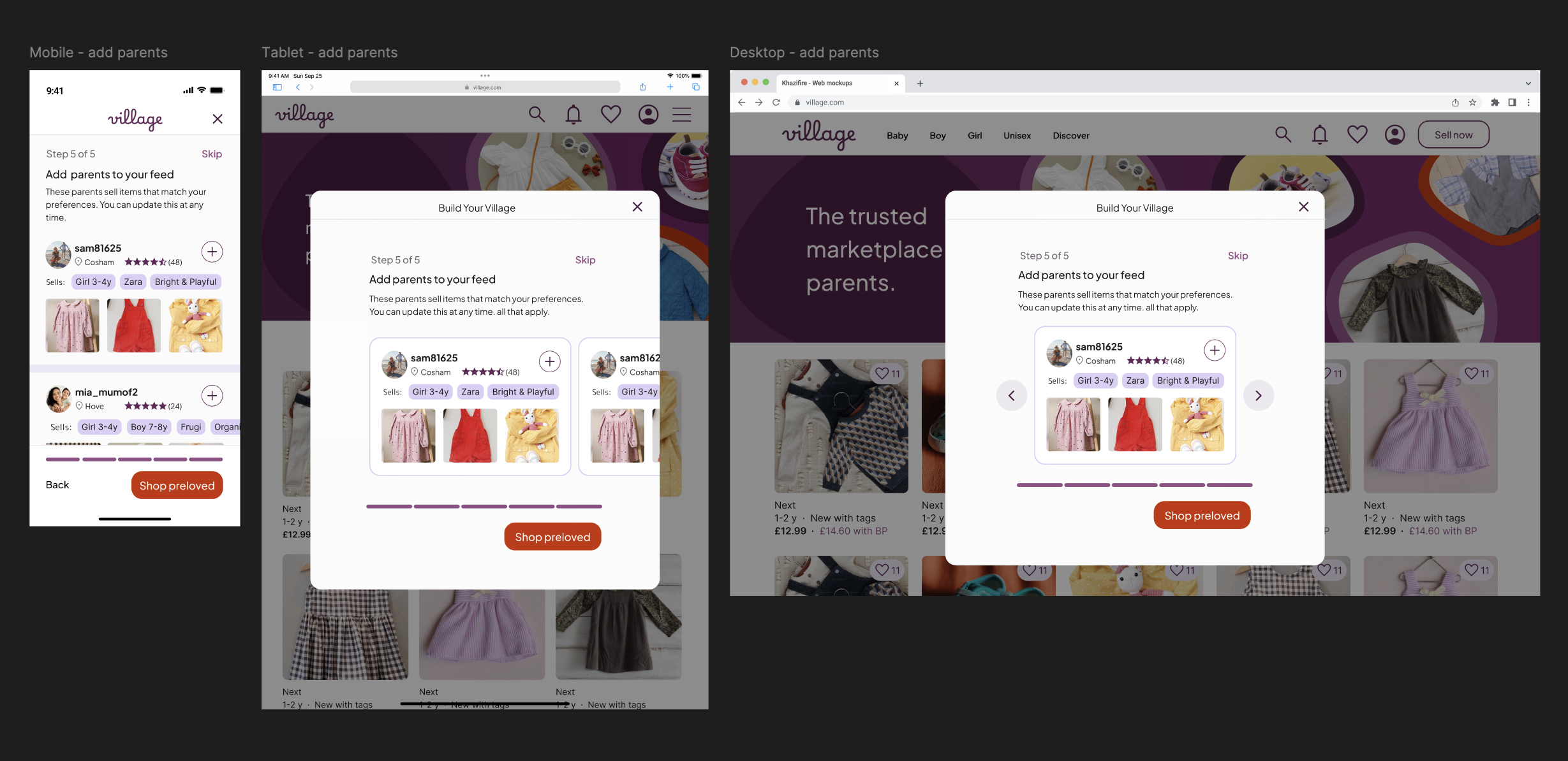
03 . Reintroducing "Add Parents" on web
In the app, the "Add Parents" step was removed from onboarding because users hadn't yet established enough trust to follow strangers. On the web, this step is reintroduced because users who reach it have actively chosen to engage with the "Build Your Village" flow. The context has shifted from gatekeeping to invitation, which transforms the same screen from a barrier into a useful discovery tool.
User intent has already been established before this screen appears. That changes how it reads.
04 . Two-column persistent profile panel
Competitor platforms like Vinted and eBay use top-banner layouts on desktop to maximise listing width. I chose a persistent left panel instead because Village surfaces more qualitative data (location, "Sells" tags, brand specialities) than a standard marketplace. The profile's primary job is trust-building before a follow decision, not product browsing, so keeping credentials visible removes the need to toggle between tabs.
My hypothesis: Village users visit profiles to assess compatibility, not to browse listings. The layout should reflect that priority.


STRATEGIC DECISION
What the Web Version Deliberately Excludes
Not every feature from the app belongs on the web. One deliberate exclusion shaped the relationship between the two platforms.
Saved Folders not available on web
Saved Folders (collaborative wishlists organised by child or occasion) received strongly positive feedback in testing. I chose to keep this feature exclusive to the native app. The web version is optimised for quick, guest-friendly discovery. The app is the high-engagement hub where parents manage family needs collaboratively. Keeping Saved Folders app-only creates a clear incentive to make the transition, and gives each platform a distinct, purposeful role.

PROTOTYPE
View the Mobile Journey
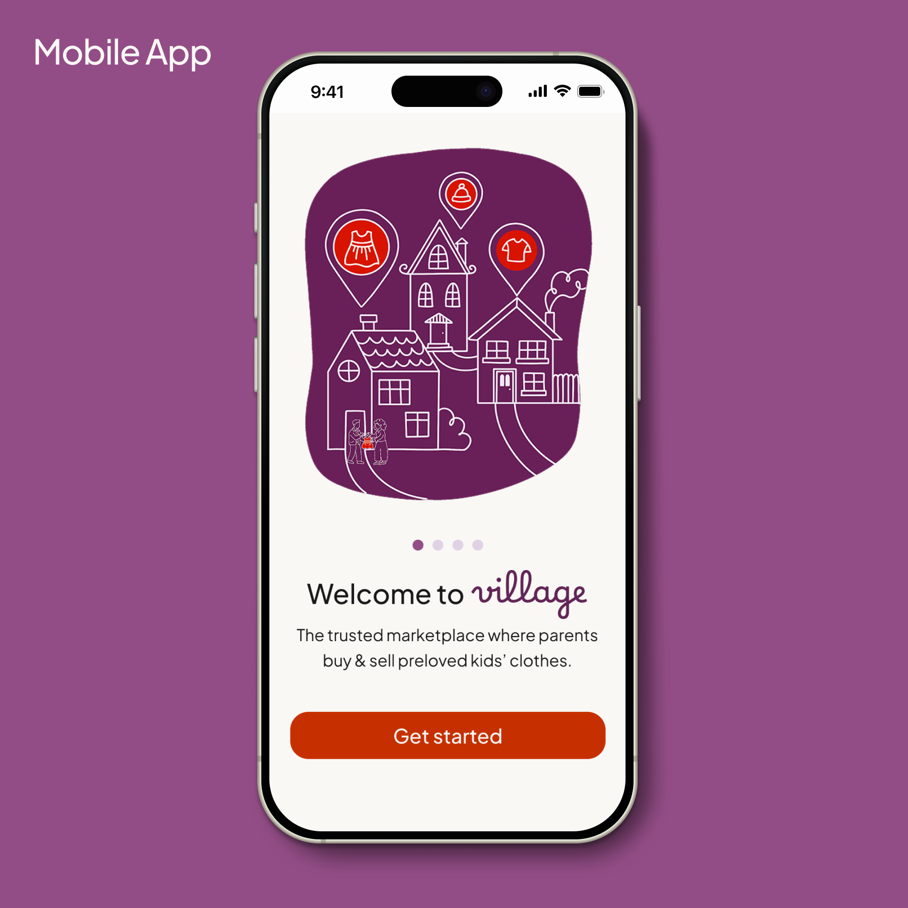
The prototype focuses on the mobile personalisation journey — from account entry through the complete "Build Your Village" flow to the personalised feed. Mobile was prioritised as the primary device for the Village community.
REFLECTIONS
What this project taught me
Behaviour over breakpoints
Responsive design isn't just about fluid grids — it's about context of use. The same feature needs a completely different logic on web vs app, not just a different layout. Scaling Village taught me to ask "how does intent change?" before asking "how does the screen change?"
Simplicity usually wins
Exploring wider desktop layouts confirmed that white space is a tool, not a gap to fill. Resisting the urge to add more — particularly in the modal flows — led to a calmer, more focused experience. Cognitive load should be kept to a minimum during personalisation tasks.
Revisiting work with fresh eyes
Returning to the Village design system with more experience was a valuable exercise in objective critique. The web project pushed me to refine decisions I'd previously made by instinct — and produced a UI that feels more considered than the original iteration.