
Village app case study
Project summary
A solo concept project created as part of the Google UX Design Professional Certificate (via Coursera), following the prompt: “Design an app and a responsive website for parents to buy and resell children’s clothing.”
Over February–September 2025 (part-time), I led the end-to-end process, from research to high-fidelity prototyping. By combining UX methods with my marketing and storytelling experience, I designed an app experience that makes personalisation feel effortless – helping parents find relevance quickly and see value from their first interaction.
My process
This case study walks through a ten-step process, from concept to prototype.
01. Understanding the user — Research, interviews, competitor audit, personas, problem statements, and journey maps.
02. Sketching & ideation — Storyboards, paper wireframes.
03. Wireframing
04. Usability testing (lo-fi)
05. Refinement - IA, visual design system.
06. High-fidelity prototype
07. Accessibility
08. Usability testing (hi-fi)
09. Final iterations
10. Reflection & next steps
The product
Village is a concept for a parent-to-parent resale app that makes second-hand shopping feel more personal, relevant, and enjoyable.
Rooted in the idea that “it takes a village to raise a child,” the app empowers parents to build their own village — a network of like-minded families that creates an engaged audience for faster sales and a more tailored browsing experience.
Parents shape their feeds by following people and brands that reflect their family’s needs, putting control back in their hands rather than relying solely on algorithms.
Village reimagines how personalisation can drive loyalty, inviting users to invest time in curating something that feels theirs. Because when people help build their experience, they’re more likely to stay connected to it.
The problem
Existing resale apps make buying and selling efficient, but not personal. Parents often feel their listings get lost among thousands of others, while shopping means sifting through endless, irrelevant content that doesn’t reflect their family’s style or needs.
Today’s platforms prioritise frictionless transactions over meaningful engagement. In the short term, that works, but over time it creates forgettable experiences and weak brand loyalty. Parents want more than convenience: they want to feel connected to the people and products they see.
The goal
The goal was to design a personalised experience that feels relevant from the very first interaction, setting the stage for faster sales and stronger engagement in a real-world setting.
To achieve this, I explored how to collect meaningful user data seamlessly and sensitively, enhancing the experience rather than interrupting it. This naturally led to a focus on the onboarding journey.
Key challenges
Personalisation without friction: How to collect meaningful preferences without slowing users down or making onboarding feel like work.
Clarity of purpose: Helping parents understand that following people and brands shapes their shopping experience — it’s about relevance, not social networking.
Motivation to complete: Designing a flow that feels instantly rewarding, so users see the value of personalisation from the start.
Balance of choice and simplicity: Giving parents enough control to make their experience feel personal, without overwhelming them with options.
01. Research: understanding the user
To design an experience that felt relevant from the very first interaction, I needed to understand how parents currently buy and sell children’s clothing — what motivates them, what frustrates them, and where existing platforms fall short.
Research approach
I combined qualitative interviews with secondary research to uncover real parent behaviours and attitudes.
I spoke with parents in my network and analysed discussions on Mumsnet, TikTok, and news articles to capture both personal experiences and broader social attitudes.
I then mapped key findings across interviews, competitor analysis, and user journeys to identify the biggest pain points and opportunities for improvement.
What I learned about parents
A mum’s domain: Shopping and resale were almost always handled by mothers; dads tended to defer to partners.
Style over quality: Parents were relaxed about quality but opinionated on taste — many disliked gender stereotypes or “tacky” designs.
Strong brand loyalty: Parents mentioned trusted go-to brands.
Motivation split by income:
Lower-income: resale as necessity; motivated by bargains.
Higher-income: resale for decluttering or sustainability; less engaged.
Platform of choice: Vinted — praised for easy listing but criticised for poor filters, irrelevant feeds, and slow sales.
“I usually stick to unisex: just because he’s a boy doesn’t mean I want him in trucks and trains. Boys’ clothing can be so limited and not very cute at all. ”
Key pain points
Irrelevant content: Algorithmic feeds show too much that doesn’t fit their needs.
Slow sales: Listings get lost among thousands of others.
Time pressure: Listing, packing, and posting take too long.
Clutter: Children outgrow clothes quickly, leaving piles of unused items parents want gone fast.
Competitor insights
I reviewed resale and circular-economy apps such as Vinted, Young Planet, and KidChing to identify gaps and opportunities for differentiation.

Key gaps identified
No parent-specific or community focus.
Profiles lack context (no quick way to see age range, style, or brands).
Limited browsing filters and category options.
Selling remains manual and time-intensive.
Branding feels generic — often green or blue, tied to sustainability rather than people.
Opportunities for differentiation
Use a warmer, more personal identity to stand out visually.
Build networks around shared family needs (children’s ages, brands, interests).
Create intuitive categories like schoolwear, hobbies, or milestones.
Combine resale and giveaway features for flexibility.
Journey mapping
Synthesising my findings into personas, problem statements, and journey maps helped me see where parents were struggling most and where thoughtful design could make the biggest difference.
User personas


Problem statements

Journey maps
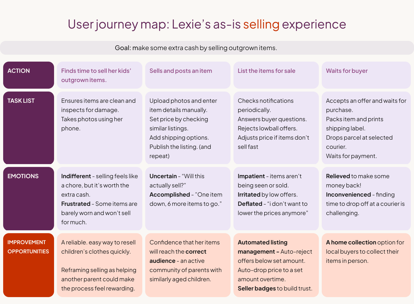
Journey mapping insights
Parents default to Vinted despite friction.
Gendered categories and weak filters limit discovery.
Selling feels inconvenient for time-poor parents.
Design Opportunities
Convenience: “Set & sell” features (auto-price drops, auto-rejecting low offers).
Filtering: Parent-centric tags and categories.
Personalisation: Relevant feeds for faster browsing and sales.
Trust & connection: Create a more supportive network where parents can share advice, offer hand-me-downs, and feel part of a genuine community.
Local exchange: supporting in-person sharing within communities.
From insights to concept
From here, I centred the design on personalisation and trust & community. Earlier research revealed parents describing the strain of “not having a village” – lacking support systems and hand-me-downs. Combined with a competitor audit showing a gap for a more human, personalised approach, this inspired both the name Village and the idea of a parent-to-parent marketplace.

02. Sketches and ideation
Before moving into wireframes, I explored early ideas through storyboards and sketches to visualise how parents might experience Village in real life. This helped me empathise with users, spot potential friction points early, and define how personalisation would fit naturally into the flow.
‘Big picture’ storyboard
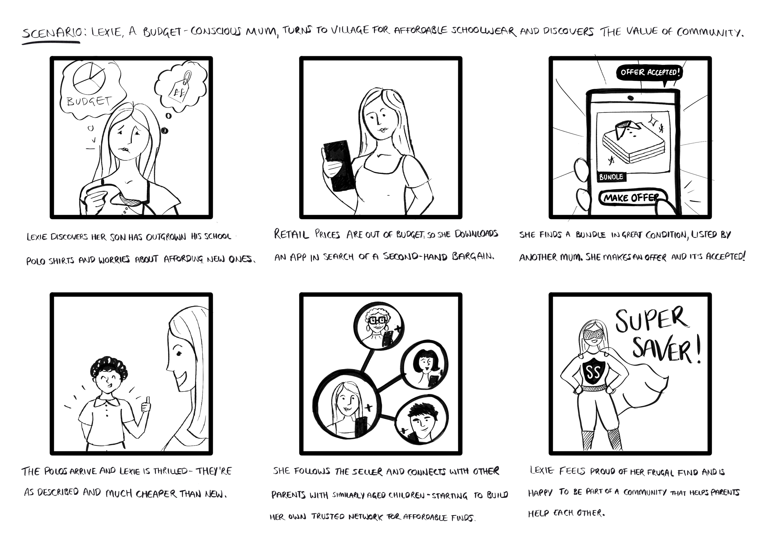
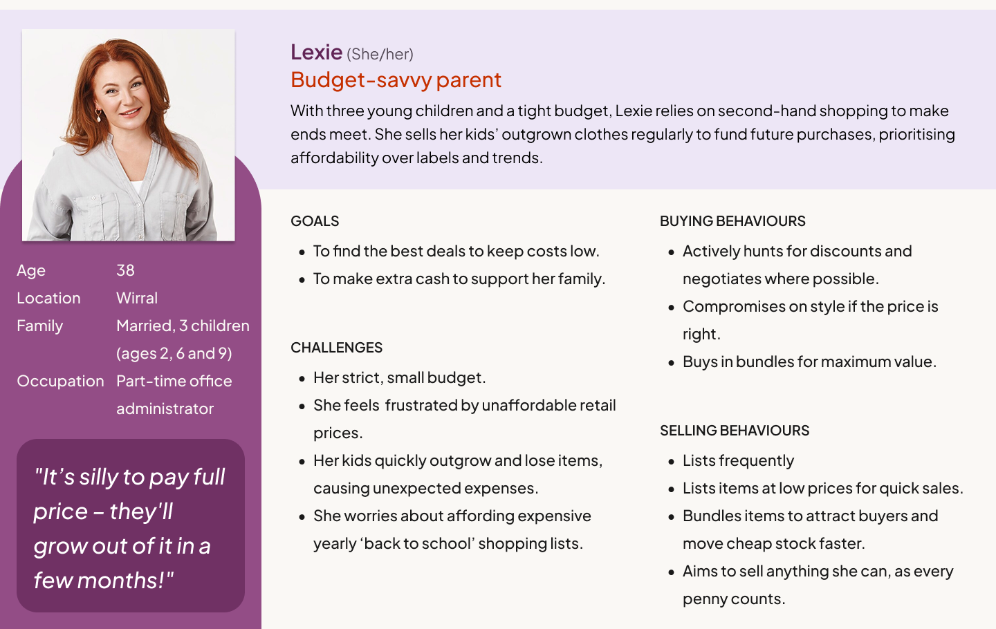
An empathy exercise to step into Lexie’s perspective — a mum replacing her son’s outgrown school uniform.
Purpose: To ground the concept in real behaviour and ensure emotional resonance before moving into detailed design.
‘Close up’ storyboard
A series of quick sketches mapping Lexie’s step-by-step interaction with the app — from opening it to completing her first listing.
Purpose: To highlight usability challenges early on, and to validate the flow and narrative of the onboarding experience before creating digital prototypes.

Paper wireframes
I then explored different layout options for the onboarding flow screens through paper wireframes.
Purpose: To quickly iterate and compare ideas side by side, helping me to decide which elements to carry forward and turn early ideas into digital wireframes.
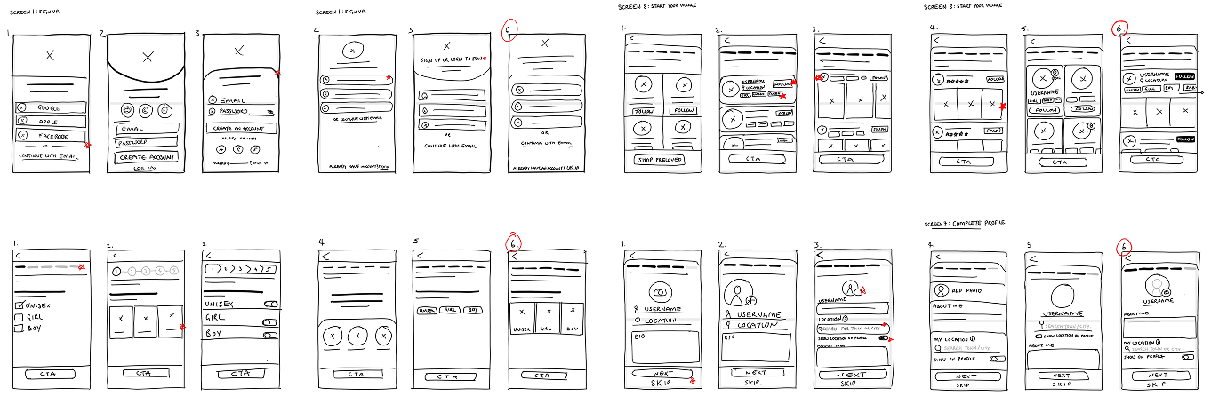
With the strongest ideas defined, I moved into Figma to create digital wireframes — building out the onboarding flow and testing how the app’s personalisation would take shape on screen.
03. Wireframing
After exploring ideas on paper, I moved into Figma to bring the onboarding flow to life. I focused on onboarding as the key opportunity to collect data for personalisation — designing a setup that felt quick, intuitive, and meaningful for parents, while gathering the information needed to tailor their experience from first use.
Goal: Design a seamless onboarding experience that balanced simplicity with valuable data collection, enhancing personalisation without adding friction.
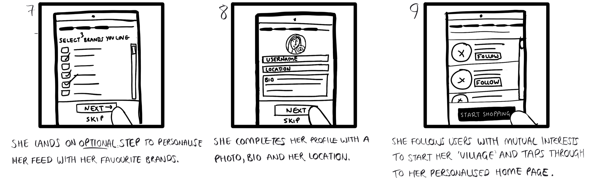
Final onboarding step: Build your Village
The final screen in the onboarding flow introduced a key differentiator: the ability to follow like-minded parents.
This optional step reinforces Village’s community-driven mission and helps users start building a more relevant feed from day one.
Profile photos, interest tags, and listing previews make it easy to spot compatibility at a glance, keeping the process quick and rewarding.
By blending personalisation with a light social element, this step soft-launches Village’s community features, gently encouraging trust and human connection without requiring full engagement upfront.

With the onboarding flow mapped out, I built a low-fidelity prototype to test how intuitive it felt in practice. The goal was to observe how easily parents could navigate the setup and whether the value of personalisation came across clearly.
04. Usability study (low fidelity)
With a low-fidelity prototype complete, I ran a moderated usability study to test how intuitive the onboarding flow felt, and whether it effectively communicated the value of personalisation without overwhelming new users.
Participants:
Five testers representing a mix of user types:
Two frequent-shopping mums (core audience)
Two occasional-shopping dads
One tech-averse grandparent (to test accessibility and simplicity)
Each session was followed by a short survey to capture overall impressions and confidence using the app.
I used Miro to cluster feedback into themes using an affinity map — a quick way to identify patterns and priorities.

Usability study insights
1. The purpose of location was unclear
Some participants were hesitant to share their location until they understood how it would improve their experience. Once explained (to surface local listings), they were happy to provide it.
2. Profile setup depends on user mindset
Sellers and buyers approached onboarding differently. For buyers, setting up a full profile felt premature, while location felt relevant with the right context.
3. Following other users felt premature
“Following” was interpreted as a social commitment rather than a practical way to personalise content. Without trust or context, the feature lacked perceived value early on.
Design changes
Based on these findings, I made several adjustments to improve clarity and reduce early friction:
Replaced profile setup with a clearer location step that explains its purpose of surfacing nearby listings and local sellers.
Moved ‘Build Your Village’ later in the journey, shifting it from an onboarding step to an optional banner on the home feed. This let users explore listings immediately — satisfying their initial goal — while still introducing personalisation once they’d had time to see the app’s value.
Reframed ‘Following’ as feed-building, replacing the “Follow” button with a simple “+” icon to feel lighter and less personal — signalling you’re adding someone to your feed rather than forming a social connection.

05. Refinement
Following usability testing, I refined and expanded the product to reflect new insights and a broader user journey.
While my initial focus was onboarding, feedback showed that parents were eager to explore listings and search early on — so I evolved the design to include Home and Search flows, capturing how these features connect within the wider app experience.
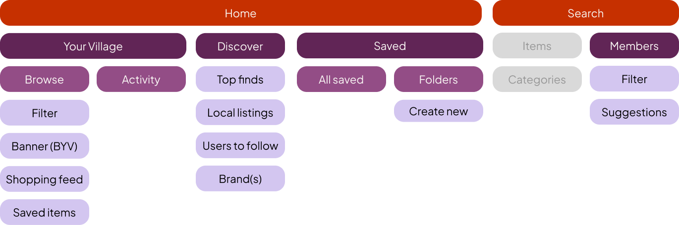
Information Architecture
To support the expanded scope, I created a hybrid information architecture and sitemap to clarify how pages connected and to assess the work required for each flow.
Although the prototype focused on Onboarding, Home, and Search, the full product would also include Sell, Inbox, and Profile – completing the end-to-end resale journey.
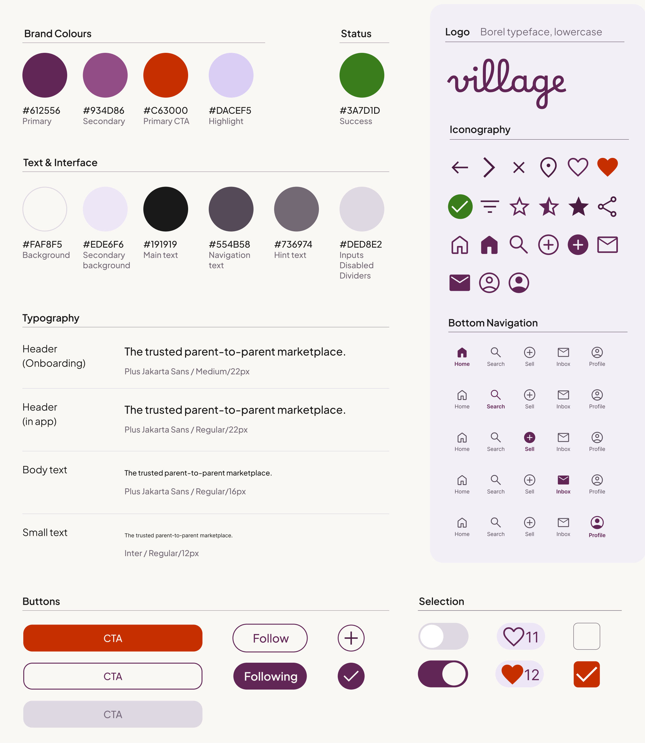
Design System
As the structure took shape, I developed the visual language and design system for the high-fidelity prototype, defining colours, typography, icons, and UI elements.
Every design decision was made with parents — especially mothers — in mind. Brand colours were chosen to feel warm and appealing to the core demographic, while remaining inclusive for male users, and functional shades guide interactions naturally.
Goal: To create a cohesive, human-centred experience that feels modern, intuitive, and emotionally in tune with its audience.
06. Mock ups & high fidelity prototype
After refining the structure and visual system, I created a high-fidelity prototype to bring Village to life.
The prototype brought together four key parts of the user journey:
Onboarding – guiding new users smoothly through sign-up and preference setting.
Home / Your Village – introducing each user’s personalised feed.
Build Your Village & Filters – helping parents find compatible families to add to their feed.
User Profiles – building trust and connection through transparency.
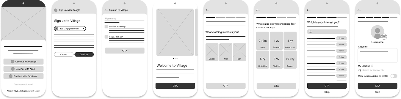
Onboarding
Goal: Create a quick, intuitive setup that collects meaningful preferences without adding friction.

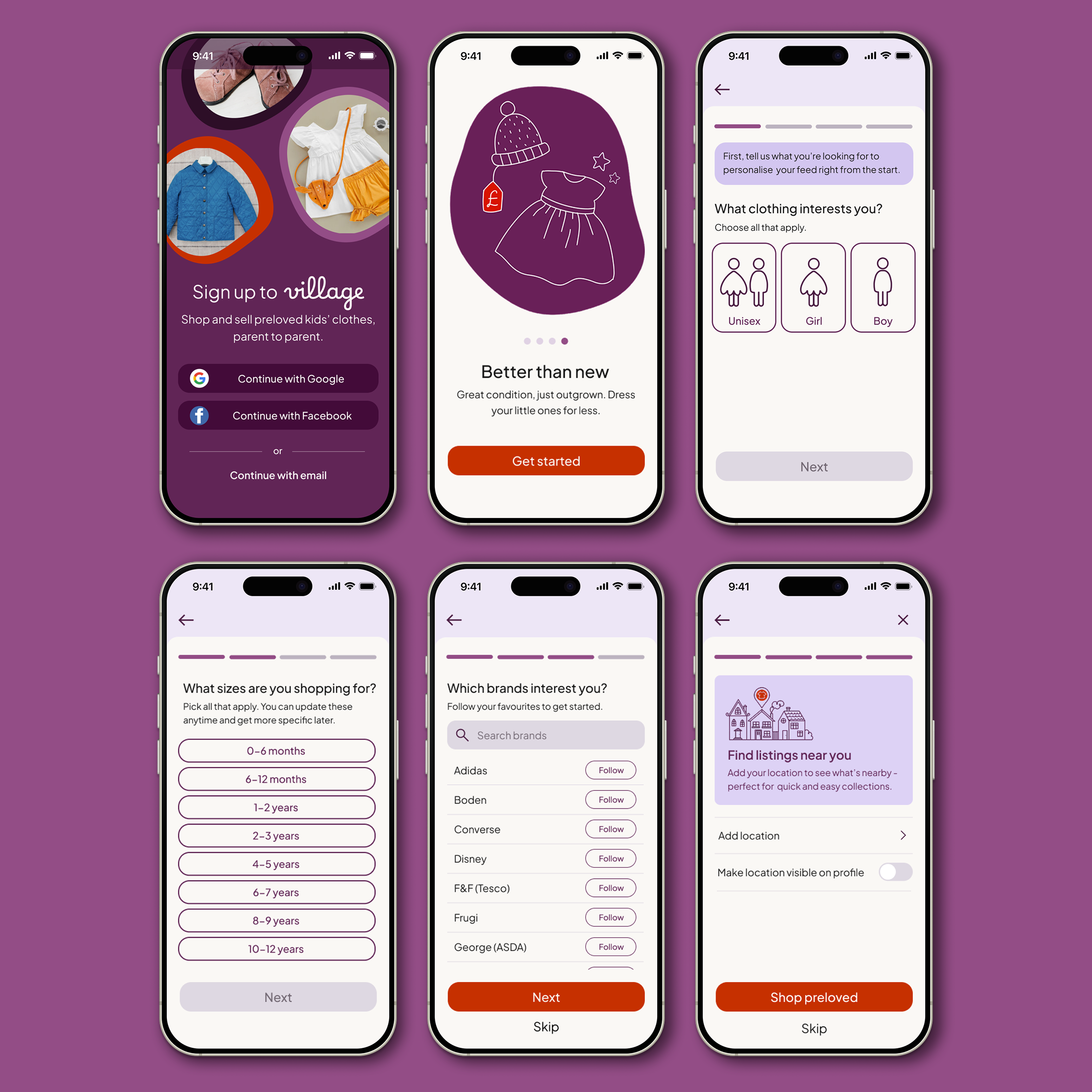
Design decisions
1. Prioritised one-tap-sign-up for faster account creation
I placed Google and Facebook sign-in options ahead of email to streamline onboarding and reduce drop-off. Third-party sign-in offers a quicker, lower-effort entry point for busy parents while still providing the option to register via email if preferred.
2. Introduced the brand through value-led welcome messages
Onboarding opens with a short carousel highlighting Personalisation, Convenience, and Quality – the core values identified through user research. This sets expectations and frames the experience from the start.
3. Collected meaningful preferences without overwhelming users
Users choose gender, size, and brand preferences to shape their feed. Including a neutral/unisex option directly addresses a key frustration uncovered in research. These early signals ensure the feed feels relevant from the first session.
4. Made location optional to reduce early friction
Testing showed that completing a full profile during onboarding felt demanding. Replacing with an optional location setup step allows the app to surface nearby items without slowing users down.
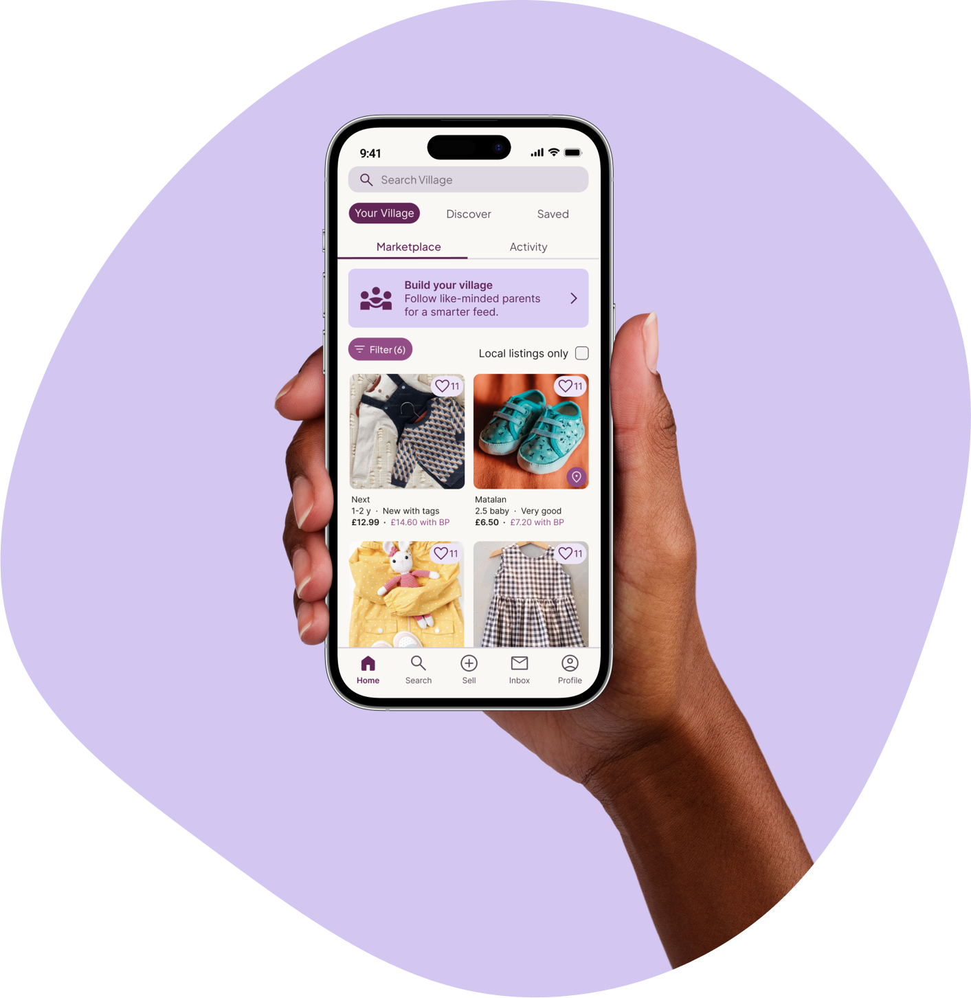
Home / Your Village
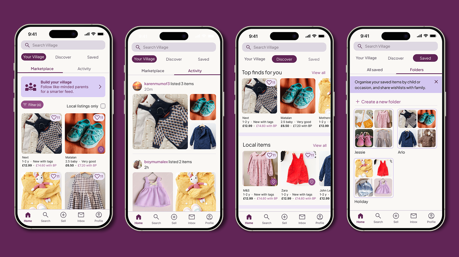
Design decisions
1. Moved ‘Build Your Village’ (follow parents) to where users are already exploring
Following families felt too demanding during onboarding. Relocating the feature to Search → Members integrates it into an existing discovery behaviour, while the Home banner acts as a gentle prompt rather than a step users must complete early.
2. Balanced shopping with community through two focused tabs
The Your Village feed combines personalisation with social context:
Marketplace displays relevant listings driven by preferences and followed families
Activity shows updates from the people users follow, adding a human touch without interrupting shopping
3. Supported returning users with subtle, contextual reminders
A carousel of saved items appears (in a real product setting this would be for returning users only, serving as an abandoned cart-style nudge not to forget about items they’ve shown interest in.
4. Added Discover and Saved tabs to complete the product experience
Discover complements the personalised Your Village feed with a familiar “browse everything” view and recommended carousels, ensuring users can still explore widely. I’d use real usage data to determine which view should be primary long term. Saved supports organisation and helps relieve the mental load mothers described around children’s shopping via sharable lists.
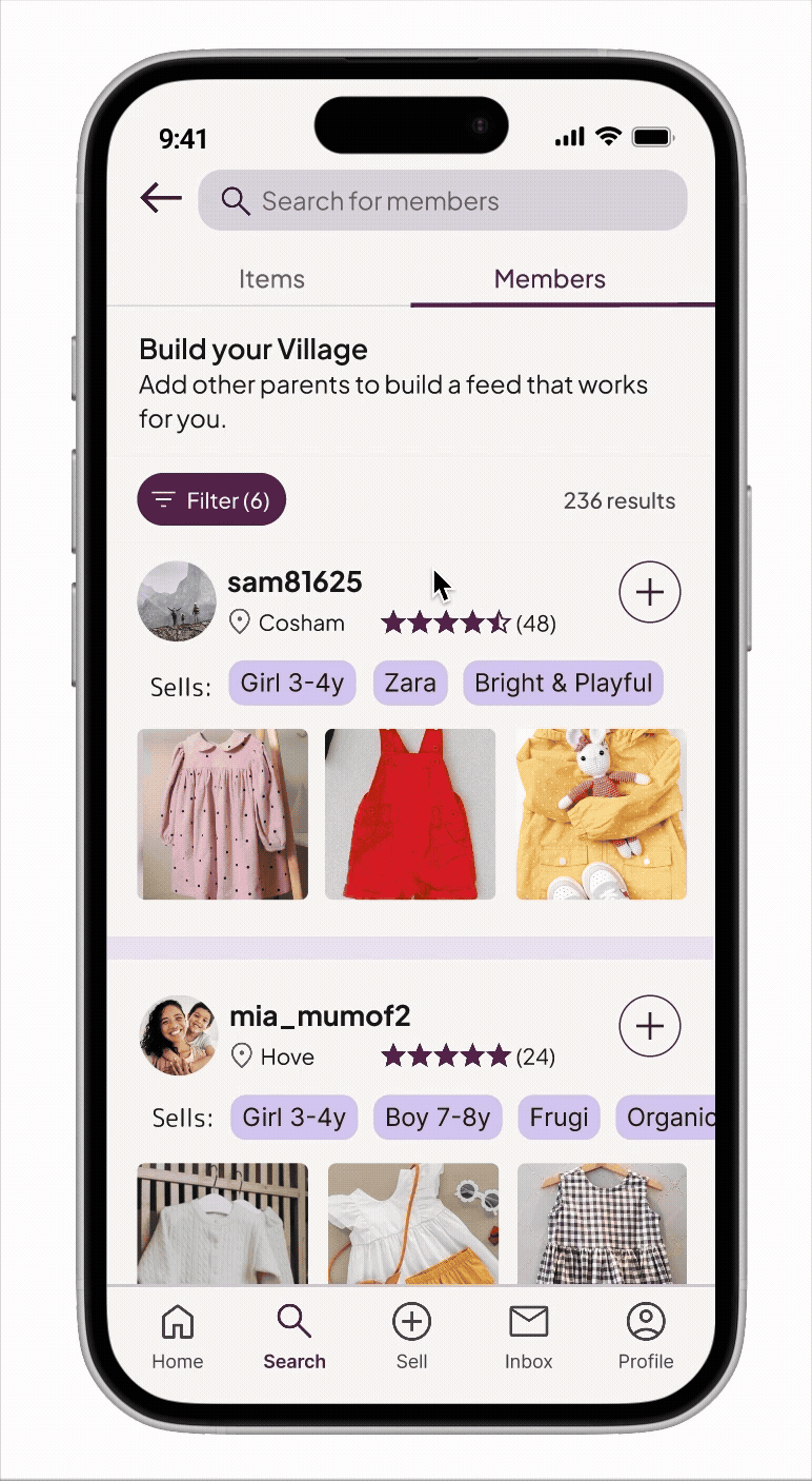
Build your Village
Within the Members view, parents can discover and follow families who share similar preferences or styles. Unlike other resale apps, Village lets users search and filter for people as well as items, giving parents more control over what appears in their feed and making the experience feel more personal and intentional over time.
Design decisions
1. Repositioned ‘Build Your Village’ to match real discovery behaviour
Originally part of onboarding, this feature now lives in Search → Members, with a light banner prompt on Home. Testing showed parents were more open to following others when already browsing, not during sign-up.
2. Designed filters around what parents actually care about
Research revealed that parents follow others with similar styles or preferred brands. Filters were expanded beyond age and gender to include style tags, making it easier to surface families they’d genuinely relate to.
3. Supported compatibility at a glance (future enhancement)
In the full app, users could pin up to five tags to their profile/preview card. This would offer an instant sense of compatibility without adding friction — outside this project’s scope but important for long-term discoverability.

User Profiles
Design decisions
1. Used a familiar, trustworthy structure to reduce cognitive load
Profiles follow a simple, recognisable pattern with swipable tabs for Listings, Reviews, and About. This mirrors mainstream resale apps, helping parents feel immediately at home.
2. Made key information easy to scan
Profile details, selling habits, and visual cues are grouped to give parents a quick sense of who they’re connecting with — supporting confidence and reducing hesitation.
3. Prioritised transparency to build trust
By keeping listings and reviews prominent, parents can evaluate credibility at a glance before deciding whether to follow someone.

Prototype includes:
Quick sign-up via Google
Welcome carousel introducing Village’s core values
Onboarding: gender, size, brand, and optional location preferences
‘Your Village’ personalised Marketplace feed
Activity feed with contextual tooltip
Discover and Saved tabs
Build Your Village (Search → Members)
User profiles
07. Accessibility considerations
As a solo learner completing the Google UX Design Certificate, I wasn’t equipped to fully test accessibility features such as screen readers or voice control. However, accessibility remained a core consideration throughout my design decisions.
I focused on creating a visually clear, mobile-friendly interface that supported a wide range of users:
Readable typography & contrast: Legible across all screens, with a secondary typeface optimised for small listing previews.
Large tap targets & intuitive gestures: Designed for mobile use and one-handed interaction.
Clear hierarchy: Consistent layouts and typography to make content scannable.
Inclusive language: Simple, jargon-free copy to improve clarity and comprehension.
Subtle motion: Animations used sparingly to avoid distraction or motion sensitivity.
Colour-blind-friendly palette: Distinguishable hues reinforced with icons and text labels.
08. Usability Study (high fidelity)
After refining the design, I ran a final round of usability testing on the high-fidelity prototype to validate improvements and explore how users experienced the full journey — from onboarding through to building their village.
Goals
Onboarding: Assess whether setup felt quick, clear, and worthwhile, and identify any remaining points of friction.
Overall concept: Gather general impressions of the app’s appeal and usefulness.
Build Your Village:
Evaluate how easily users could find and understand the feature.
Test whether profile content and tags provided enough context to decide who to follow.
Learn if the reframed concept of “building a feed” (rather than a social network) felt comfortable and valuable.
Methodology
I conducted a mix of remote and in-person moderated sessions (via Google Meet), followed by a custom usability survey to capture both behavioural insights and qualitative feedback aligned with my research goals.
KPIs
To evaluate usability and overall experience, I tracked a mix of qualitative and quantitative measures:
Time on task: How long users took to complete onboarding steps.
Feature comprehension: How well users understood and used key features, particularly Build Your Village.
User perception & satisfaction: Feedback from moderated sessions and survey responses on clarity, usefulness, and overall experience.
Key Insights
Onboarding
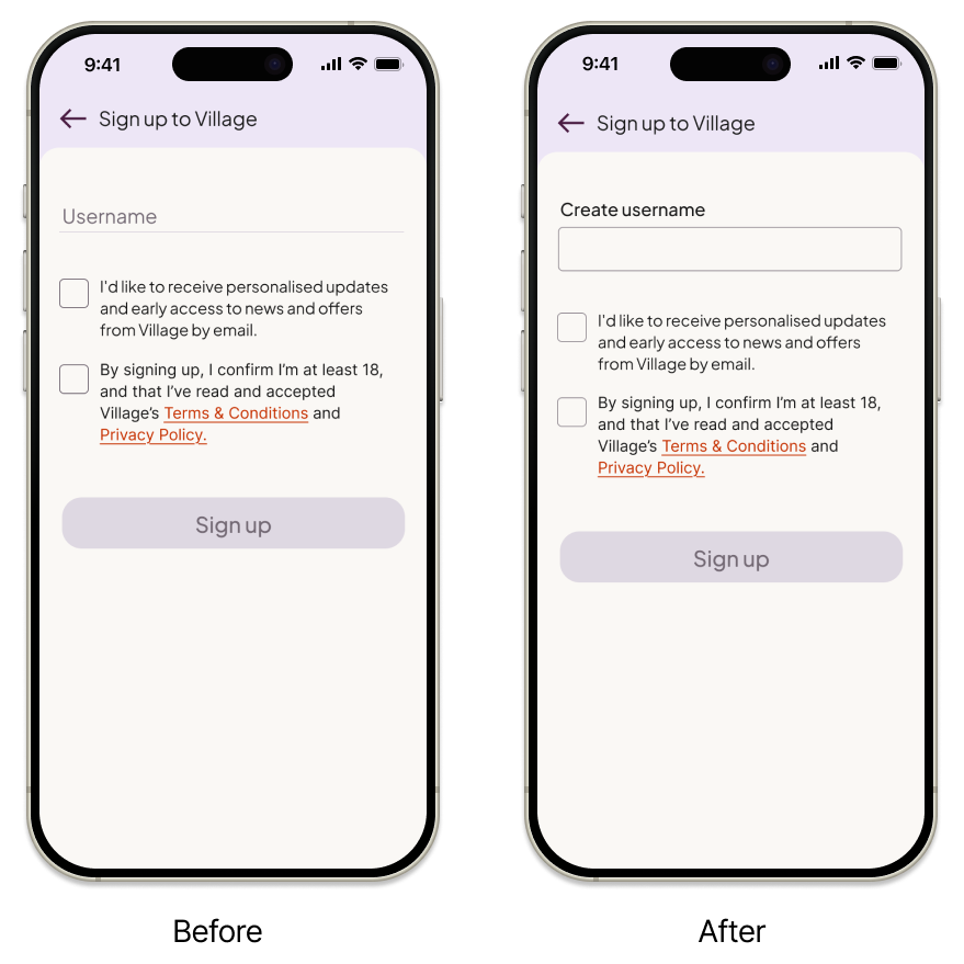
The average time taken to complete the onboarding flow was just 58 seconds, with everyone finishing all tasks independently — a strong indication that the flow was intuitive and easy to navigate.
Missed username field
Observation: 2/5 users didn’t notice the username field at first, mistaking it for a heading.
Insight: The minimal design made it too subtle, losing its visual cue for interactivity.
Next Step: Strengthen the field’s visual hierarchy (e.g., outline, contrast, or spacing).
Broad age brackets
Observation: 1 participant hesitated when her child’s exact size (2–3) wasn’t listed.
Insight: When searching for something specific, users may overlook broader options — not a flaw, but worth monitoring.
Next Step: Test narrower age brackets in future iterations to balance precision and simplicity.
Home page & first impressions
Layout and design felt intuitive
Observation: All participants (5/5) found the layout clear, attractive, and easy to browse.
Insight: The home design successfully balances aesthetics and usability.
Next Step: Maintain the current layout and hierarchy.
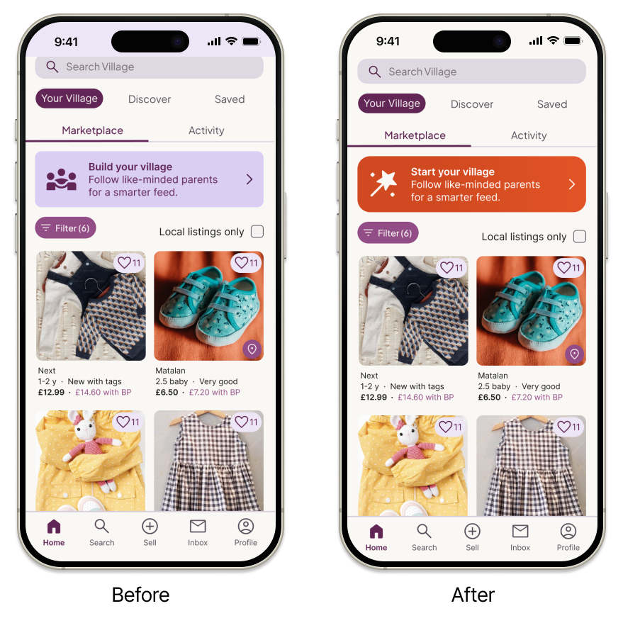
‘Build Your Village’ banner overlooked
Observation: 3/5 participants didn’t notice the banner.
Insight: Its subtle, ad-like design reduced visibility and perceived importance.
Next Step: Adjust visuals (e.g., stronger colour or bolder copy) to make it feel integrated and purposeful.
Build your Village function
Feature is clear and intuitive
Observation: All participants understood the purpose and found the interaction familiar.
Insight: The new framing and iconography communicate the feature clearly and build trust.
Next Step: Retain the “add to feed” icon instead of the “follow” label to keep it approachable.
Feed-building suits engaged users, not new ones
Observation: None of the participants wanted to start building their village immediately; they preferred browsing first.
Insight: Feed-building adds value once users are invested — it’s more effective as a retention feature than an onboarding one.
Next Step: Keep the prompt visible but optional, surfacing it later in the journey once trust has formed.
Filters & user profiles
Filters are clear and inclusive
Observation: All participants found the filters easy to use and felt represented by the options.
Insight: Filters enhance relevance and confidence; brand and size tags are most useful, though style filters add subtle context.
Next Step: Retain the current structure but track filter usage to see which tags deliver the most value.
Profiles provide sufficient context
Observation: All participants found profiles informative, with “selling tags” and “recently sold” sections highlighted as helpful.
Insight: The design offers enough detail for users to make confident follow decisions.
Next Step: Maintain the current layout and emphasis on key tags, refining only if future data suggests gaps.
Overall sentiment
Brand and experience resonate with target audience
Observation: All participants said they would use the app in real life. Two praised the branding, and male participants found it inclusive.
Insight: The brand and UI strike the right balance — appealing to the core audience without alienating others.
Next Step: Keep the existing visual identity; it effectively supports usability and emotional connection.
09. Final Design Iterations
Based on insights from the high-fidelity usability study, I made a series of targeted refinements to improve clarity, visibility, and perceived effort for new users.
The two main updates focused on the username field and the Build Your Village banner.
1 . Username field refinement
Insight: The minimalist design made the input look non-interactive, creating a small moment of friction early in onboarding.
Design Update: Replaced the faint line with a clearly defined input box and bolder title (“Create username”), making it instantly recognisable and ensuring users complete the step smoothly..
2. Build Your Village banner
Insight: The design was too subtle, and its ad-like appearance reduced perceived value – yet making it too prominent risked overwhelming new users.
Design Updates:
Colour: Introduced a softer gradient of the CTA red (
#E25426 → #D14920) to stand out from the purple interface without implying urgency or error.Icon: Swapped the “network” icon for a magic wand, symbolising personalisation and ease rather than effort.
Copy: Updated “Build your Village” → “Start your Village”, shifting from a task-oriented tone to one that feels light and exploratory.
Shape: Increased corner radius to signal clickability and differentiate the banner from static elements.
Reflection 💭
While the banner worked as a first iteration, further reflection on the research – and designing for web, where banners are often dismissed as marketing noise – made it clear a floating wand button would be a stronger choice. In my follow-up web project, I evolved this into a ‘Build Your Village’ wand button to make the action more visible, intriguing, and effortless to engage with.
10. Reflection & next steps
Key takeaways
1. Usability testing doesn’t just validate – it inspires.
As someone who isn’t a parent, testing opened my eyes to assumptions I didn’t know I was making. Some of the best ideas came from off-script moments — casual comments that revealed real needs. I learned that creating space for open conversation can be just as valuable as structured testing.
2. Clarity matters more than minimalism.
I love clean, minimal design, but watching users miss simple interactions taught me where simplicity becomes confusion. I learned how to reduce friction without hiding functionality.
3. Designing for context, not just personas.
Understanding when and why users interact is as important as knowing who they are. Feed-building made sense for returning users, not new ones, reminding me that even useful features need the right timing.
4. Trust the process
Moving through research, iteration, and testing built my confidence. Each stage proved that evidence and iteration create better outcomes than assumptions.
5. Adaptability is key
I began with a community-driven vision, but research showed parents wanted personal benefit, not social connection. Reframing “Build Your Village” as “building your feed” kept the heart of the idea while making it relevant. It taught me that good design listens and evolves.
Overall: This project taught me how to balance empathy with evidence, designing not for what I assume users want, but for what they actually need.
Next steps
1 . Evaluate ‘Build your Village’ adoption:
Track how often users create their personalised feed versus relying on Discover. These insights will help measure whether feed-building truly drives engagement — testing the core value of the concept.
2. Explore accessibility improvements:
Run usability sessions with assistive technologies such as screen readers and voice-to-text to ensure Village works seamlessly for all parents — especially those multitasking or using one hand.
3. Explore compatibility highlights
Explore lightweight ways to help users recognise compatibility instantly, such as a “mutual interests” section, coloured tags, or prioritising shared attributes within profiles.