Village: Responsive Web Design
As a continuation of the Village App Case Study, and part of the Google UX Design Certificate, this project explores how to adapt Village’s personalisation experience to a responsive website for desktop, tablet and mobile.
Understanding the shift from app to web
In the app, personalisation sits within onboarding – a natural fit for users who have already shown commitment by downloading the product.
However, web visitors behave differently. They arrive to browse, often encountering the brand for the first time, and are less willing to invest time upfront. Forcing onboarding risks interrupting their primary goal: exploring listings and making purchases.
What I learned from the app project
Usability testing from the app project showed that users were happy to set basic preferences (age, size, brands) upfront, but preferred to follow other parents gradually, after they’d spent time browsing and understanding how Village worked. This clarified how Your Village – the user’s personalised feed – should be shaped: partly through quick preference choices and partly through optional, relationship-based actions over time.
This reframed the journey into two parts:
Personalisation setup – quick, upfront choices such as age, size, and brands.
Following other parents – an optional, ongoing behaviour surfaced naturally within browsing, not forced during onboarding.
This project focuses on bringing those behaviours to the web in a way that feels intuitive for exploratory users.
The challenge
Support browsing first: Introduce personalisation without blocking or slowing down shopping.
Surface feed-building progressively: Make “Build Your Village” visible and valuable at the right moments, without harming conversion.
Project goals
Adapt Village’s key personalisation features so they function seamlessly across devices.
Make feed-building visible and effortless — introducing personalisation as an optional, lightweight part of browsing that users can engage with at their own pace.
Enable personalisation without compromising conversion — keeping the shopping journey clear and uninterrupted.
My process
01. Site map & IA
02. Selective wireframes
03. Scaling the experience across devices
04. High-fidelity prototype
05. Key takeaways
This case study explores how personalisation and feed-building can feel natural on the web — visible enough to add value, but unobtrusive.
01. Site map & IA
To adapt the Village app for web, I created a combined sitemap and information architecture showing how users move through the site and where core features sit within their journey. (Checkout and listing upload flows were out of scope for this project.)
To keep the web experience focused and lightweight, I intentionally removed two app features:
Village Activity — a community-style feed better suited to highly engaged app users
Saved folders — removed to encourage app downloads
Streamlining the architecture kept the web version simple and commerce-first, with personalisation introduced in a way that feels unobtrusive.

Moving forward: personalisation overlay
Mapping out the site made it clear that onboarding doesn’t naturally belong on the web, as it interrupts the shopping flow. I still needed a way for users to personalise their experience, but it had to feel optional and lightweight — something people could open or dismiss easily .
I decided to explore a web-based overlay that introduces personalisation without pulling users out of their journey; visible enough to encourage engagement, yet subtle enough not to distract from browsing or conversion.
Exactly how this overlay would appear and behave became the focus of my next stage: wireframing.
02. Selective wireframes
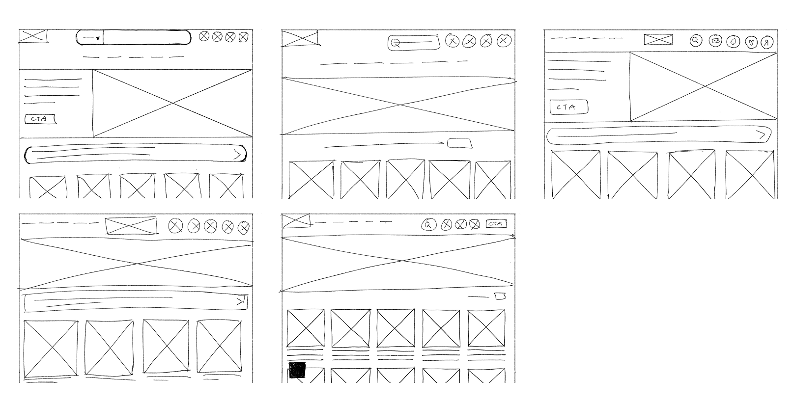
Paper wireframes
I sketched a few early paper wireframes to explore structure. However I found it more effective to move into digital wireframes quickly – as this project builds on my existing Village app, the core design system was already in place. Since the goal was to adapt my existing app design for web, working digitally made iteration faster and clearer.
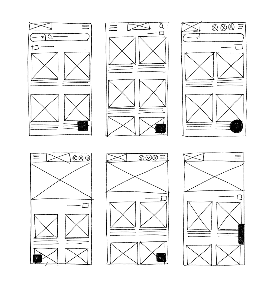
Digital wireframes
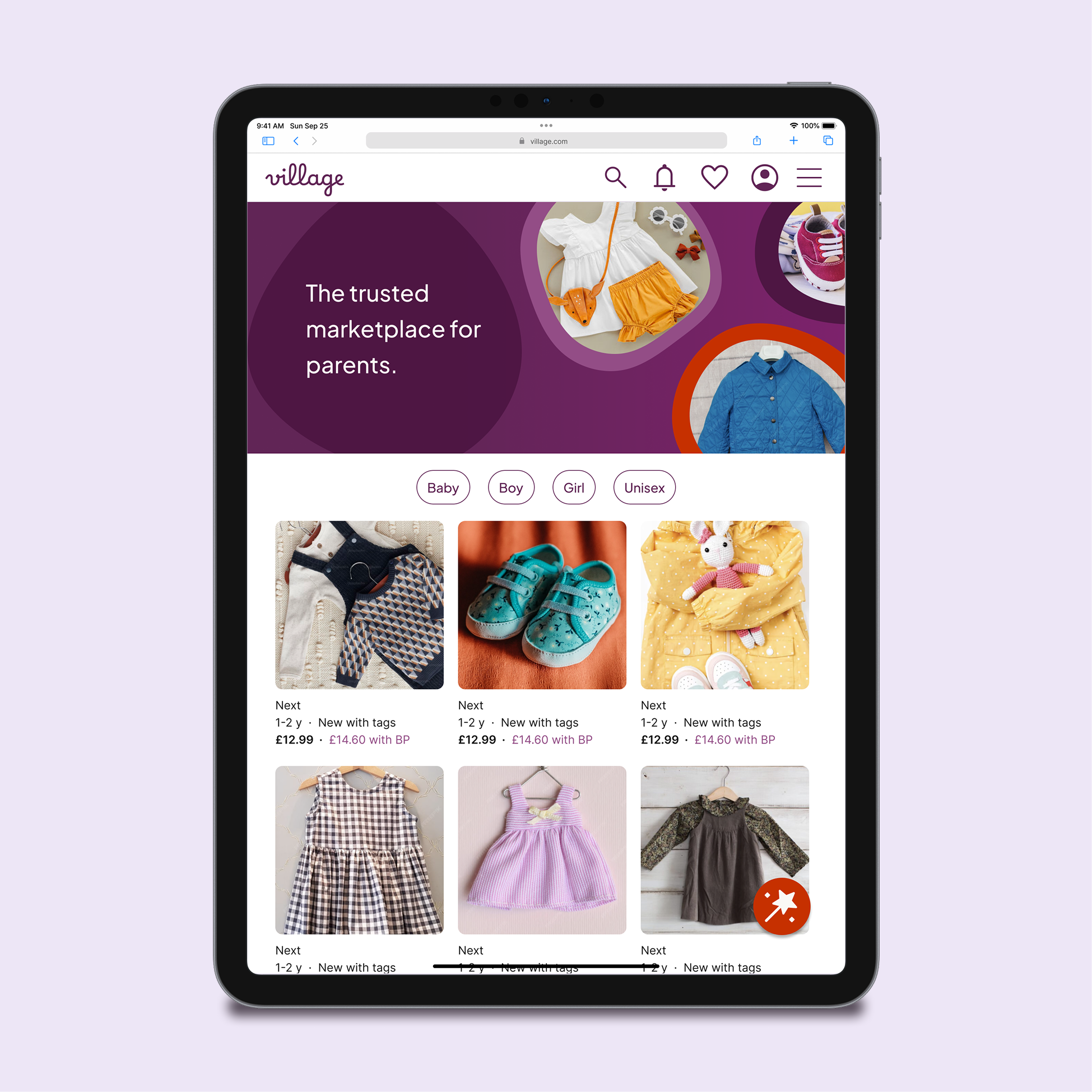
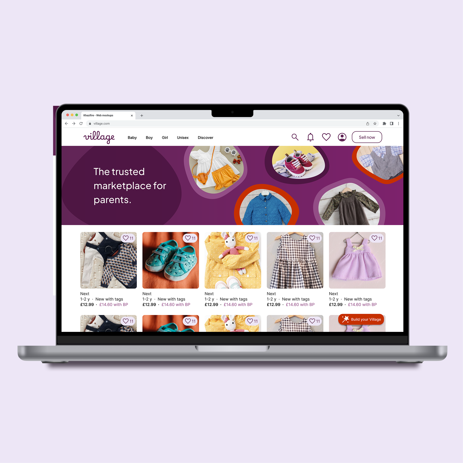
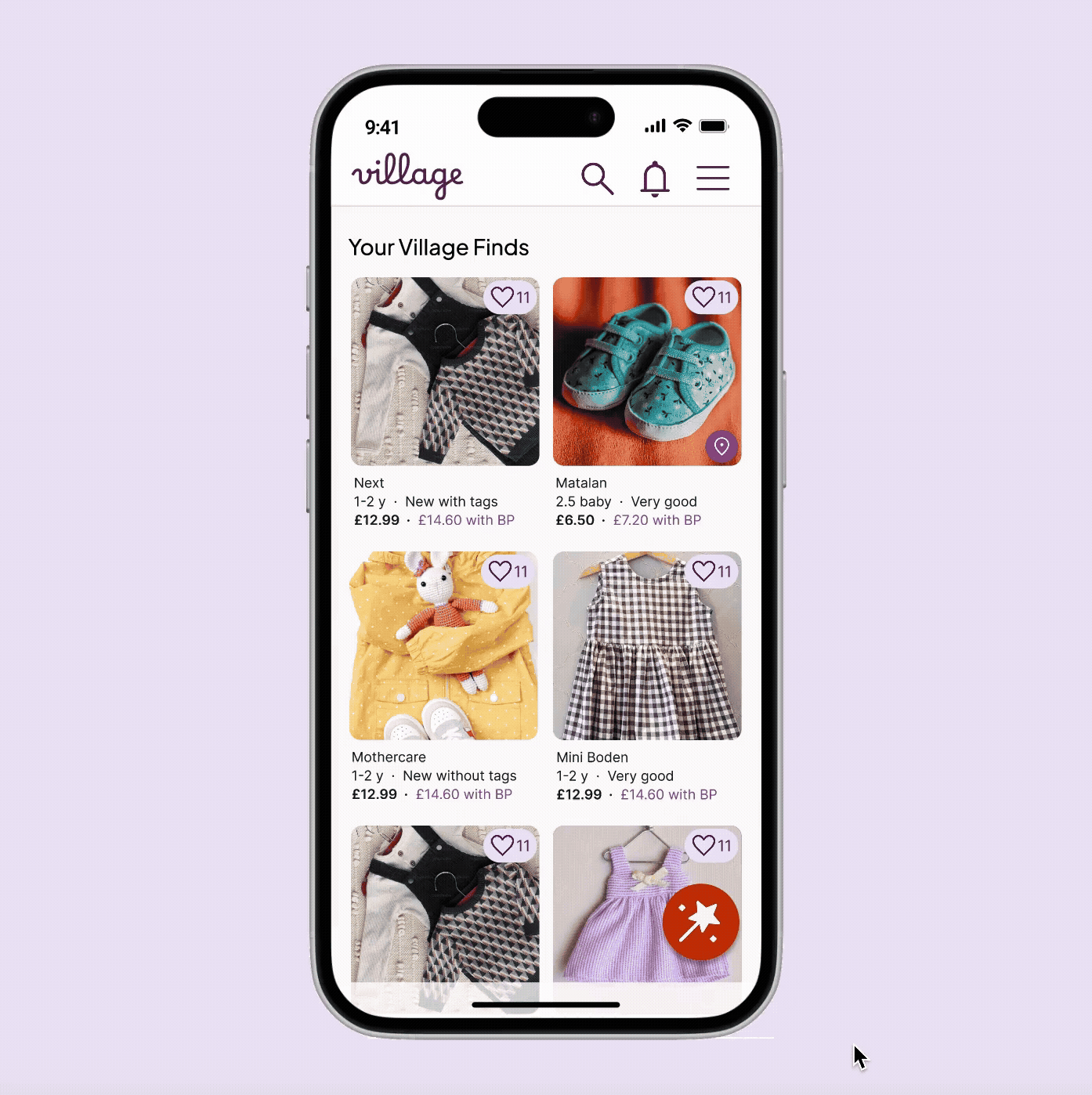
I created low-fidelity wireframes only where new structures were needed before moving straight into high-fidelity designs. The wireframes below show how the homepage would adapt across desktop, mobile, and tablet devices.

03. Scaling the experience across devices
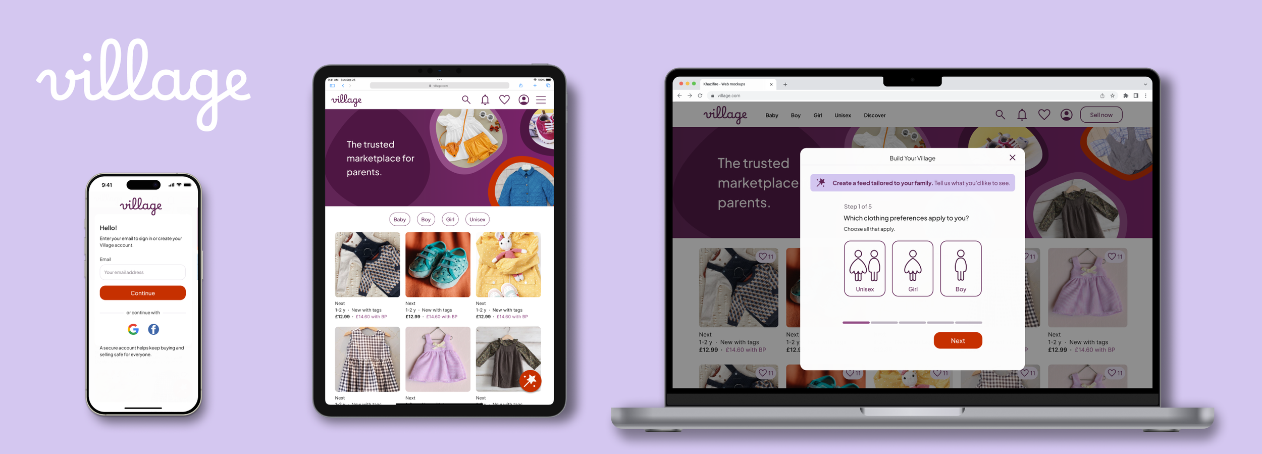
To show how Village’s personalisation journey (“Build Your Village”) scales across devices, I focused on four early touchpoints:
Homepage (logged out)
Select clothing preferences (gender)
Add Parents
User profile
These screens demonstrate responsive UI and a personalisation flow that stays lightweight and optional, complementing browsing rather than interrupting it.
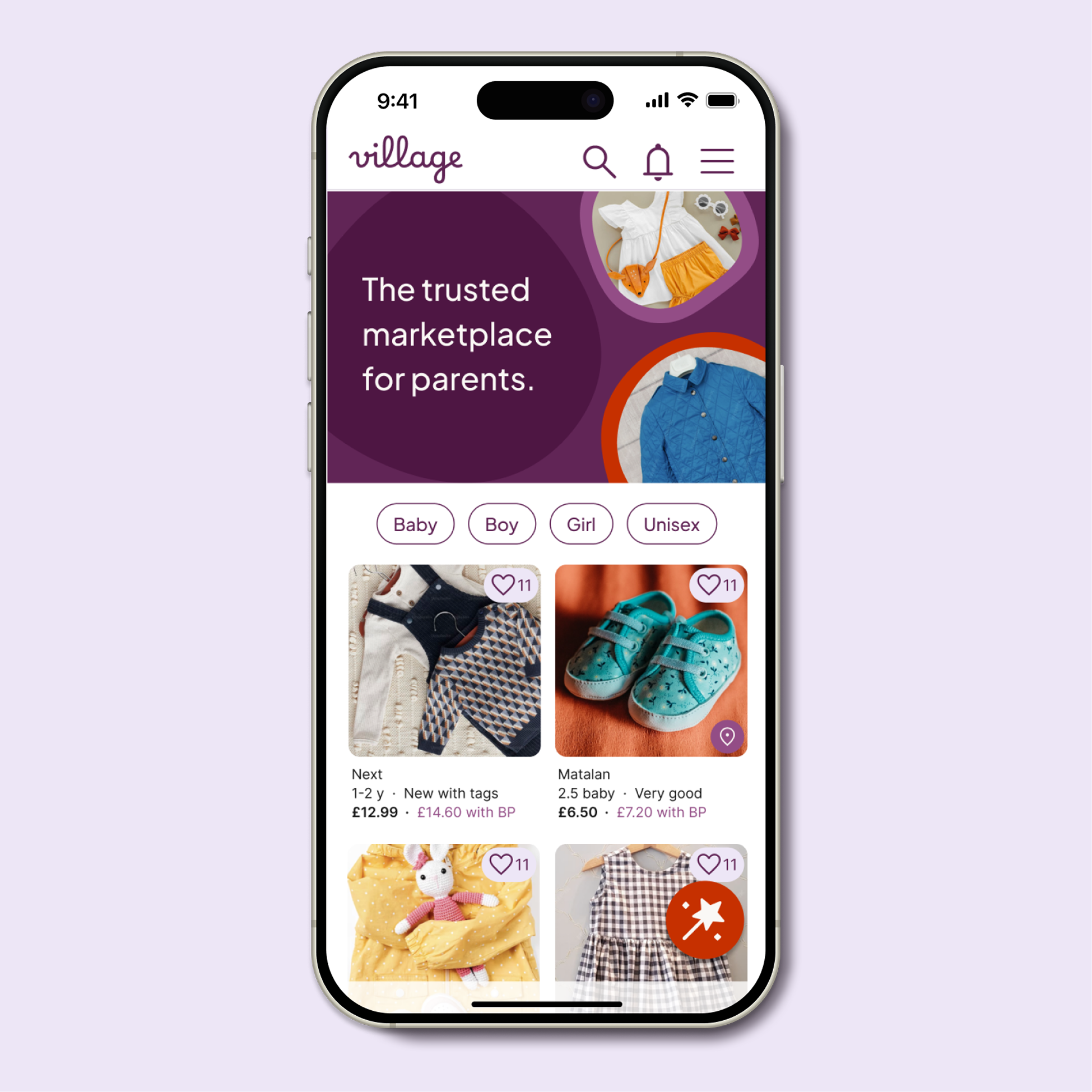
Homepage (logged out)

Key design decisions
1. Hero image shown only for logged-out users
Displayed on the homepage to clearly communicate what Village is — a trusted marketplace for parents.
Removed for logged-in users to prioritise feed content.
Why: New users need clarity; returning users need immediacy.
2. Consistent hierarchy across devices:
Brand promise → Listings → Personalisation CTA
Why: Positions Village as a trusted marketplace first, with personalisation introduced only when users are ready.
3. Multiple lightweight entry points to account creation
The sticky “Build Your Village” button, along with the favourites and notification icons, are all visible while logged out.
Interacting with any of these triggers the sign-up flow, giving users several natural, low-pressure ways to create an account.
On mobile/tablet, a sign-up option also sits in the burger menu; on desktop, the design relies on these “account-only” interactions to prompt registration.
Why: Encourages sign-up at moments of genuine intent, rather than interrupting browsing with forced prompts.
4 . Adaptive, sticky “Build your Village” CTA
Sticky placement keeps the CTA visible while browsing, without interrupting the shopping experience.
Larger-than-usual floating button (vs small chat/cookie widgets) was intentional to signal importance, not utility.
Mobile/tablet: Large circular button, right-aligned for thumb reach and visibility.
Desktop: Becomes a labelled pill for clarity and faster scanning.
Why: Personalisation is a key differentiator, but not a user’s first goal. A sticky CTA makes it easy to engage when the user is ready, without forcing a flow upfront or relying on a dismissible banner.
5. De-prioritised “Sell now” CTA for logged-out users
Mobile/Tablet: Moved into the menu.
Desktop: Switched to a ghost button to avoid competing with the personalisation CTA.
Why: New users typically browse before selling, so the UI reflects real behaviour and reduces cognitive load.
6. Responsive navigation
Mobile/tablet: Browsing guided through category pills.
Desktop: Categories move into the top nav to match web conventions.
Why: Keeps browsing effortless on every device without duplicating patterns unnecessarily.
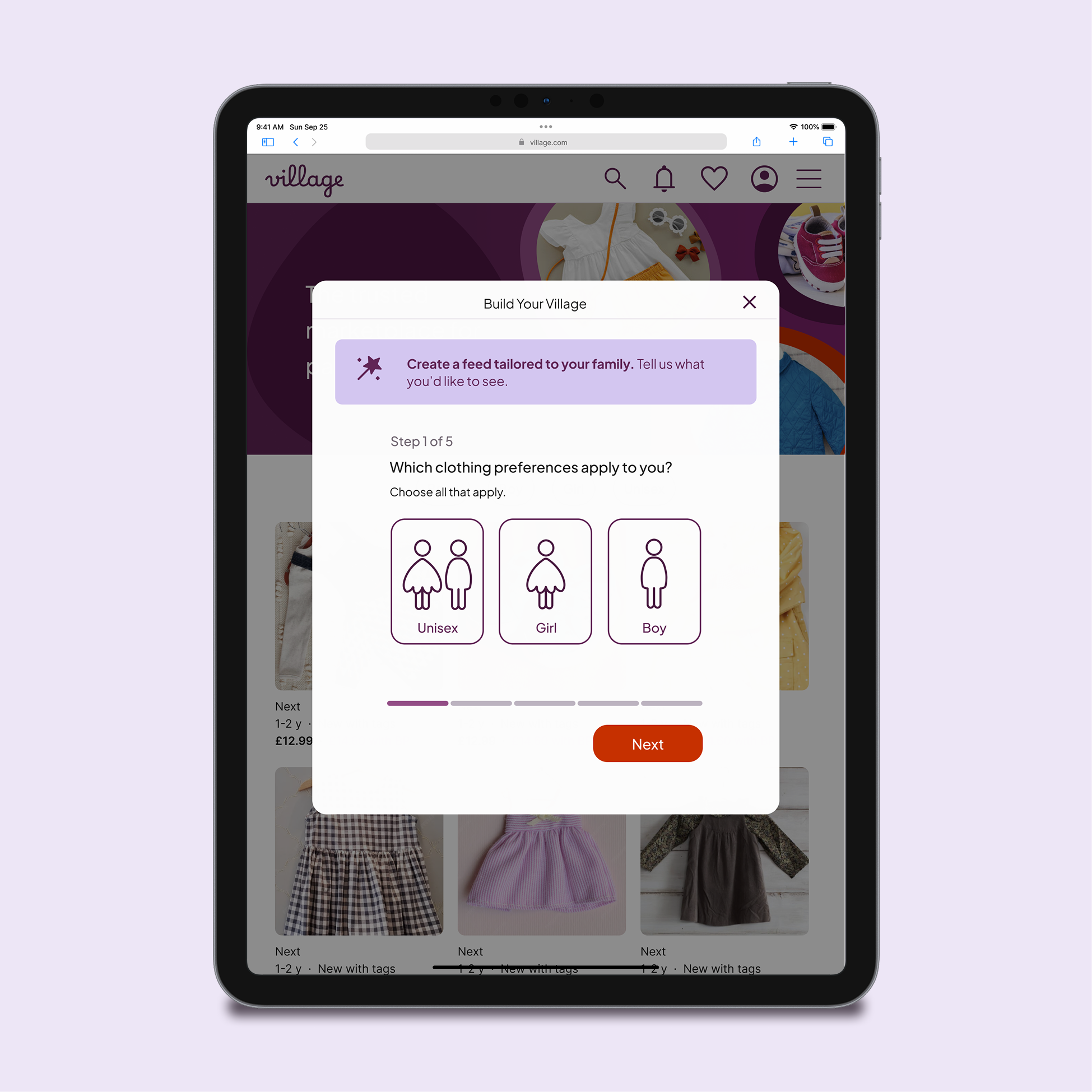
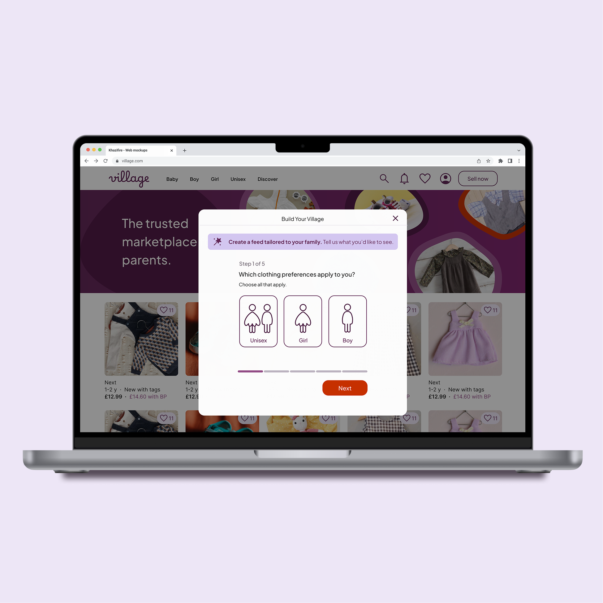
Select clothing preferences (gender)
Moving this flow from app to mobile web gave me the chance to refine the design with fresh eyes. I improved spacing, introduced a clearer top-level structure with branding and step indicators, and created a lighter, more contemporary layout that feels more welcoming to first-time visitors.
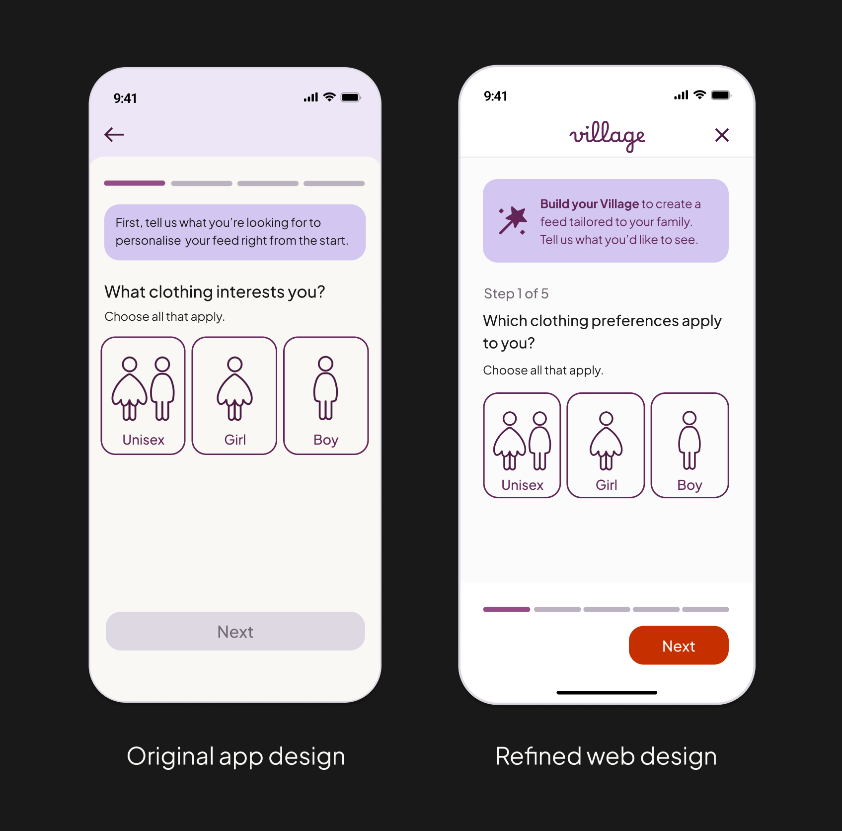

Key Design decisions
1 . Modal-based flow on tablet and desktop
Mobile uses a full-screen step, while tablet and desktop use centred modals sized appropriately for each device.
The dimmed backdrop keeps users oriented while still allowing the webpage to remain visible.
Why: A full-screen takeover on desktop felt like navigating away from browsing — too disruptive for a flow that’s intentionally optional. The modal keeps users rooted in the page and reassures them they’ll return to exactly where they were.
2. Strengthened the introductory callout across devices
When adapting this screen for tablet and desktop, I explored wider banner-style treatments but ultimately kept the introduction as a rounded callout for consistency.
I increased internal padding and spacing so the callout stayed prominent, even when the text collapsed to a single line on wider layouts.
This ensured the message felt like intentional guidance, not an easy-to-miss strip at the top of the modal.
Why: The callout sets the purpose of the step, so it needed to remain the first thing users notice. Strengthening its presence ensured it wasn’t visually lost on larger screens.
3. Navigation removed during the flow
Once the personalisation process begins, primary navigation is hidden to minimise distractions.
Users can still dismiss the modal at any time without losing their browsing context.
Why: Removing navigation reduces accidental exits and supports a calmer, more focused experience — especially for first-time visitors.
4. Kept the layout compact rather than expanding it on desktop
I explored widening the layout and adding more structural elements on desktop, but the extra space made the step feel heavier and more demanding.
Keeping the modal compact helped the step feel light and easy to complete, rather than stretched out or effortful on a larger screen.
I intentionally resisted adding extra labels or decorative structure simply because the canvas was bigger — prioritising clarity and negative space instead.
Why: On larger screens, simple mobile-first flows can easily lose their simplicity and calmness. Keeping the layout compact ensures the step stays quick and light-touch.
5. Wand icon added to introduction for visual continuity
The wand icon appears in the introductory banner to connect this step back to the Build Your Village CTA seen on the homepage.
Reinforces meaning and strengthens recognition across touchpoints.
Why: Repeating the icon helps first-time visitors understand that they’re still within the same personalisation journey, reducing cognitive effort.
Add parents
On the app, this step was removed from onboarding because it asked too much, too soon. On the web, I chose to reintroduce it because users reach it by choice — they’ve intentionally opened the Build Your Village flow. That shift in intent means the screen no longer feels like a barrier, but a helpful, optional way to personalise their feed.
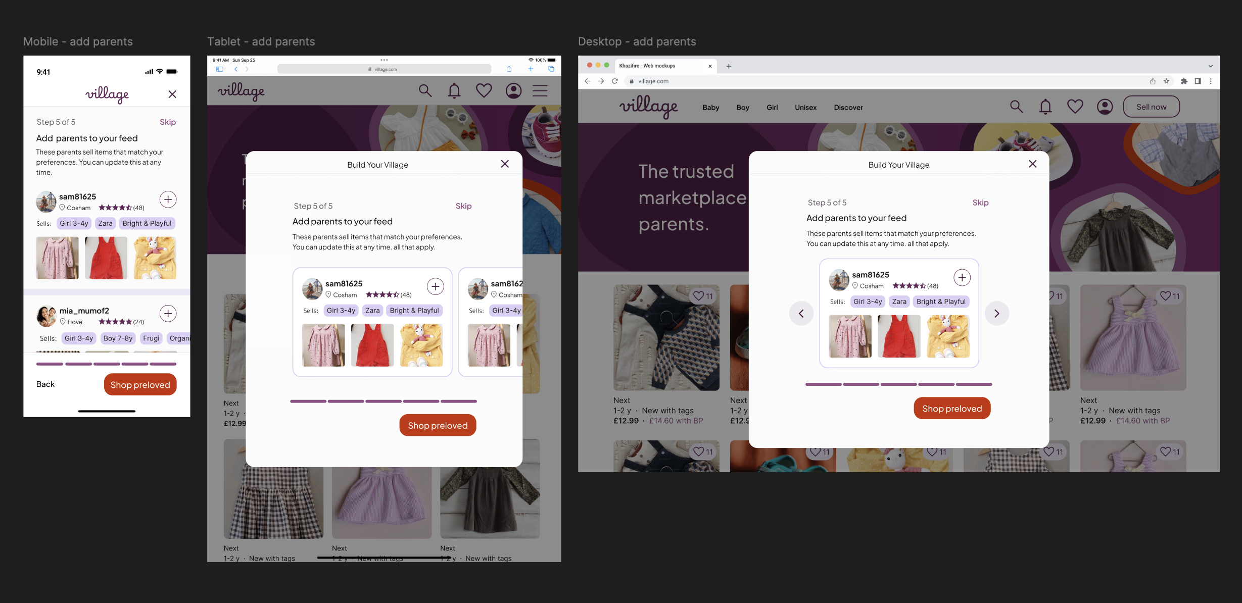
Key design decisions
1 . Adapted the pattern from a vertical list (mobile) to a carousel (tablet & desktop)
On mobile, a scrollable list feels natural and mirrors users’ browsing habits.
On tablet and desktop, scrolling inside a centred modal felt awkward and visually cramped.
Switching to a carousel makes better use of the space and feels more deliberate on larger screens.
Why: The interaction respects how users physically navigate each device: scrolling for mobile, swiping for tablet, clicking through items on desktop.
2. Matched the interaction style to each device
Tablet users see a “peek” of the next card, signalling horizontal swipe.
On desktop, arrows replace swipes – a clearer fit for pointer-based navigation.
Nothing about the card design itself changes; just the way you move through them.
Why: People expect different behaviours from different devices. This makes the flow feel familiar wherever they are.
3. Maintained a consistent flow structure and anchored bottom actions across devices
The placement of the step label, title, description, interactive area, progress bar, and CTA follows the same structure established earlier in the flow.
On tablet and desktop, even though the carousel adds height, the progress bar and CTA remain anchored in the same positions as previous steps.
This creates a predictable rhythm from screen to screen, making the multi-step flow feel cohesive and easy to navigate.
Why: Consistency reduces cognitive load — users always know where to look and what to do next, regardless of the device or step.
User profile
The Profile screen sits just outside the personalisation flow, but it plays a key role in the Build Your Village experience. After seeing suggested parents, users often want to view a profile before deciding to follow. Including it here rounds out the journey and shows how the design scales on full-page layouts across devices.


Key design decisions
1 . Combined ‘Listings’ and ‘About’ on desktop
Desktop moves to a two-column layout: key profile info on the left, main content (listings or reviews) on the right.
The bio is removed to avoid clutter in the narrower left panel.
“Typically sells” becomes an expandable list, showing a few tags upfront with the option to view the rest.
Why: Desktop users scan quickly. Combining sections reduces unnecessary clicks, and adapting the tag list keeps the side panel clean without hiding useful context.
2 . Updated selling tag design
Unpinned selling tags now appear as outline-only, while only pinned tags use the filled purple style.
Why: The filled style gives immediate feedback when a tag is pinned and keeps pinned and unpinned tags visually distinct across devices (this problem surfaced on larger screens, where both tags were visible).
3. Lightened dividers on desktop
Thicker mobile dividers are replaced with finer 1.3px lines on larger screens.
Why: Heavy dividers work on small screens where they span edge-to-edge and read as structure, but on larger layouts they overpower content. Lighter rules keep the profile feeling open and modern.
Design consideration
Competitors like Vinted and eBay use top-banner profile layouts to maximise listing width. I chose a left panel because Village surfaces more profile information, and – based on the project context – I assumed users visit profiles primarily to assess compatibility. In a real product setting, I’d validate this through usage data and test wider listing layouts if profiles proved to drive shopping.
04. High fidelity prototype
Designing mobile first made the most sense for this project: it’s the platform parents are most likely to browse on, and the app already had a validated mobile experience I could build on. This allowed me to design and test the full personalisation flow end-to-end before scaling selected screens for tablet and desktop. For the purpose of this case study, the prototype is focused on mobile, with desktop and tablet shown through targeted mock-ups rather than full flows.
The prototype includes:
Login and account creation screens
The full ‘build your village” flow (all steps)
Home page and navigation patterns (category pills + burger menu)
Listing previews and early browsing interactions

05. Key Takeaways
Responsive design is about behaviour, not breakpoints – Scaling the flow across devices taught me that responsive design isn’t about making things bigger; it’s about adapting to how people actually use each device. I became much more aware of interaction cues: swiping on tablet, clicking on desktop, scrolling on mobile. It was interesting how something that felt perfect on one device could feel completely wrong on another.
Simplicity usually wins - Exploring wider layouts helped confirm that restraint often leads to better design. The simplest version was almost always the clearest and calmest.
This project made me a stronger designer - revisiting my app designs and scaling them for web showed how far I’ve come - I worked faster, used Figma intuitively and trusted my judgement. Seeing my newer designs next to the original app was both humbling and energising!
Thank you for reading.