
Pass It On: Community Gifting
Role: Lead Product Designer (end-to-end)
Platform: iOS App & Responsive Web (mobile, desktop)
Context: Professional brief completed as part of the Google UX Design Professional Certificate.
Project summary
Pass It On is a community-first extension for Village, my preloved children’s clothing marketplace concept. While Village handles commerce, Pass It On explores how the platform can support families through local “free-cycling”. This project was a 3-week feature brief exercise, focusing on social impact, rapid prototyping, and designing within an existing system.
The Problem
Parents accumulate outgrown clothing faster than they can sell it. Low-value essentials often aren't worth the effort of listing and posting, leading to household clutter or landfill waste. Village lacked an easy way for parents to clear space while supporting their local community.
The Goal
Design a low-effort, community-driven feature for giving away clothing locally. The objective was to demonstrate how to scale an existing design system and introduce new user behaviours (freecycling) without diluting the core commerce experience.
Key Considerations
Balancing modes: Integrating a free-to-list feature without cannibalising the main marketplace.
Low-effort exchange: Ensuring the process of giving and collecting feels easy enough that parents choose it over simply throwing items away.
Trust & safety: Creating a "local pickup" UX that feels secure for parents.
System scalability: Evolving the Village UI to signal a "mode shift" while maintaining brand cohesion.
Case Study Roadmap
01. Discovery - refined personas, problem statements, user research, competitor scan and feature definition
02. Information architecture and user flows
03. Design system adaptations
04. High fidelity app design
05. App prototype
06. App usability testing
07. Iterations & refinement
08. Adapting the experience for web
09. Reflection & next steps
01. Discovery
Because Pass It On is a feature extension rather than a new product, I began by revisiting Village’s existing personas. I refreshed and reframed them through the lens of freegiving and the circular economy to understand how each user might engage with a new non-commerce mode.
With the personas reframed, I revisited insights from the earlier Village research, focusing on clutter, convenience, financial pressure, and parents’ willingness to give items away. These patterns provided a clear foundation to define the feature and move efficiently into solution exploration.
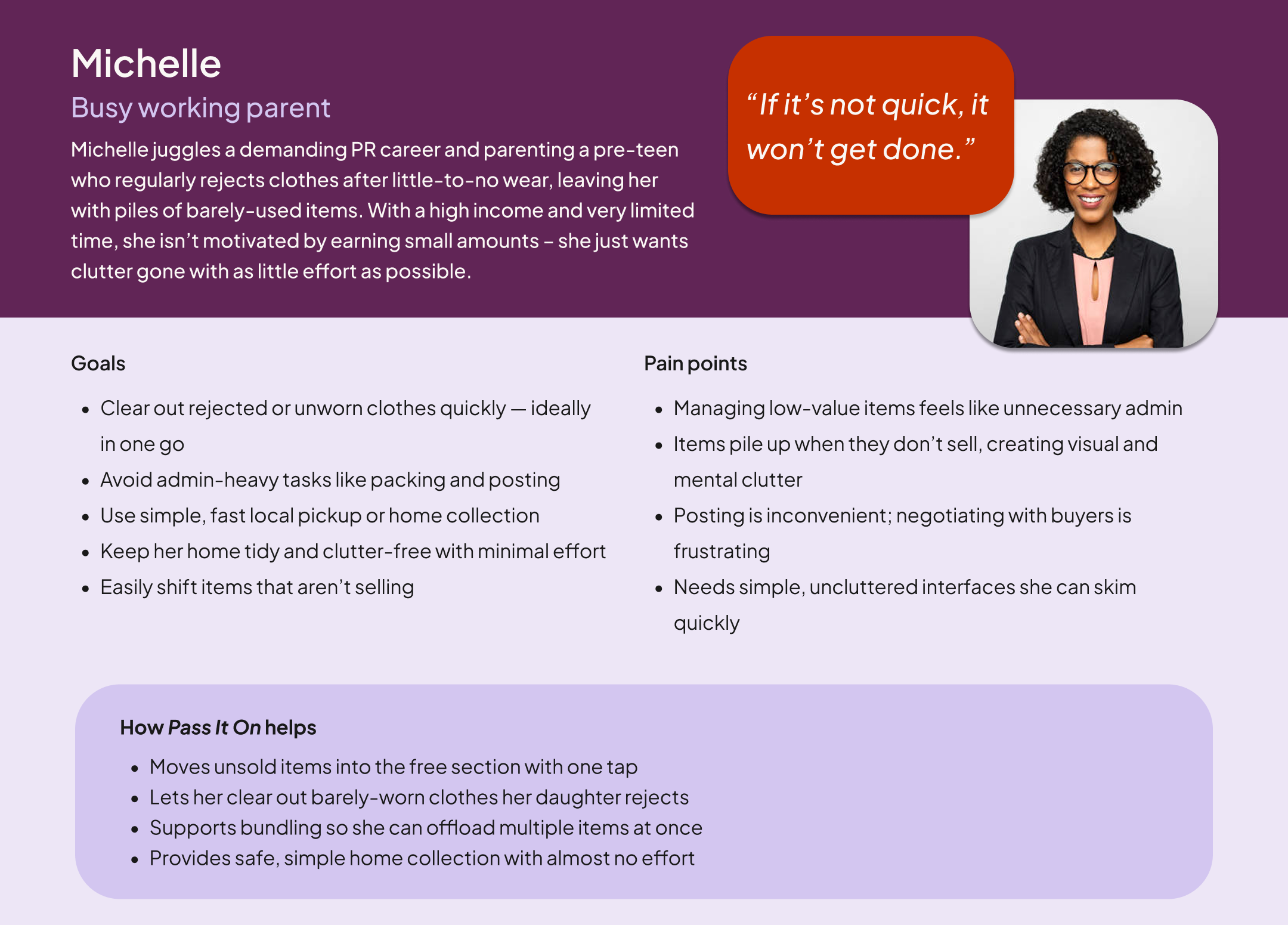
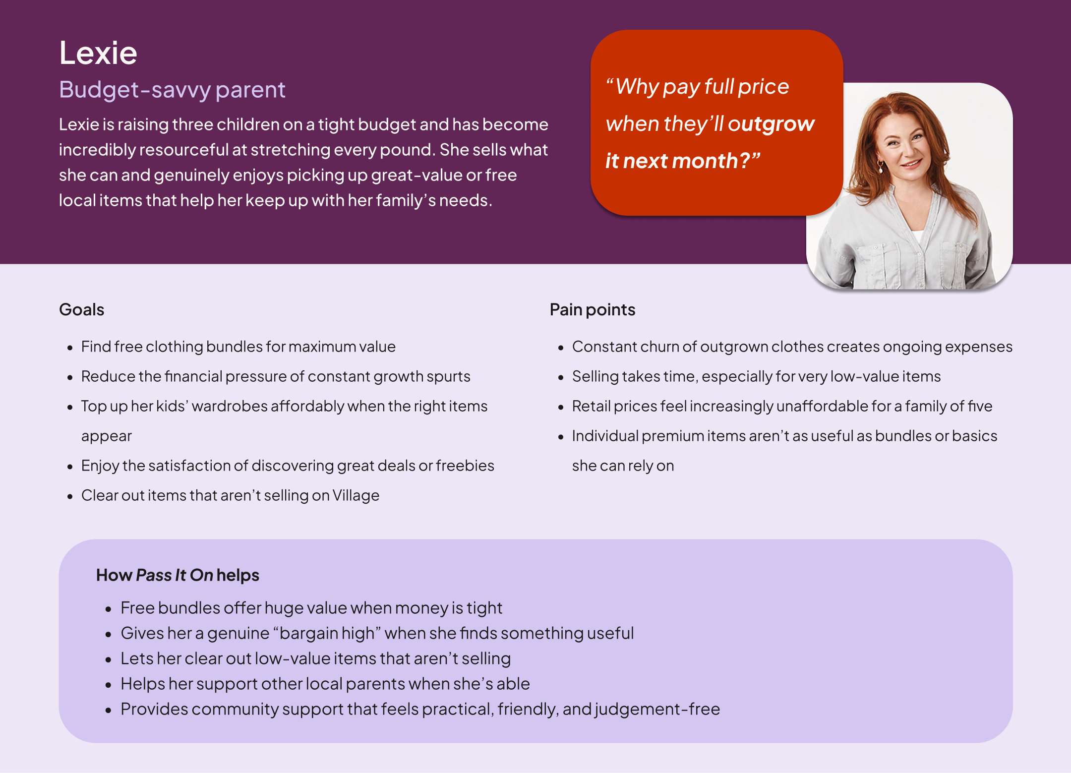
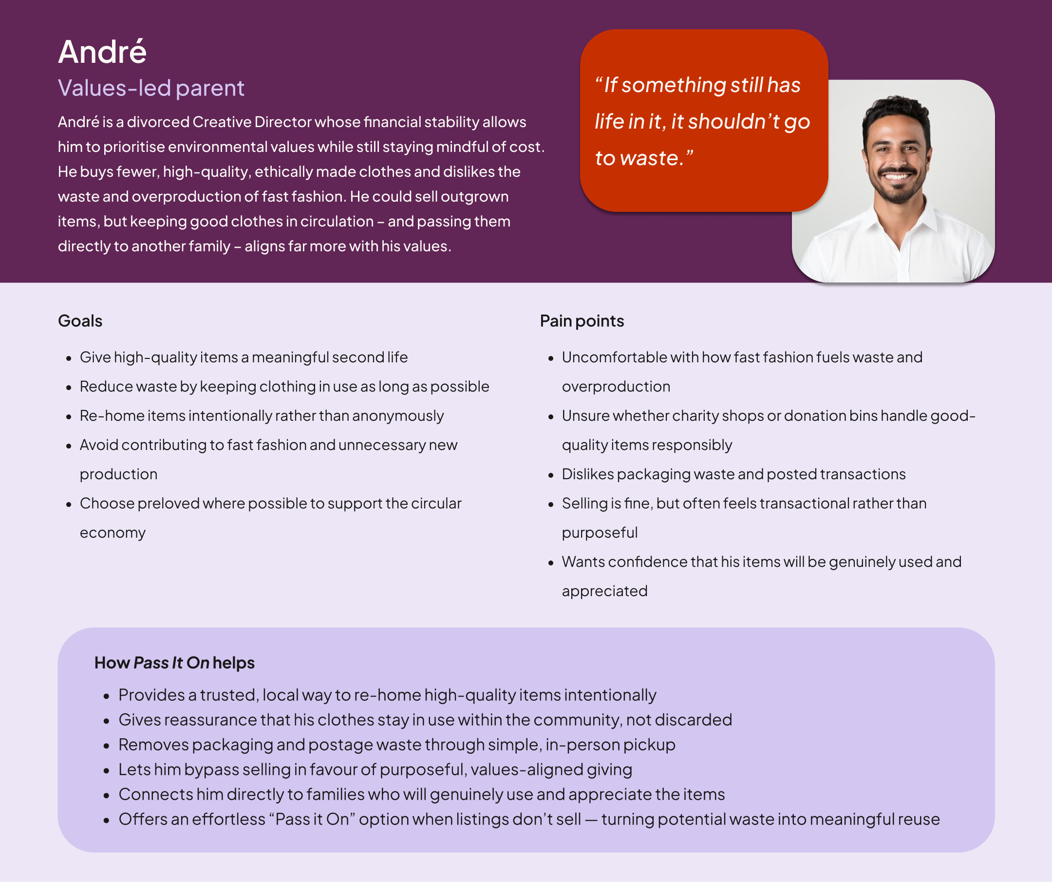
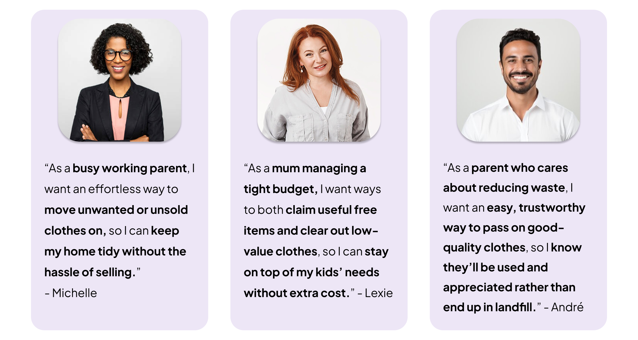
User Personas
I focused on three distinct motivations: financial necessity (Lexie), convenience (Michelle), and environmental values (André).
I intentionally excluded my fourth persona, Aleesha; her focus on aspirational, high-end style didn't align with the community-driven nature of free-giving. Narrowing the focus this way allowed me to design for the people who would actually use the feature daily.
Problem Statements
Foundational insights from early research
Leveraging foundational research rather than starting from scratch, I revisited the interviews and research from the original Village project. This allowed me to work within the realistic constraints of a fast-paced feature sprint, focusing on the specific patterns that pointed toward a need for free-giving.
Key themes:
The "Vinted corner" & clutter: Parents accumulate clothes faster than they can sell them. Many would happily give items away just to clear space with zero effort.
The tipping point: For essentials like baby grows, the market is often too saturated to sell quickly. Parents reach a point where the value of a clear home outweighs the small financial return of a sale.
The postage barrier: The "admin" of packaging and posting is a major friction point. For low-value items, it feels like a disproportionate amount of work compared to the reward.
The case for local pickup: Many parents prefer home collection because it fits into their existing routines (like the school run) and removes the cost of P&P entirely.
Universal financial pressure: Even for families on stable incomes, the cost of constantly replacing essentials is a stressor. There is a high appetite for free, local alternatives.
Declining trust in charity shops: Overflowing bins and rising shop prices have left some parents feeling disconnected from traditional routes, increasing interest in direct, community-based giving.
Competitor scan
I carried out a quick competitor scan across leading community-driven and freecycling apps to understand how other platforms support free-giving and local exchange. Rather than comparing visual design, I focused on behaviours, interaction patterns, and points of friction that Pass It On could meaningfully improve.
1. Olio

What it does well:
Strong sustainability mission and polished UI. I love the Community Tab for local events and the way it shows nearby users on sign-in – it validates that the community is active and therefore safe.
Where there is friction:
The home screen lacks hierarchy, and because it groups all non-food items into one broad category, clothing is buried. With no filters or discovery tools, finding a specific size is impossible. Furthermore, pickup relies entirely on manual messaging, adding coordination friction.
2. Trash Nothing
What it does well:
A large, active community inherited from Freecycle with a simple “offer/request” structure.
Where there is friction:
The dated UI creates a lack of "visual trust," making the service feel unreliable and abandoned. The experience is clunky, requiring users to join and wait for "Group" approvals just to browse local areas. Crucially, the app silos "Offers" and "Requests" into separate feeds; this forces users to manually cross-reference needs with availability – a noisy, manual task that the system should automate through smart recommendations.
3. YoungPlanet
What it does well:
Perfectly niche-focused for families. The "give and get" model is clear, and the tone feels very community-oriented.
Where there is friction:
The single row layout makes browsing slow, and the feed is overloaded with info (like seller bios) too early. Like its competitors, it lacks clothing-specific filters, and the heavy reliance on unstructured DMs creates a high "mental load" for busy parents.
Overall takeaways: the "gap" in the market
Across all platforms, I identified four consistent gaps that informed my design strategy:
Discovery is difficult: None offer clothing-specific categories (like size or age), making finding essentials a game of chance.
Trust is thin: Minimal profiles and unstructured messaging make home pickups feel uncertain.
Pickup is effortful: Coordination relies almost entirely on chat, creating a "mental load" of back-and-forth messages.
Information hierarchy is poor: Feeds are often crowded or show too little data at once, slowing down parents who are usually time-poor.
This created a clear opportunity: Pass It On could offer a trust-driven, friction-free experience tailored specifically for children’s clothing – leveraging the personalisation and established patterns already built into Village.
Feature definition
To move from discovery into design, I defined a set of core features that address the "effort gap" for parents. My aim was to make the ‘collection journey’ feel as seamless as a marketplace, while strategically planning for a low-friction listing experience.
1. Strategic "one-tap" conversion (The quality engine)
The heart of Pass It On is a conceptual one-tap action that converts unsold Village listings into free items. This ensures the feed is populated with high-quality, pre-photographed items, turning a "failed sale" into a "community win."
Persona fit: Ideal for Michelle (zero effort) and Lexie (clearing unsold inventory).
2. High-Value Bundle Support
I identified bundles as a key organic behaviour for parents looking to declutter quickly. I included "Bundle" pills in the UI to help collectors find these bulk listings, making a local trip more "worth it" for the user.
Persona fit: Helps Michelle clear bulk clutter and offers Lexie maximum value in a single trip.
3. Structured "Flexi-Window" Collection
To remove the "admin" of back-and-forth messaging, I designed a structured request flow. Listers provide broad availability (e.g., "Weekday evenings"), and collectors select their matching windows. This guides the conversation and saves time while keeping a "human" safety net via chat.
Persona fit: Crucial for time-poor parents like Michelle.
4. Low-Friction Entry & Context Setting
I used a context-setting banner on the Pass It On feed, visible to first-time users, to introduce the "Free to Collect" mode and prompt for a postcode. This ensures users immediately see relevant, local items without navigating a separate app.
Persona fit: Confirms immediate convenience for all users.
Strategic note: Scope & MVP focus
To deliver a high-quality prototype in a three-week sprint, I focused exclusively on the collector’s journey and kept the scope limited to children’s clothing, rather than expanding into additional product categories.
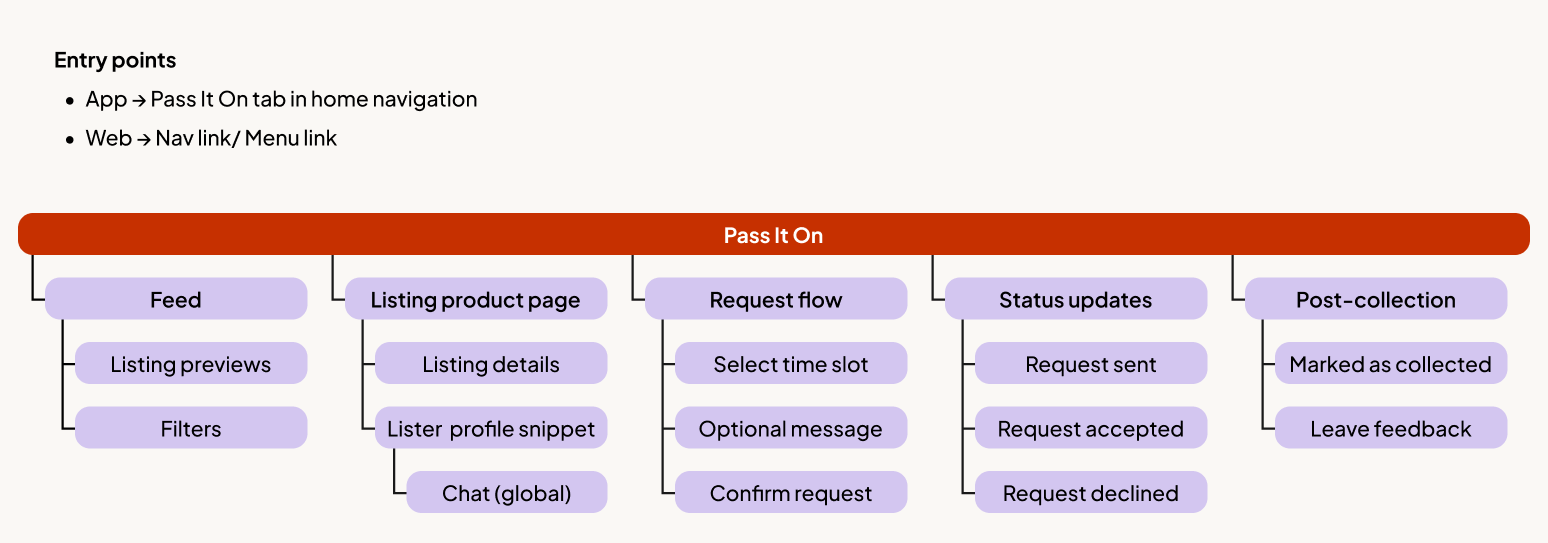
02. User flows and information architecture
To keep this extension lightweight and focused, I mapped the core journey with the highest user value: claiming a free item. This flow defines the essential screens, decisions, and system states required to make local exchange feel reliable and low-effort.
The User flow
This flow follows the happy path from discovery to collection. A key focus was Stage 3 (Collection Request); by integrating the "Flexi-Window" time slot selection directly into the request, I removed the need for the unstructured back-and-forth messaging typical of freecycling apps.

Information Architecture
This feature-level IA maps the core structure of Pass It On, showing how users move from browsing to requesting and completing a collection.
Edge cases and future proofing
While out of scope for this prototype, I identified several high-friction edge cases that would be prioritised in the next iteration to ensure platform reliability:
Availability management: Holiday modes or "pausing" a listing to prevent request fatigue.
The "no-show": Automating the re-listing process if a claimer fails to collect.
Race conditions: Handling simultaneous requests on a single item.
Cancellations: Clear protocols for mid-request or post-acceptance cancellations.
03. Design System Adaptations
Pass It On needed its own character while remaining unmistakably native to Village. My approach was to introduce a subtle "mode shift" through colour, signalling a change in intent without breaking the brand's core visual language.
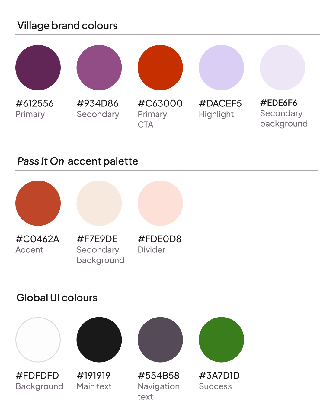
Design rationale
I introduced a "muted clay" accent palette that softens the primary Village CTA red into a more welcoming tone. This colour shift serves a dual purpose:
Contextual awareness: It signals the transition from "marketplace" to "community."
Psychological safety: It moves away from "high-alert" red, ensuring the free-giving experience feels generous and low-pressure.
All Global UI colours and Type scales remained unchanged to minimise the technical overhead for engineering teams while maintaining the "visual trust" established by the main Village app.
The emotional logic:
Village is the "boutique": Curated, premium, and personal.
Pass It On is the "community noticeboard": Practical, generous, and neighbourly. The clay accent carries the immediacy of free-giving while sitting harmoniously alongside Village’s warm, plum-centered palette.
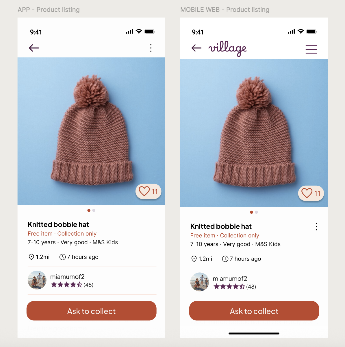
05. High fidelity app designs
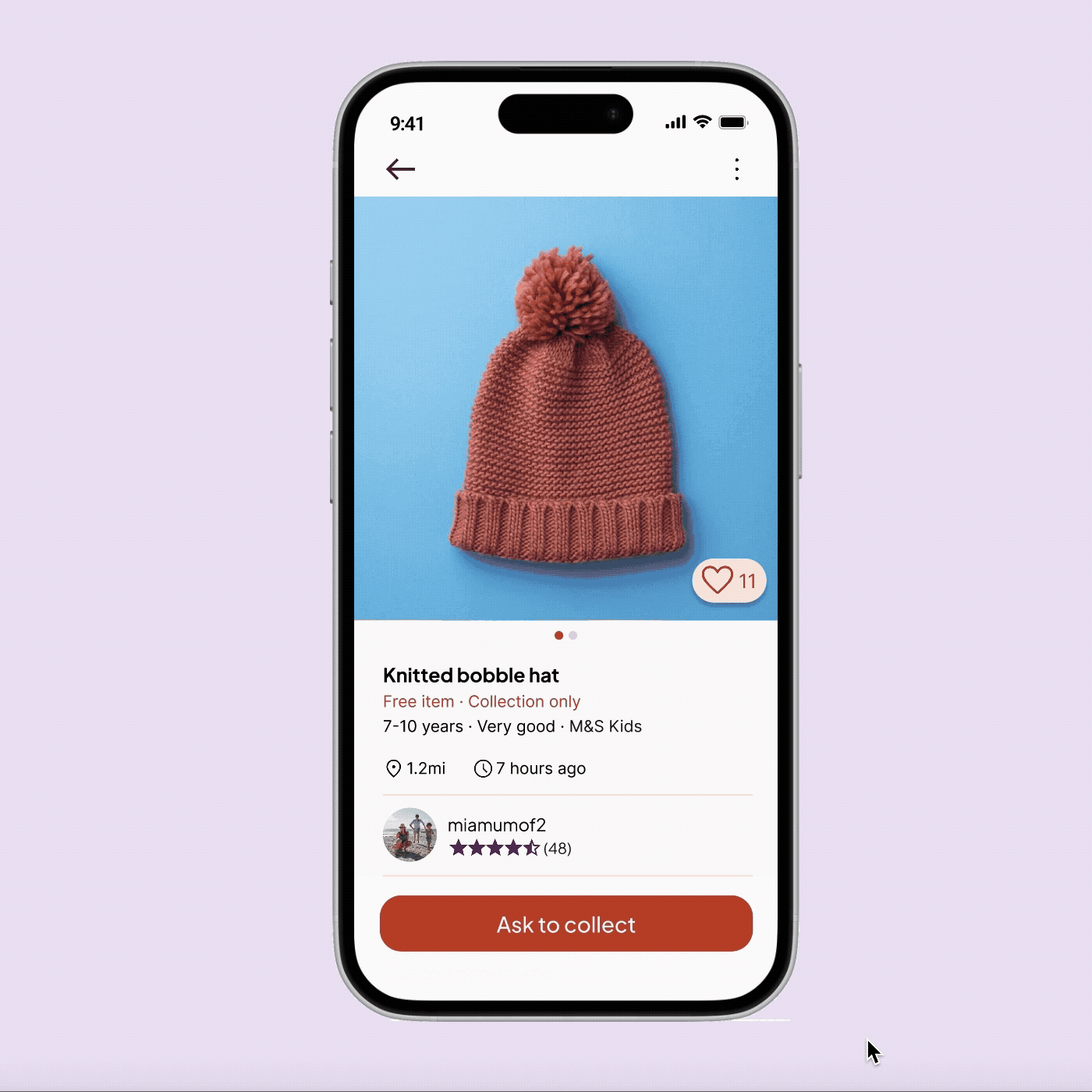
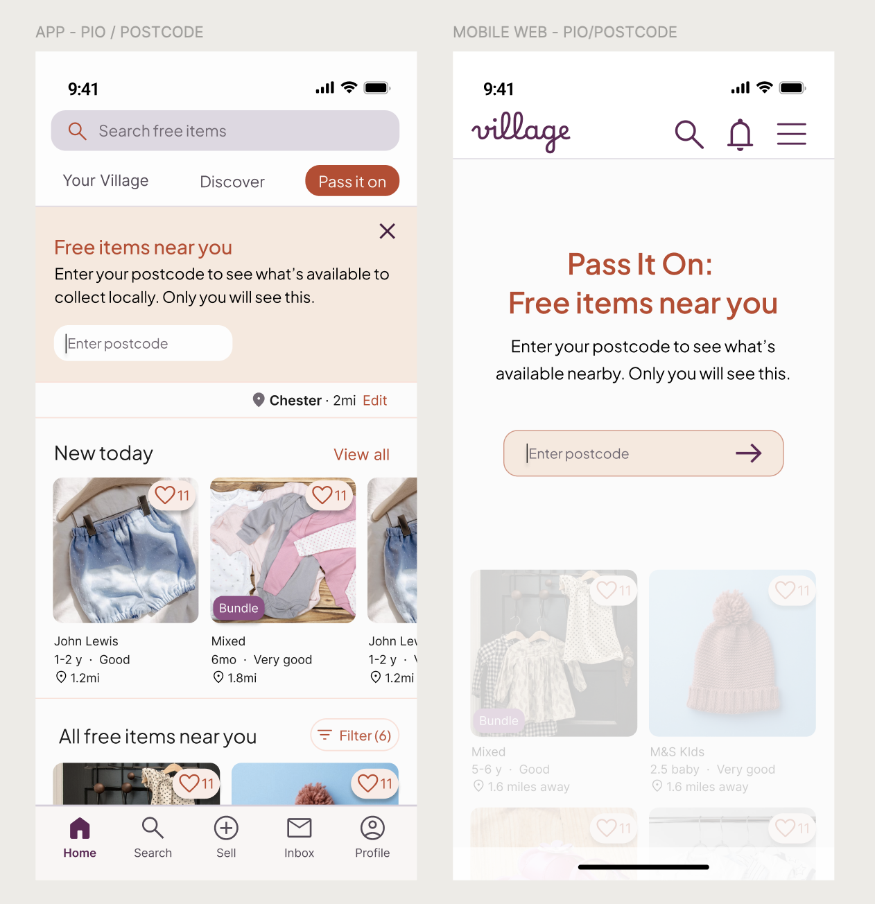
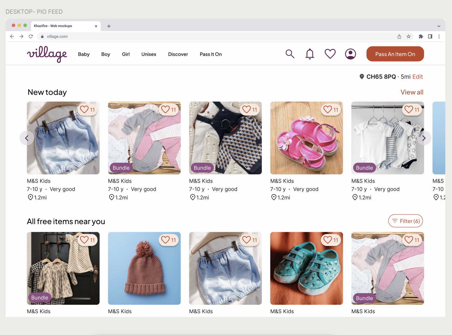
Entry point and context setting
Pass It On is a parallel feed integrated into the Village home screen, designed to minimise disruption while maximising discovery.
Low-friction discovery: A dismissible banner introduces the feature and prompts for a postcode to ensure content relevancy
Privacy-first logic: I separated public ‘town’ location (captured during the Village app onboarding) from private ‘postcode’ filtering. Users can see nearby items without exposing their precise location.
Subtle mode-shifting: A warmer accent palette and search-bar iconography signal the shift from "Marketplace" to "Community" without breaking brand patterns.
Re-prioritised navigation: I moved the "Saved" tab in the previous Village design to the Profile to make Pass It On a primary navigation pillar alongside core feeds.
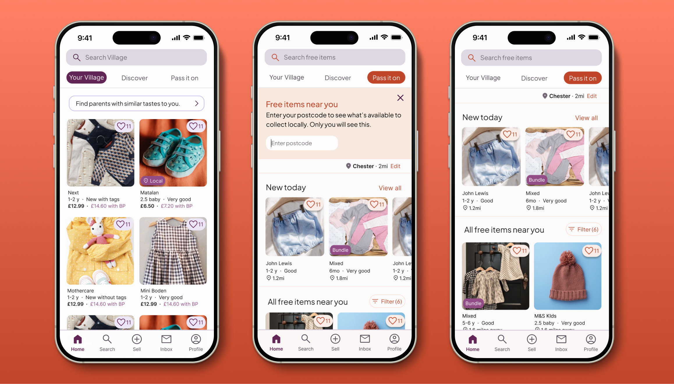
Design notes
Visual continuity: Key listing details (like bundle labels) remain the existing Village Purple to ensure consistency with the wider marketplace.
Interaction signalling: Pass It On–specific actions, such as favouriting free items, use the PIO accent colour to gently signal a different type of interaction.
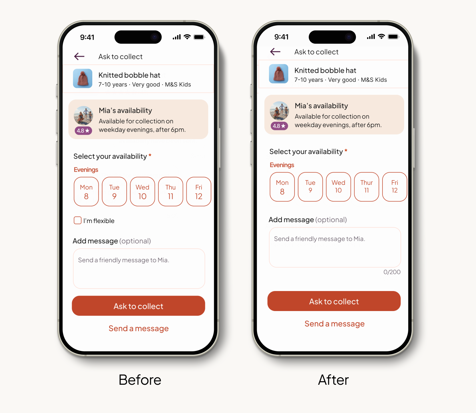
Requesting to collect
The request flow is designed to turn a multi-message negotiation into a "two-tap" confirmation, bridging the gap between interest and action.
The "flexi-window": Collectors select from the lister's availability windows (e.g. weekday evenings) directly within the request. Defining collection windows at the point of request sets clear expectations early on, bypassing the mental load of manual back-and-forth messaging.
Conflict-free scheduling: To prevent contradictory requests and reduce visual overwhelm, availability options are dynamically limited to the lister's stated preferences.
Human-centred flexibility: An optional message field remains to maintain the warm, community tone of the Village brand while allowing for specific safety or location queries.

Design logic
Reduced friction to action: By keeping the "Ask to Collect" CTA sticky, the next step remains accessible while all critical trust signals – photos, distance, and ratings – are prioritised above the fold. This ensures the screen is optimised for conversion.
Intent signalling: The "Send a message" option is deliberately withheld until the Ask to collect screen. This mitigates "time-wasters" by ensuring users are already in a commitment mindset before initiating a conversation. While queries are expected for paid items, free listings benefit from a "take it or leave it" efficiency – protecting listers like Michelle from unnecessary admin unless a user is ready to commit.
Guided journey: By placing the chat bypass below the primary CTA, the design gently prioritises the structured "Flexi-Window" flow. This leads users through a path of maximum efficiency while still providing a human safety net if genuinely required.
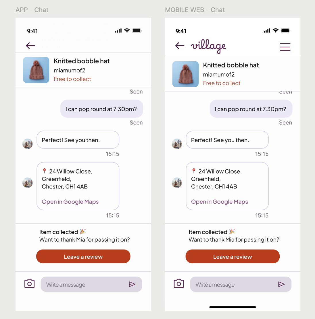
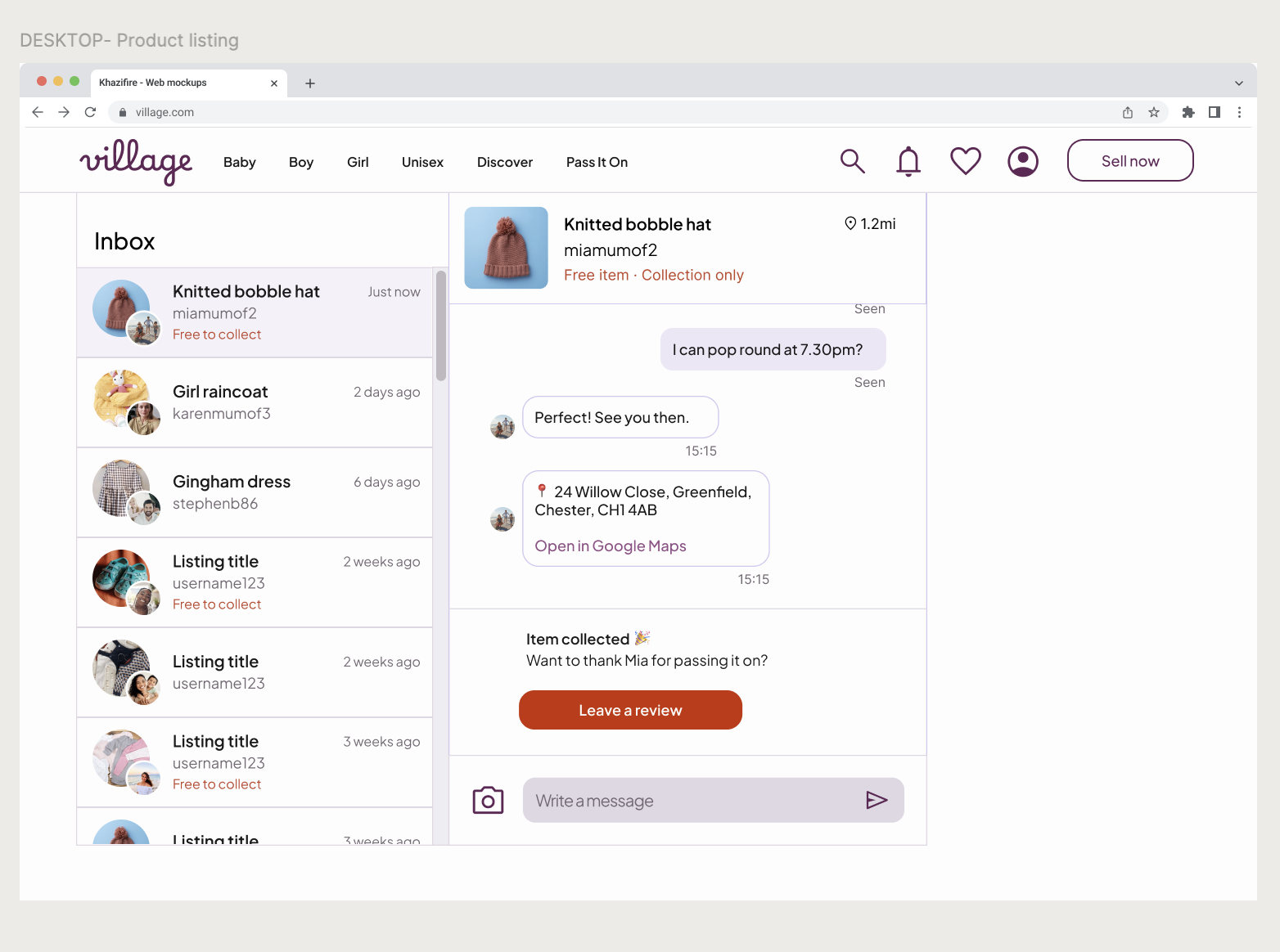
Coordinating collection via chat
Once a request is sent, the journey moves into a lightweight chat interface designed to finalise logistics with minimal effort.
Quick confirmation: Because availability is shared upfront, the chat shifts from open-ended negotiation to simple confirmation. This allows time-poor parents to move from "hello" to "confirmed" in seconds.
Privacy-first address sharing: To protect the lister, the precise collection address is never shared automatically. It is only revealed through an explicit system action once timing is agreed, ensuring listers retain full control over their personal data.
One-tap agreement: I integrated "Smart Replies" (e.g., “That works for me”) to facilitate a one-tap final agreement, removing the need for repetitive typing while maintaining a warm, human tone.
Note: Lister-side interactions were considered conceptually but kept out of scope.
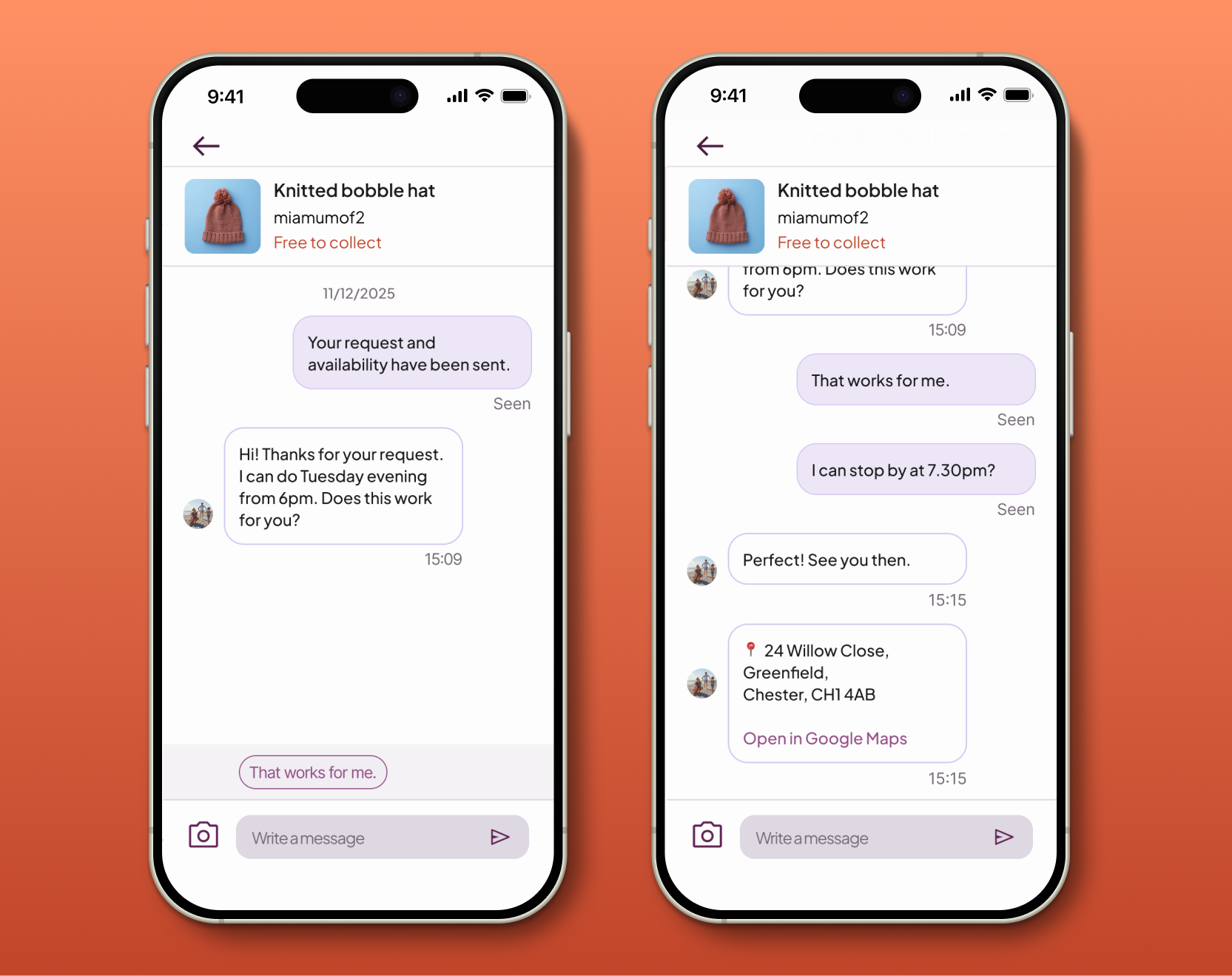
Design note: The UI returns to the primary Village Purple to reinforce that chat is a global, trusted surface within the app rather than a Pass It On–specific flow. A subtle “Free to collect” tag in the PIO accent colour preserves transaction context without disrupting the familiar messaging experience.
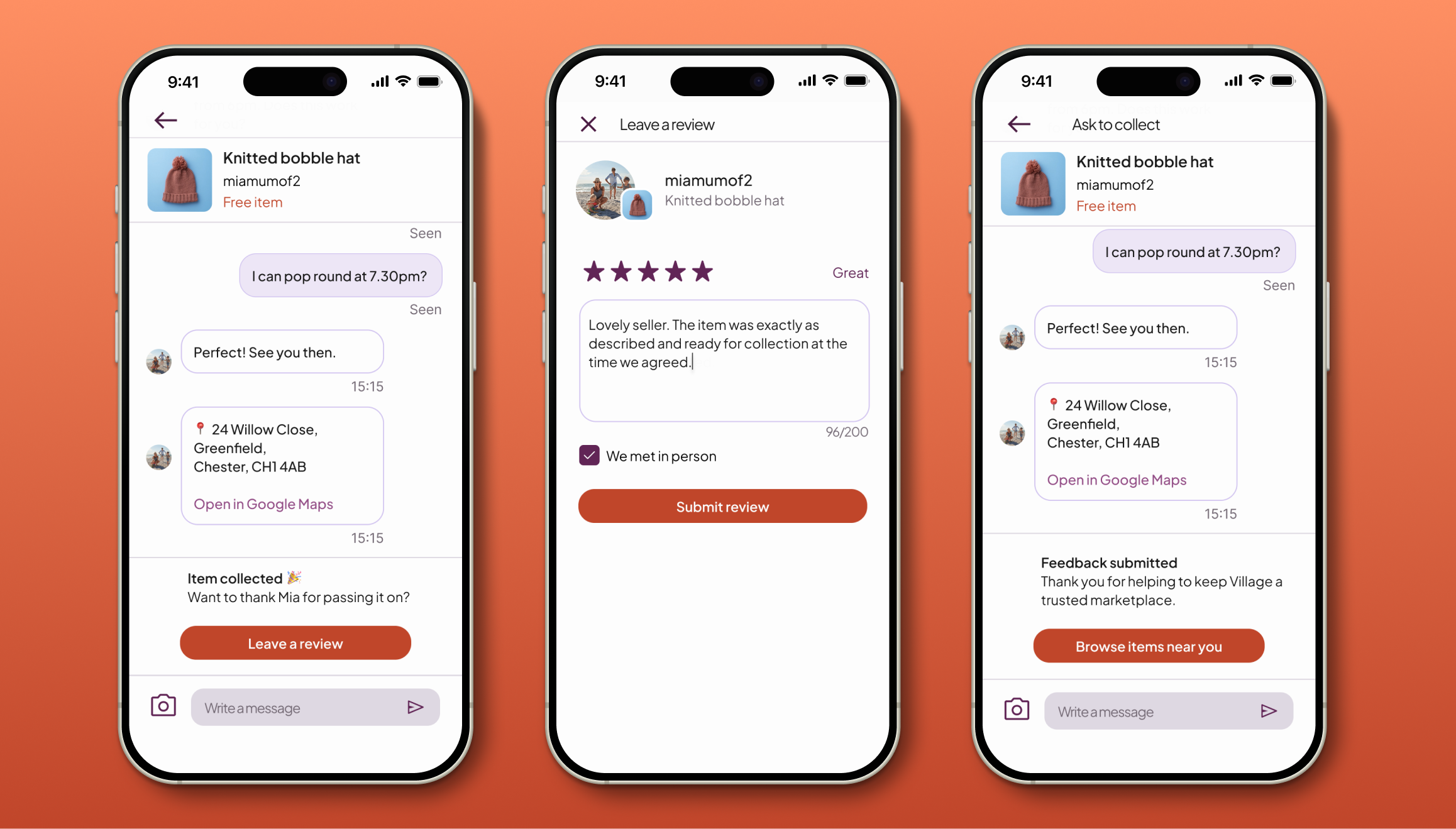
Closing the loop
Once collection is complete, the journey concludes by reinforcing community trust at the exact moment the interaction is most fresh.
Outcome-focused chat: Feedback prompts are surfaced contextually within the existing chat thread. This ensures the "logistics" phase transitions naturally into a "gratitude" phase without the friction of separate notifications or inbox clutter.
Lightweight trust signals: The review flow is deliberately familiar—using star ratings and optional text—but includes a "We met in person" checkbox. This allows the system to distinguish high-value community interactions from standard transactions without increasing cognitive load.
Momentum-based redirection: After feedback is submitted, a final CTA gently guides users back into the local feed. This closes the loop from discovery to contribution while supporting ongoing engagement and discovery.
Design notes
Review prompts are surfaced contextually in chat, avoiding separate notifications or inbox clutter.
Verified offline exchanges: The "in-person" checkbox helps to differentiate Pass It On interactions from standard marketplace data.
Cognitive ease: I prioritised established review patterns over novelty to ensure the process takes seconds, acknowledging the limited time-budget of a busy parent.
Reinforcing the cycle: The final ‘Browse items’ CTA redirects user’s mindset back to discovery, supporting ongoing engagement.
06. App Prototype
I developed a high-fidelity prototype to stress-test the end-to-end journey – from initial discovery to the final review. Moving into an interactive state allowed me to validate the "two-tap" logic and ensure the transition between the Village marketplace and the Pass It On feed felt seamless.
Key Focus Areas:
The context switch: Testing the visual transition from the Purple marketplace to the Muted Clay community feed.
The request friction: Ensuring the availability selection felt like a "helper" rather than a hurdle.
The success state: Validating the clarity of the triggered address card within the chat thread.
Note: Secondary actions were intentionally excluded to maintain focus on the primary collection flow and ensure a clear testing path.
07. App usability testing
I conducted moderated testing to stress-test the end-to-end collection journey. While the core concept was already validated with parents, this round focused on interaction clarity, trust, and the mental model of "free" exchanges.
Research Goals
Concept clarity: Do users understand what Pass It On is before entering?
Product differentiation: Are "free" items clearly distinguished from the paid marketplace?
User agency: Do users feel confident and in control when proposing a collection?
Methodology
Format: Moderated in-person usability testing using a mobile prototype.
Participants: Four non-parents (recruited to isolate UI logic from domain behaviour).
The scenario: Participants were asked to find a specific free item, coordinate a collection time that worked for them, and successfully "close the loop" via the chat and review flow.
Success criteria: 100% completion without assistance and a clear understanding of the "point of agreement."
Study findings
1 . High-Intent Commitment
Observation: Participants felt "locked in" when requesting, treating the flow as a formal social contract.
Insight: Requests were treated as real commitments. This aligns perfectly with the goal of protecting listers (Michelle) from low-intent "time-wasters."
Outcome: Retained the deliberate, multi-step request flow to ensure "Ask to Collect" remains a high-intent action.
2. Mental Model Mismatch
Observation: The name "Pass It On" created initial curiosity, but one user brought "reward" or "gifting" mental models to the experience.
Insight: The ambiguity encouraged exploration, but the gift icon reinforced the wrong model.
Outcome: Removed iconography altogether, relying on naming and contextual copy to preserve curiosity.
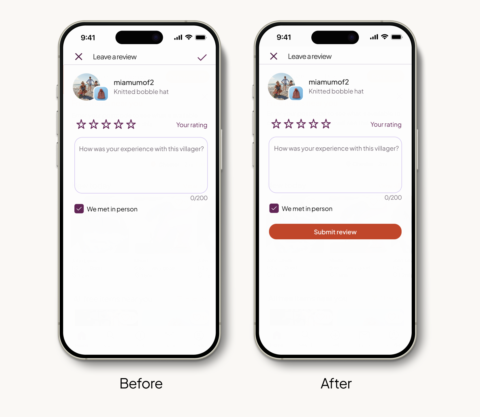
3. Physical Barriers in the Final Step
Observation: During the review stage, 3 of 4 participants experienced a noticeable pause after typing their feedback. Their eyes scanned the screen before their hand awkwardly adjusted to tap the "Tick" icon in the top-right corner.
Insight: The placement of the final "success" action was outside the natural “thumb zone” for one-handed use. This physical stretch created a moment of hesitation that broke the happy path just as the user was finishing the journey.
Outcome: I transitioned the final action from a small top-right icon to a primary, full-width "submit review" button at the base of the content. This ensures the final step is effortless and physically accessible, regardless of how the device is held.
4. Social vs Functional Flexibility
Observation: Rather than using "I’m flexible" as a shortcut to bypass specific dates, participants selected specific windows and ticked the checkbox as a way to signal cooperativeness and "friendliness."
Insight: At this high-commitment moment, users prioritised sounding cooperative over optimising inputs. The flexibility checkbox added cognitive load without meaningfully reducing effort.
Outcome: Removed the "I’m flexible" option to streamline the UI. By relying on the date selection + chat for nuance, the flow remains efficient while allowing the "human" flexibility to happen naturally in the conversation.
Study outcome: The study successfully met all primary success criteria. Participants reported high levels of confidence when requesting items and navigating the collection process. The resulting refinements focused on high-level optimisations: shifting the interface structure to better align with mobile ergonomics and stripping away redundant cognitive load to ensure the fastest path to a successful exchange.
08. Iterations and refinements
Following usability testing, I implemented targeted refinements to reduce unnecessary cognitive load and ergonomic friction.
Refinement 1: Improving accessibility and ease of use
75% of users paused after writing their review, struggling to find the "tick" icon in the top-right. It was tucked away in a corner that was physically hard to reach while holding the phone one-handed.
Design update: I moved the final action to a large "Submit Feedback" button at the bottom of the screen.
Why: This places the action in the “thumb zone”. It removes the physical effort of stretching to the top of the screen, making the final step of the journey feel effortless.
Refinement 2: Simplifying for clearer intent
The "I'm flexible" checkbox was intended as a functional shortcut, but testing showed it was being used as a "social lubricant" that added unnecessary friction.
Design update: Removed the "I’m flexible" checkbox from the request flow.
Why: Because users prioritised sounding cooperative over using UI shortcuts, the checkbox became a redundant step. Removing it streamlines the high-commitment "Ask to Collect" moment, allowing natural flexibility to be expressed through the message field and chat.
09. Adapting the experience for web
To demonstrate how the Pass It On experience translates across the wider ecosystem, I designed a representative selection of key screens for mobile web and desktop.
I focused on the above-the-fold architecture for four critical moments. This targeted approach allowed me to prioritise the most significant shifts in navigation, density, and visual hierarchy, ensuring the experience remains intuitive as the screen real estate expands.
Postcode entry: establishing local context
Unlike the app, which utilises stored onboarding data, web users often arrive as "guests" without a saved location. I introduced a dedicated entry state for web. Requiring a postcode upfront ensures that the "local-only" value proposition is preserved and that the feed remains relevant from the first interaction.
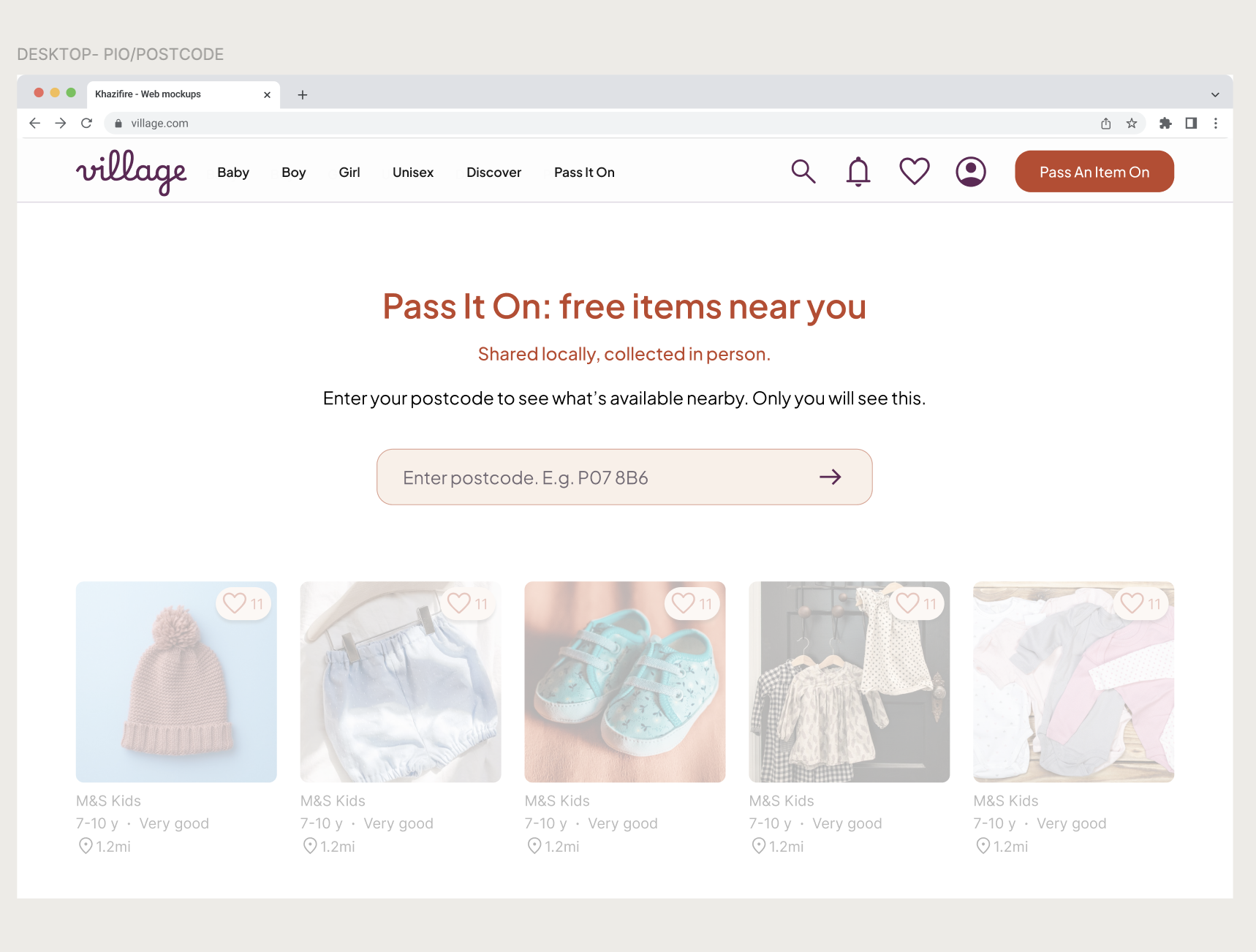
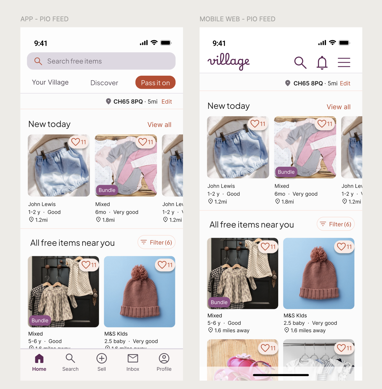
The Feed: Optimising for browsing
The feed scales from a dual-column mobile view to a multi-column desktop grid. Navigation shifts from a bottom bar (optimised for thumb-reach) to a top-level header to align with standard web mental model. On desktop, I utilised the increased screen real estate to show more items simultaneously, catering to a "lean-back" browsing mindset where discovery is the priority.
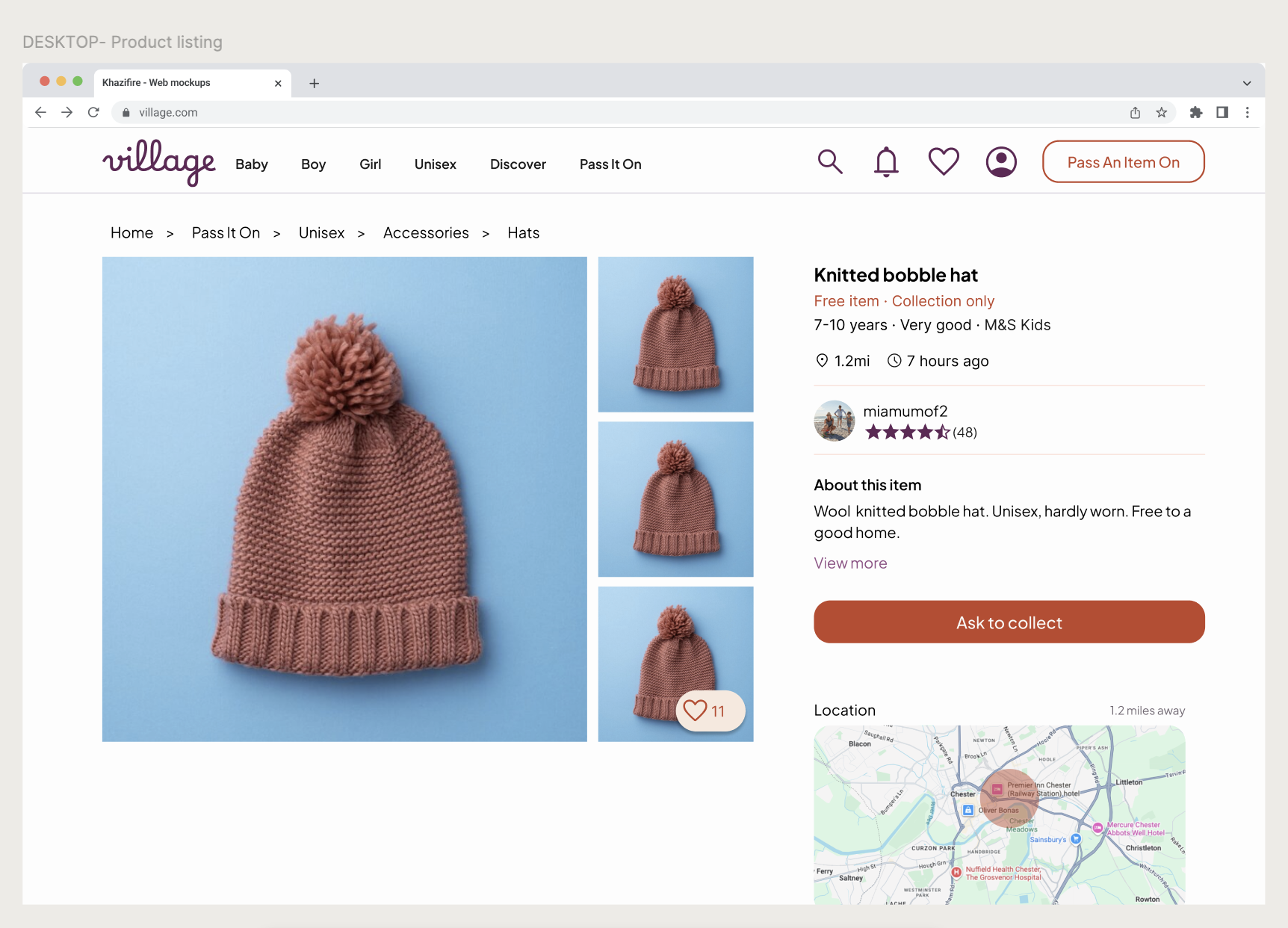
Product listing page
Core content and trust signals stay consistent across devices. On mobile web, the interface is simplified to keep attention on the main action, while desktop prioritises clarity and calm over content density.
The inbox: preserving conversational flow
The chat interface utilises a split-pane view on desktop. To maintain a "human" feel, I constrained the message width even on large screens; overly wide text bubbles are difficult to read and feel impersonal. System actions (like address sharing) remain visually distinct to anchor the logistics of the collection.
10. Next steps
If Pass It On were to launch, my focus would shift from hypothetical flows to observing real-world community behaviour. Beyond standard product metrics, I would collaborate with customer care teams to analyse support conversations, identifying specific moments of uncertainty or friction.
I’d pay particular attention to:
Fulfilment bridge: Tracking the conversion from "Time Agreed" to "Item Collected." This validates that the coordination flow actually leads to successful offline outcomes.
Flow adoption: Monitoring the ratio of users using the "Ask to Collect" flow vs. simply messaging the seller. This identifies if the structured intent-gating is seen as helpful or as a hurdle.
Trust signals: Analysing the "Address Reveal" rate and average seller ratings to ensure the privacy triggers are providing Michelle with enough confidence to share her location.
Friction analysis: Identifying "Drop-off" points within the availability-selection screen to see if parents find the date-picker too restrictive or overwhelming.
I intentionally avoided heavy-handed safety messaging to preserve a "calm and human" interface. These real-world insights would determine if – and where – additional reassurance is required, ensuring it is introduced only when it adds value without cluttering the discovery experience.
Personal reflection: This project challenged me to balance social etiquette with functional logic. By observing how parents prioritised sounding "friendly" over using UI shortcuts, I learned that in community-led products, the interface must act as a facilitator for human connection, not just a tool for transaction.