Village: Scaling for responsive web
Role: Lead Product Designer (conceptual)
Platform: Responsive Web (mobile, tablet, desktop)
Context: Professional brief completed as part of the Google UX Design Professional Certificate.
Project summary
As a continuation of the Village ecosystem, this project explores how to adapt the Village experience for a responsive website. The goal was to take the core "Your Village" personalisation features and translate them for web users, who often have a different mindset and set of expectations than those using a native app.
The bridge: applying app insights to web
My previous work on the Village App provided insight into how parents want to build their community: users were happy to set basic preferences (age, size, brands) upfront, but they preferred to "follow" other parents gradually after browsing. This clarified how Your Village – the user’s personalised feed – should be shaped: partly through quick preference choices and partly through optional, ongoing community-building actions over time.
This project focuses on bringing those behaviours to the web in a way that feels intuitive for exploratory users.
Strategy: designing for user intent
In an app, personalisation usually happens during onboarding. This works because a person who has downloaded an app has already shown a high level of commitment.
On the web, visitors are often in a "discovery" phase. They might be arriving from a search engine or social media to look at a specific item. Forcing these users through a setup process before they can browse creates a barrier that leads to high drop-off rates.
The app logic: Upfront personalisation to build a tailored experience immediately.
The web logic: A "browse-first" approach where personalisation is offered progressively as the user shows interest.
The challenge: balancing value vs. conversion
The task was to introduce personalisation without interrupting the primary goal of exploring and buying items.
Reducing onboarding friction: I shifted from a mandatory setup to an optional, progressive onboarding model.
Context-aware features: I moved from a "one-time setup" to surfacing small, relevant actions naturally within the shopping journey.
Project goals
Platform-specific navigation: Reorganise the Information Architecture to suit different screen sizes and input methods (click vs. tap).
Protect the path to purchase: Ensure that personalisation adds value without cluttering the interface or slowing down the conversion flow.
Scalable design: Build a flexible layout that remains consistent and functional across device
The process
01. Information architecture: Mapping the transition from a native app to web.
02. Selective Wireframing: Testing layout reflow and navigation patterns across devices.
03. Responsive Design: High-fidelity mockups, designed mobile-first, then scaling to tablet and desktop.
04. High-Fidelity Prototype: A focused mobile journey to validate the "Build Your Village" flow.
05. Reflections
01. Information architecture
To adapt Village for the web, I restructured the Information Architecture to move away from a mobile-specific tab bar toward a standard web header. This allowed for a more "browse-first" experience while keeping core tools accessible. The persistent "Sell," "Inbox," and "Profile" tabs were moved into the global header to align with web mental models and desktop real estate.
Strategic differentiation: app-only features
I made the intentional decision to exclude Saved Folders (collaborative wishlists) from the web version, keeping this feature exclusive to the native app.
Why: While initial user feedback on the "Saved Folders" concept was highly positive –specifically the ability to organise by child or occasion, I wanted to create a clear incentive for users to transition from the web to the app.
The result: The web version is optimised for quick, guest-friendly browsing, while the app serves as a high-engagement hub where parents can use collaborative tools to organise family needs together.

From mandatory to optional
Mapping out the site made it clear that a full-screen onboarding flow doesn’t naturally belong on the web as it interrupts the shopping experience. I still needed a way for users to personalise their feed, but it had to feel like a choice, not an obstacle.
I decided to move away from a mandatory setup and toward a web-based overlay. This allowed me to:
Keep the journey clear: Users stay on the page they intended to visit.
Encourage engagement: The "Build Your Village" prompt is visible and valuable, but easily dismissible.
Support conversion: Personalisation becomes a "perk" of browsing rather than a barrier to seeing products.
This became the focus of my wireframing phase.
02. Selective wireframing
Paper wireframes
I began with quick sketches to explore how the app’s features might translate to a larger canvas. However, because this project builds on the existing Village Design System, I moved into digital wireframes early. This allowed me to test the responsive reflow – how the components actually behave when scaling, more accurately.
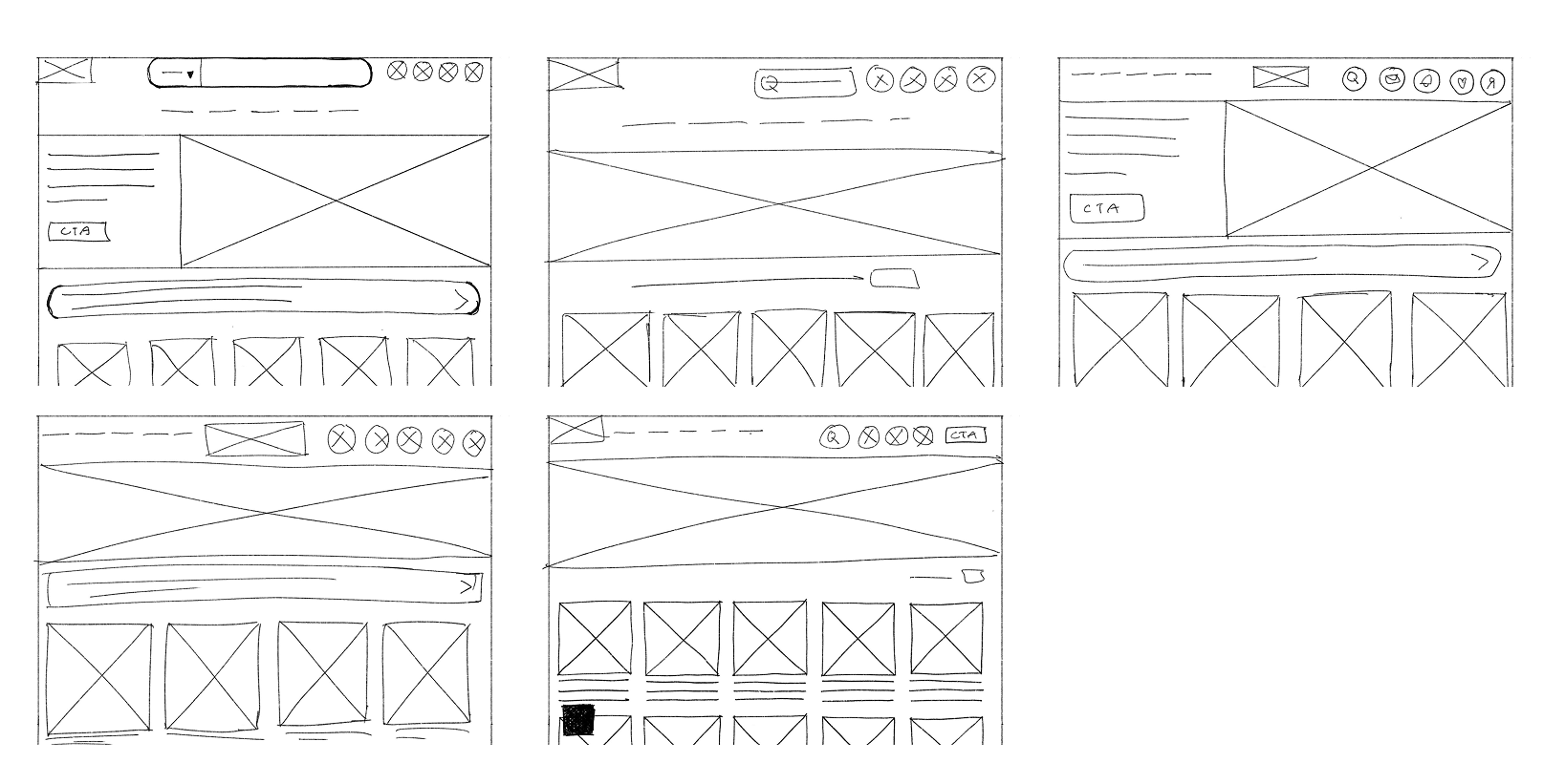
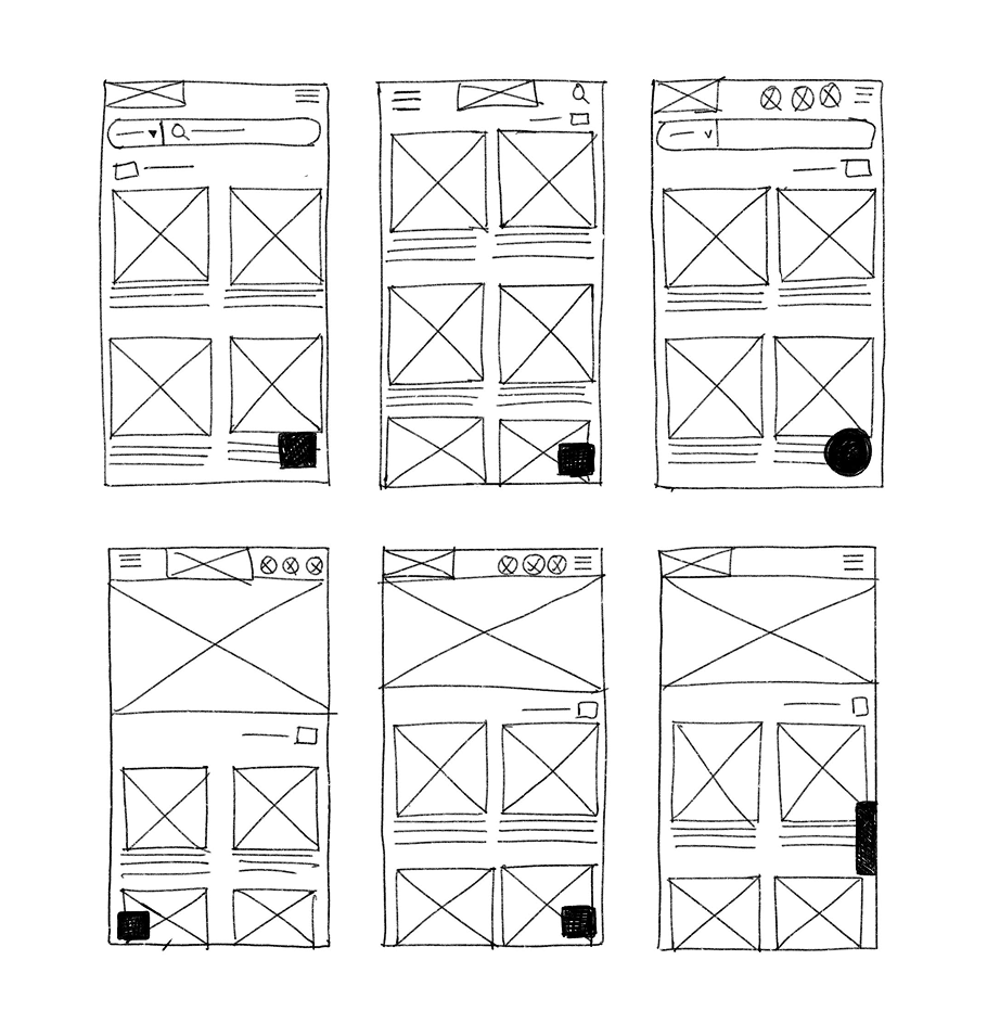
Digital wireframes: cross-device comparison
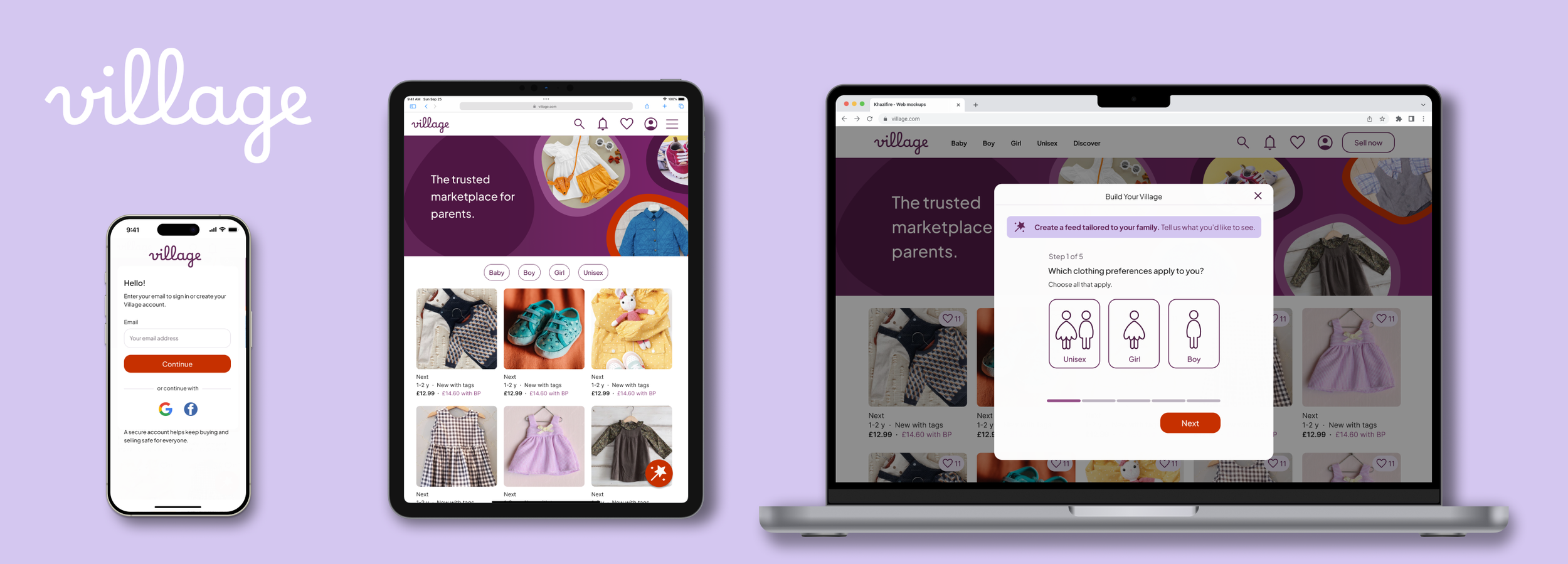
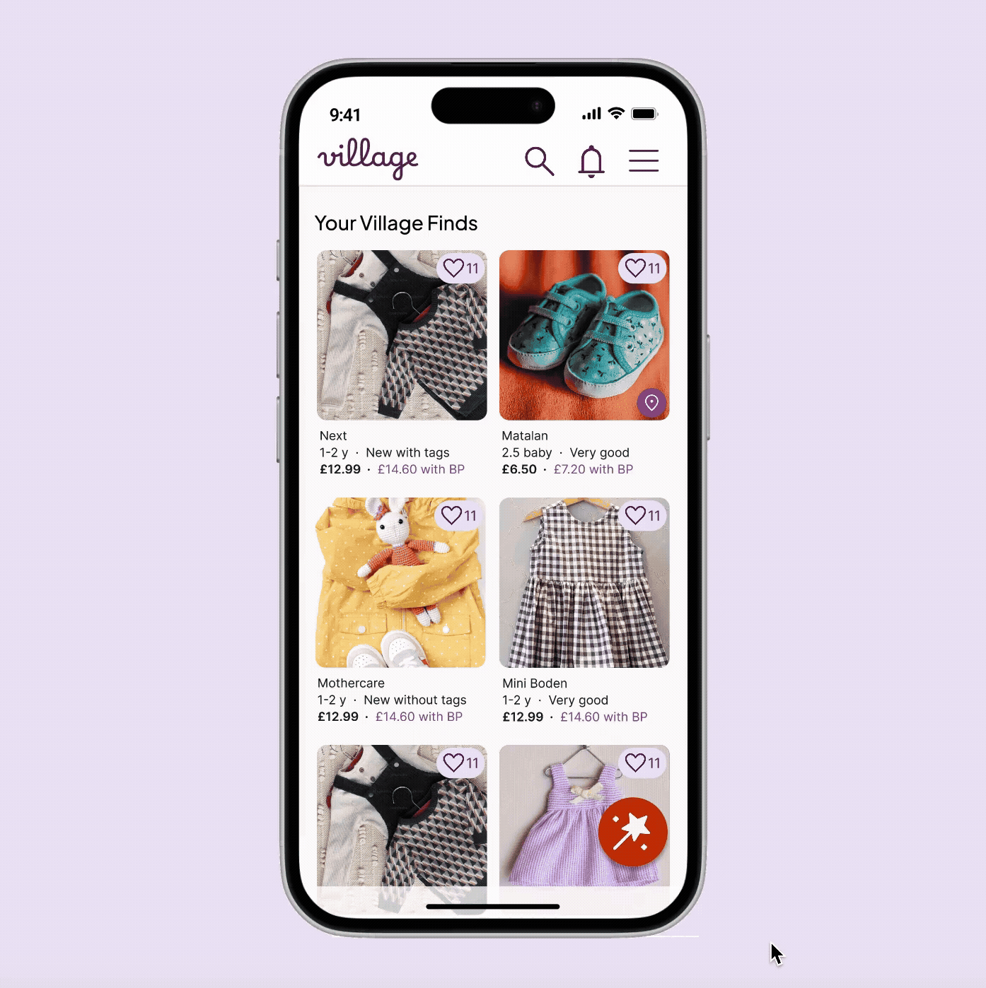
I focused my digital wireframing on the Homepage and the "Build Your Village" (BYV) entry points. This side-by-side comparison shows how the layout shifts to maintain visual hierarchy across desktop, tablet, and mobile, while also accounting for different user states.

Key responsive decisions:
Dynamic hero state: The brand-focused hero image is exclusive to the logged-out state; once a user is recognised, it is removed to prioritise bringing listings above the fold.
Adaptive grid: I moved from a 2-column mobile grid to a 5-column desktop layout to maximise screen real estate without overwhelming the user.
Navigation: To adapt the native app’s bottom-tab navigation for web, I moved utility actions (Inbox, Saved, Profile) into a global header for desktop, while consolidating them into a “hamburger” menu for mobile web to preserve screen space.
03. Scaling the experience across devices
To demonstrate how the Village personalisation journey scales, I focused on four critical early touchpoints: the Homepage, Clothing Preferences, Adding Parents, and the User Profile. These screens highlight a responsive UI that keeps personalisation optional, ensuring it complements the browsing experience rather than interrupting it.
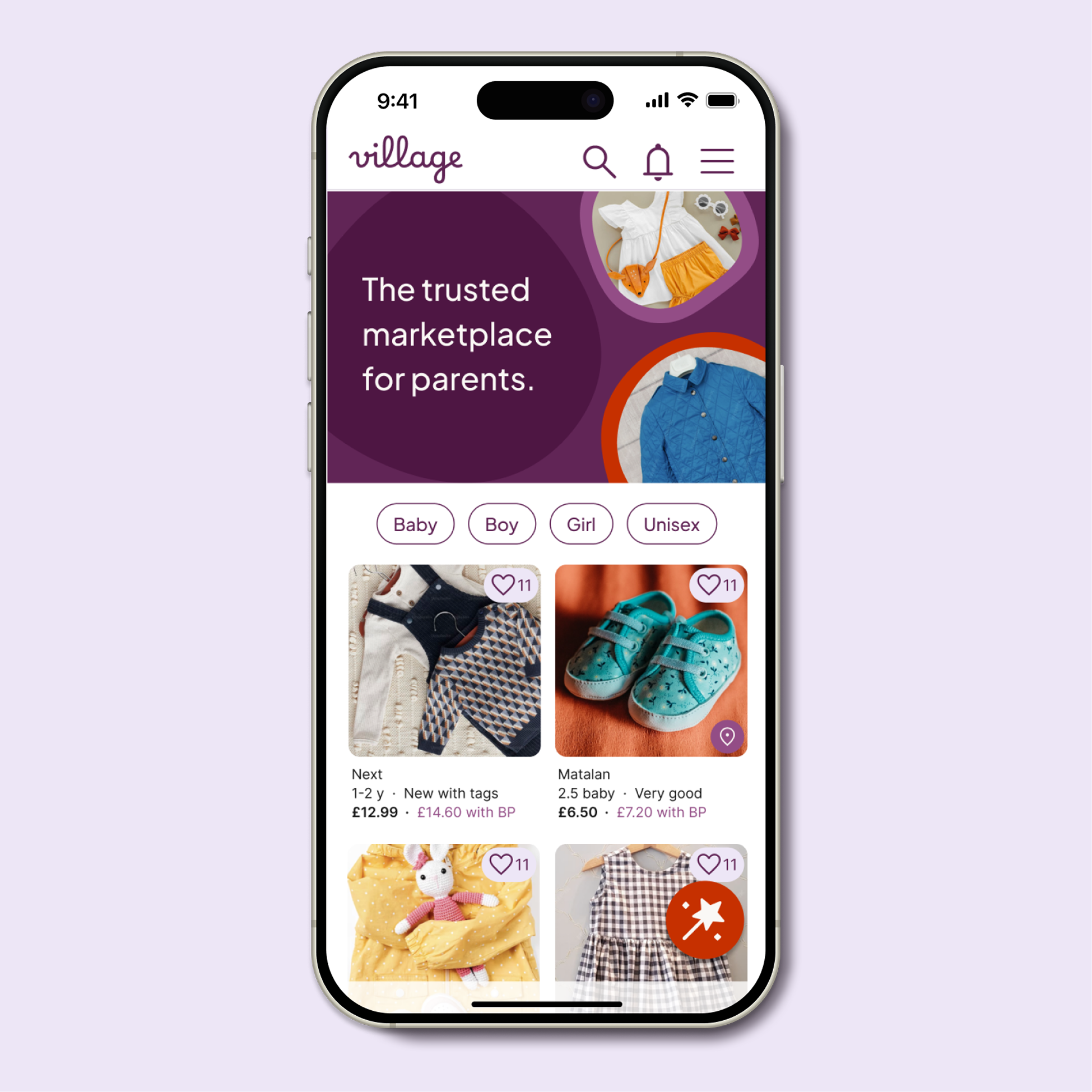
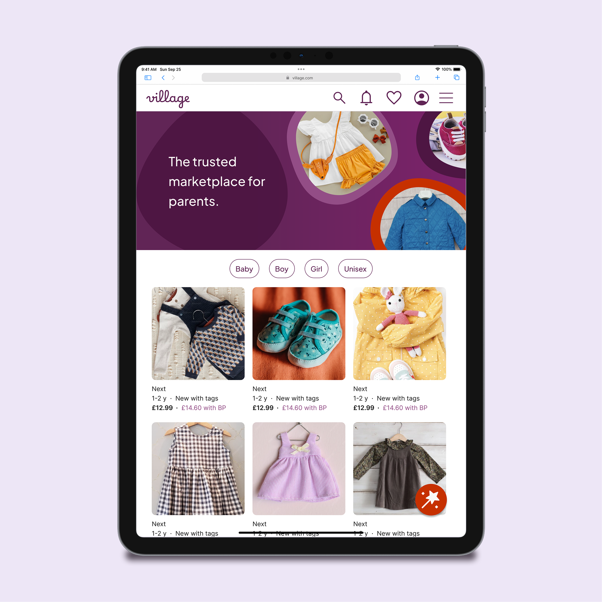
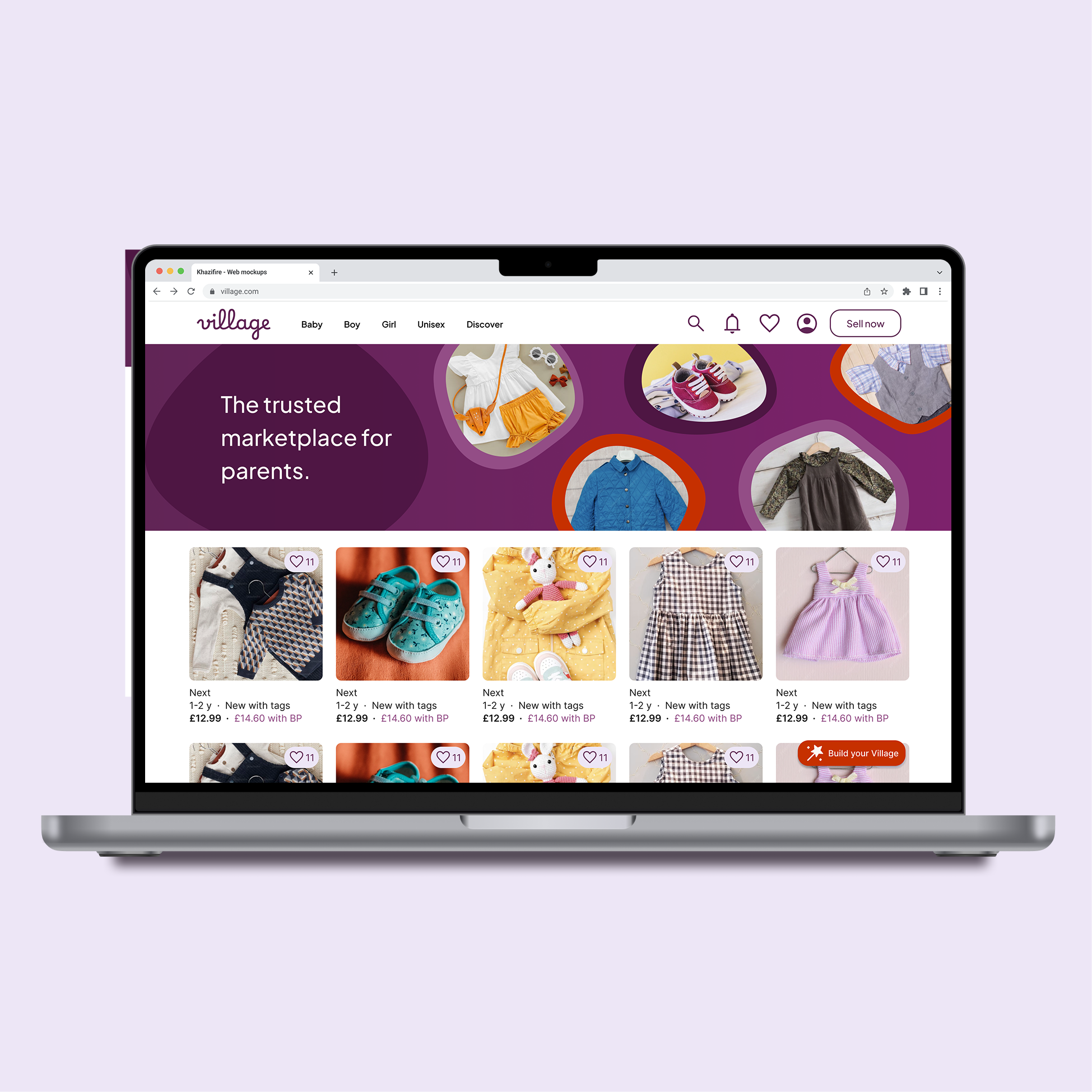
Homepage (logged out)

Key design decisions
Intent-driven account entry: Rather than forced sign-up, I utilised "account-only" triggers (Favourites, Notifications, and the BYV CTA). This encourages registration at moments of genuine intent during the browsing journey.
Adaptive "Build Your Village" CTA:
Mobile/Tablet: A large, right-aligned circular button optimised for thumb reach.
Desktop: Transitions to a labelled pill for faster scanning on a larger canvas.
Why: Sticky placement ensures the personalisation tool is always available but never blocks the "path to purchase".
Defining a single primary action: The "Sell Now" CTA is moved to the hamburger menu on mobile and converted to a ghost button on desktop. This prevents it from competing with the red, rectangular "Build Your Village" CTA, ensuring a clear primary action on the page whilst reducing cognitive load for new users, whose primary intent is discovery rather than selling.
Responsive navigation: Horizontal category pills guide mobile browsing, while desktop categories are integrated into the global header to align with standard web mental models.
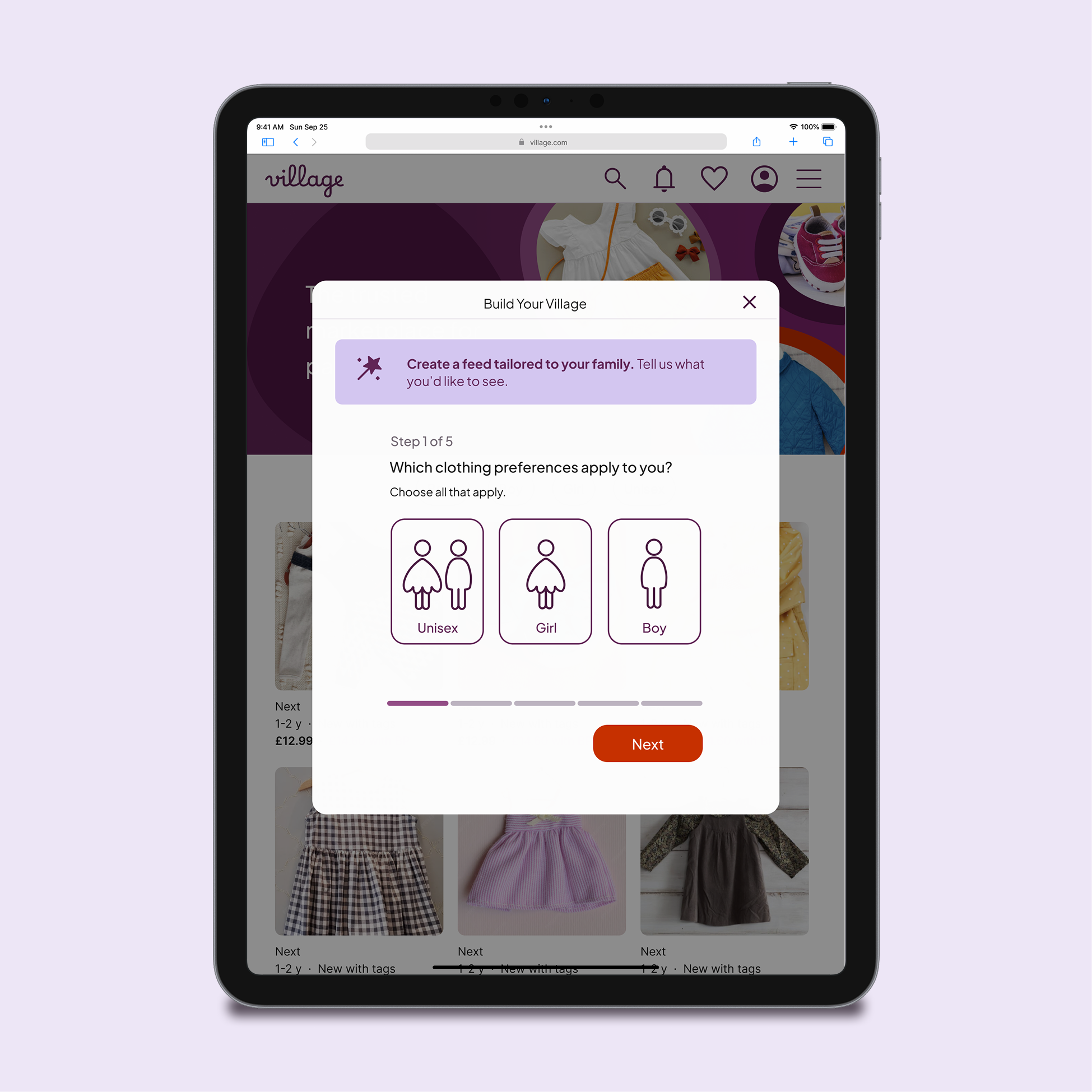
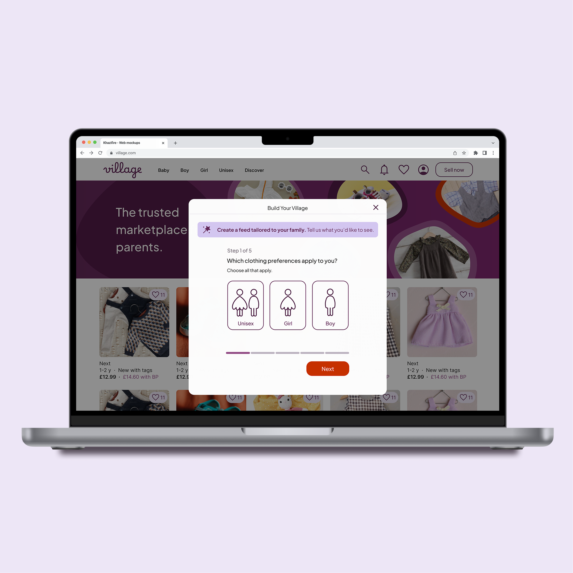
Select clothing preferences (gender)
Moving this journey from a native app to the web allowed me to refine the design. I focused on improving information hierarchy and introducing a lighter, modal-based structure.
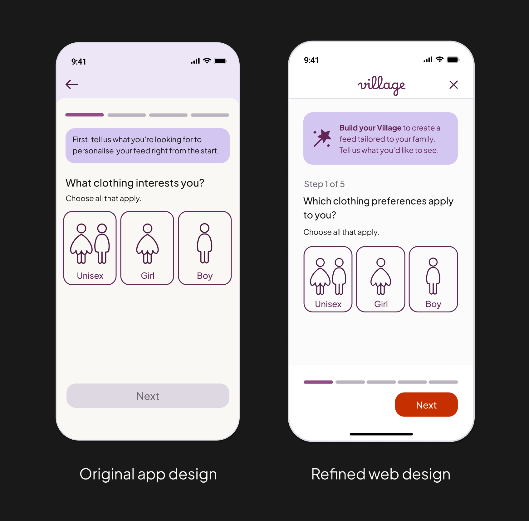

Key design decisions:
Context-preserving modals: While mobile utilises a full-screen step, I opted for centred modals on tablet and desktop.
Why: A full-screen takeover on desktop felt too disruptive. The modal maintains the user's browsing context behind a dimmed backdrop, reassuring them that they can return to their search instantly.
Intentional "negative space" on desktop: I resisted the urge to expand the layout for larger screens.
Why: Keeping the modal compact prevents the task from appearing "heavy" or effortful. It maintains the simple, calm essence of the mobile-first flow without unnecessary decorative structure.
Visual continuity: I introduced a "wand" icon within the introductory callout to create a direct visual link back to the Build Your Village CTA on the homepage.
Why: This strengthens feature recognition and reduces cognitive effort for new users.
Distraction-free focus: On mobile, once the personalisation flow is active, global navigation is hidden.
Why: This creates a focused, "linear" experience while still allowing the user to dismiss the modal at any time to resume browsing.
Add parents
In the native app, this step was removed from onboarding as it was deemed too high-friction for new users. On the web, I chose to reintroduce it because users enter this flow by choice. This shift in user intent transforms the screen from a potential barrier into a helpful, optional tool for community discovery.
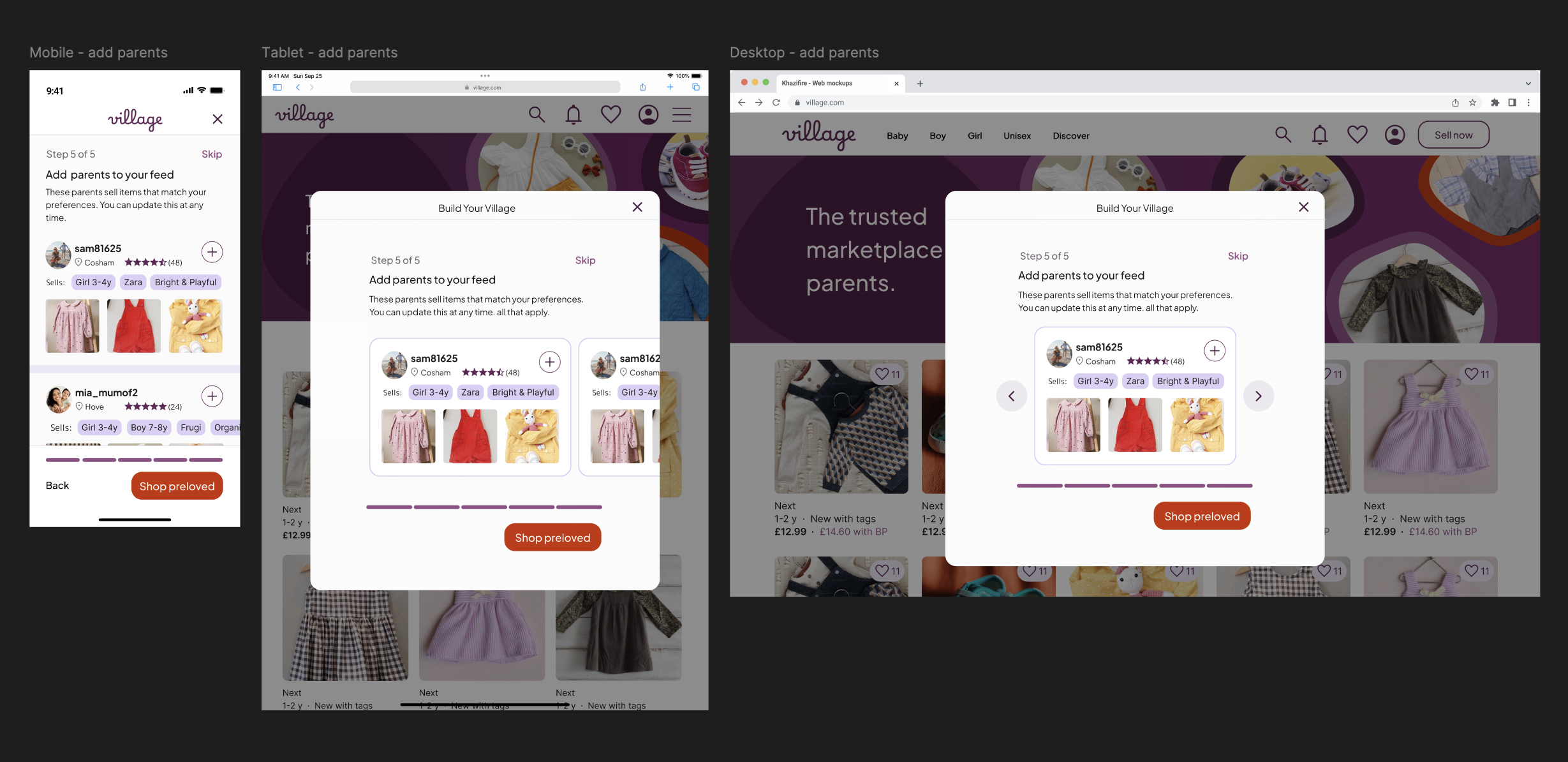
Key Design Decisions:
Device-specific interaction patterns: To ensure the experience feels natural on every device, I adapted the layout from a vertical list (Mobile) to a horizontal carousel (Tablet and Desktop).
Why: A long scrollable list inside a centred modal felt visually cramped on larger screens. The carousel respects device-specific mental models: vertical scrolling for mobile, swiping for tablet, and clicking for desktop.
Navigation cues: On tablet, the cards feature a "peek" of the next item to signal a horizontal swipe interaction. On desktop, pointer-based navigation is supported by the addition of directional arrows.
Structural consistency: Despite the shift to a carousel, the core information architecture – including the progress bar and CTA placement – remains anchored in the same position as previous steps.
Why: This establishes a predictable rhythm, reducing cognitive load as users move through the multi-step personalisation journey.
Optimising for Decision Speed: By keeping the profile cards lightweight (focusing on seller location and brand specialities), I prioritised speed of discovery, allowing users to build their "Village" without over-analysing individual listings
User profile
The user profile sits just outside the core personalisation flow, but it is a critical touchpoint for user validation. While the homepage is for discovery, the profile is where users evaluate a seller's compatibility before deciding to follow.


Key design decisions
Building trust at a glance: Desktop transitions to a two-column architecture, placing fixed seller credentials on the left and dynamic content (listings or reviews) on the right.
Why: It removes the need to toggle between tabs, making the decision to "follow" much lower friction.
Visual hierarchy of tags: I updated the selling tag system: only "Pinned" tags retain a solid purple fill, while "Unpinned" tags use an outline-only style.
Why: On larger screens where many tags are visible at once, this distinction prevents the UI from feeling overwhelming. It provides immediate feedback on user preferences and helps the eye settle on what’s most relevant.
Design Consideration: Choosing Profile over Product Density
When researching user profile layouts for desktop, I noted that competitors like Vinted and eBay often use top-banner layouts to maximise listing width. However, I opted for a persistent left panel for Village:
Why: Village surfaces more qualitative profile data (location, "typically sells", brand specialities) than a standard marketplace.
Strategy: My hypothesis is that Village users visit profiles primarily to assess compatibility and trust before following.
Validation: In a live product environment, I would monitor engagement data to see if this layout drives "Follows" or if a wider product grid would better support conversion.

04. High fidelity prototype
I focused the prototype on the mobile journey, as this is the primary device for the Village community. To stay focused on the project's core goal, the prototype is dedicated specifically to the personalisation journey rather than a full end-to-end shopping experience.
Key prototype features:
Account entry: The initial login and account creation screens that trigger the personalisation journey.
The "Build Your Village" flow: A fully interactive, five-step journey demonstrating how preferences are captured.
Feed visualisation: A high-fidelity look at the personalised homepage.
UI Patterns: A representation of the mobile-first navigation, including the category pills and "burger" menu layout.
05. Reflections
Behaviour over breakpoints: This project reinforced that responsive design isn't just about fluid grids; it’s about context of use. Scaling the "Build Your Village" flow taught me to adapt to device-specific mental models, prioritising thumb-reach on mobile while introducing pointer-based cues (like carousels and hover states) for desktop.
Simplicity usually wins: Exploring wider desktop layouts confirmed that white space is a tool, not a gap to be filled. I learned that resisting the urge to add "more" often leads to a calmer, more focused user experience – particularly for personalisation tasks where cognitive load should be kept to a minimum.
Iterative growth: Revisiting my earlier app designs with "fresh eyes" was a valuable exercise in objective critique. By applying a more refined design system and a "web-first" mindset, I was able to work more efficiently and produce a UI that feels significantly more contemporary and intuitive than the original iteration.