
The quick read: Village is a parent-to-parent resale app that builds loyalty by letting users curate their own experience. By moving away from generic algorithms and focusing on personal setup, I designed a platform where the more a user "builds" their feed, the more valuable and relevant it becomes.
Village Resale App
Overview
Village is a parent-to-parent resale concept. Rooted in the idea that "it takes a village to raise a child," the app empowers parents to build their own network of like-minded families – creating an engaged audience for faster sales and a tailored browsing experience.
Role: Lead Product Designer (end-to-end)
Platform: iOS App
Context: Professional brief (Google UX Design Certificate)
The Concept and Evolution
The inspiration came from parenting content on TikTok, where the phrase "it takes a village" is often cited as a missing piece of modern parenting. My original concept was a social-first marketplace for hand-me-downs, centred on community and mutual support between parents.
However, testing revealed a critical design tension: parents wanted community relevance but feared social obligation.
This led to a strategic shift: "Building your Village" evolved from a community network into a curated discovery tool. The "Village" became the personalised support system you build for yourself – a feed tailored to your family without the clutter of irrelevant listings or the pressure of social networking.
The Hypothesis: Retention through Investment
Modern e-commerce is often obsessed with frictionless conversion. However, my experience in the tech start-up space taught me that streamlining for the short term can come at the expense of long-term loyalty.
Professional Insight: While working at thortful, I observed that customers remained loyal to competitors like Moonpig not because of a superior product, but because they had invested time upfront – setting up occasion reminders and special dates that locked them into a routine. The effort was the anchor.
I tested a theory: if we invite parents to put in a small amount of effort to "build" their feed at the start, will they feel more connected to the result?
The Problem
For the user: Existing apps are efficient but impersonal. Listings get lost, and parents sift through irrelevant content that doesn't reflect their family’s needs.
For the business: Prioritising transactions over engagement creates forgettable experiences. Parents want to feel a connection to the community they buy from.
The Goal: Rewarding Personalisation
To design an onboarding journey where the "work" of data collection feels like an empowering benefit, not a chore. My aim was to ensure that the user’s initial investment of time results in an immediate, high-quality "win", proving the value of their curated Village within the first 60 seconds.
Case Study Roadmap
01. Strategic Foundations: Research insights, audience segmentation, and defining the opportunity.
02. Product Direction: Why "Social Commerce" became the hypothesis.
03. Ideation & Lo-fi: Storyboarding and initial wireframe validation.
04. Information Architecture: Structuring the "Village" for scale.
05. High-Fidelity & Refinement: Tested mockups, iteration logic, and the final interactive prototype.
06. Accessibility & Reflections: Universal design principles and project takeaways.
01. Strategic Foundations
I first had to understand the friction points in the current resale landscape. My research combined qualitative interviews with secondary analysis of "Mum-tok" trends and Mumsnet discussions to capture the emotional reality of modern parenting.
Strategic Insights
The "invisible labour" of resale: I found that the "mental load" of managing children’s wardrobes falls almost exclusively on mothers. For them, resale isn't just a transaction; it’s an ongoing chore of decluttering and sourcing.
Style matters: Parents were surprisingly relaxed about fibre content, but highly sensitive to aesthetic. They wanted a way to filter out "tacky" designs or rigid gender stereotypes.
Feed fatigue: While Vinted excels at ease of listing, users described feeling overwhelmed by algorithm-driven feeds. Broad recommendations meant constantly sifting through irrelevant listings to find the specific brands or styles they actually wanted.
Problem-Solution Map
I distilled my research into five primary pain points that defined the requirements for Village:
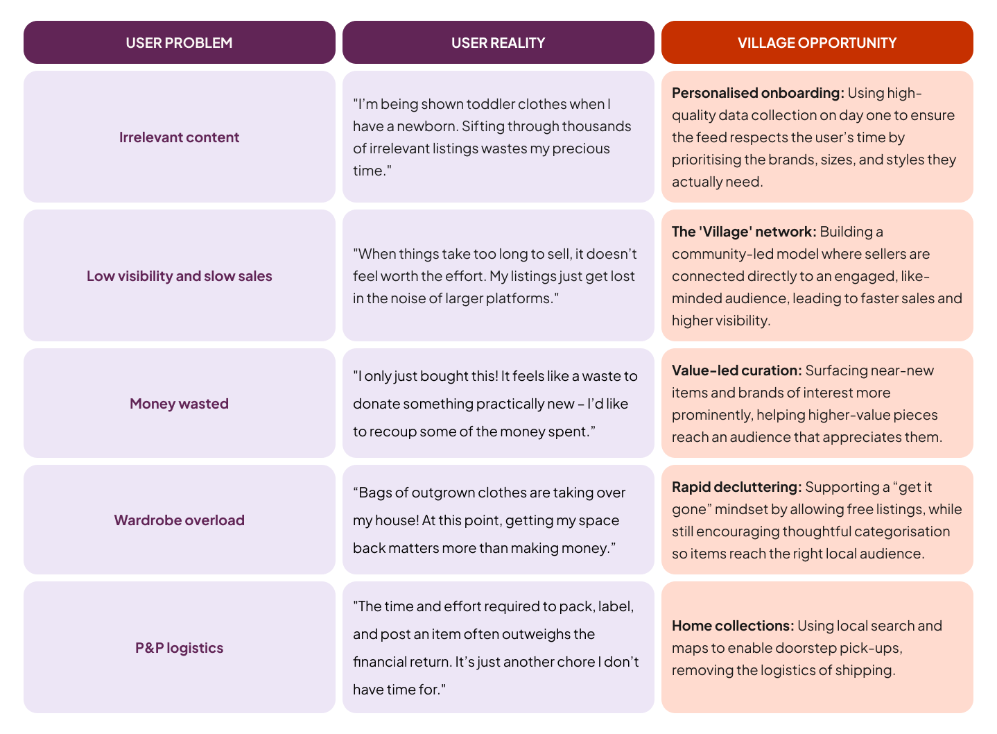
Note on Scope: For this project, I intentionally limited the scope to focus on personalised onboarding and the Village network. I explore rapid decluttering and home collections in a separate, complementary project: Pass It On: Community Gifting, which builds on the same user needs from a different angle.
Competitor Insights
I analysed market leaders like Vinted and eBay, and niche players like Young Planet, and KidChing to understand why parents still struggle with the "mental load" of resale despite these existing solutions.

Key gaps identified
Lack of seller context: Competitor profiles offer minimal information, making it hard for parents to understand who a seller is buying for. Key signals – such as a child’s age range or preferred brands – are buried in listings rather than visible at a glance.
Non-parent-centric browsing: Most platforms use granular filters based on technical attributes (size/colour) but ignore parent-centric milestones. Key categories like school wear, hobbies, and seasonal costumes are often buried or missing.
Time-heavy selling: Across the market, listing and shipping flows have barely evolved. Selling still requires hands-on effort (pricing, packing, negotiating) with few tools designed to protect a parent’s time.
Visual convergence: The category relies heavily on similar colour cues — particularly greens tied to value and sustainability. As a result, platforms begin to blend together, creating an opportunity to differentiate through warmth, trust, and a more human visual language.
Opportunities for Village
Digestible profile tags: Introducing “typically sells” tags (size, gender, brand, style) to turn profiles into scannable shopfronts.
Parent-centric browsing: Designing categories around real-world parenting needs, from school uniforms to Christmas outfits.
“Set & Sell” automation: Streamlining the selling process with smart features like automatic rejection of low-ball offers to reduce time-wasting and cognitive load.
Building your Village: Moving from a keyword-search model to a social-first feed curated around shared family needs and interests.
Distinctive visual identity: Using a warmer visual language that signals a supportive network rather than just a resale platform.
Flexible listing modes: Allowing parents to choose between resale and free listings depending on their goal — whether that’s recouping value or clearing space quickly.
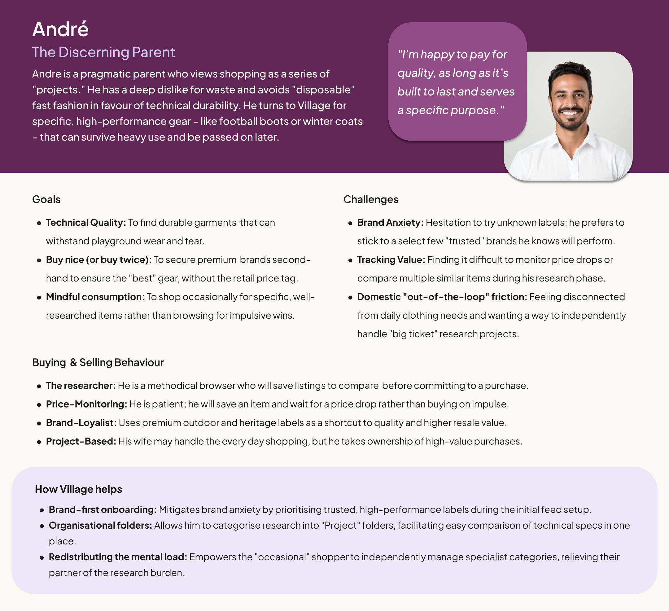
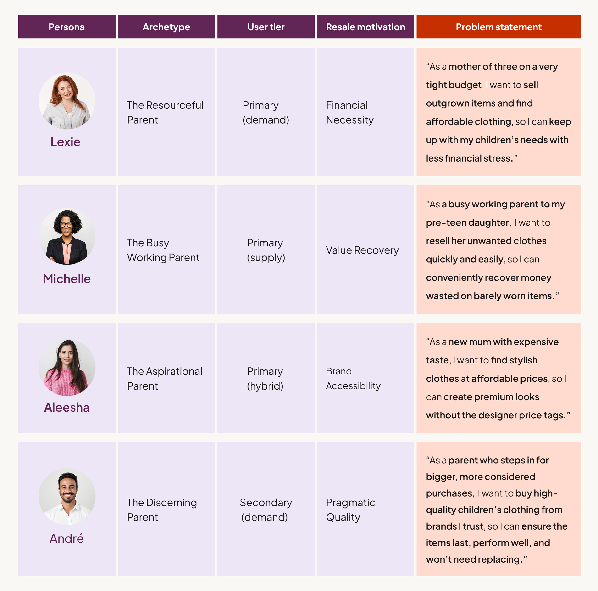
User Personas
While research confirmed that mothers remain the primary demographic, I defined four archetypes to ensure the experience met a diverse range of resale motivations. Moving beyond basic demographics, these personas represent a spectrum of reasons for choosing second-hand: financial necessity (Lexie), aspirational brand accessibility (Aleesha), value recovery (Michelle), and my secondary user, pragmatic quality (André).
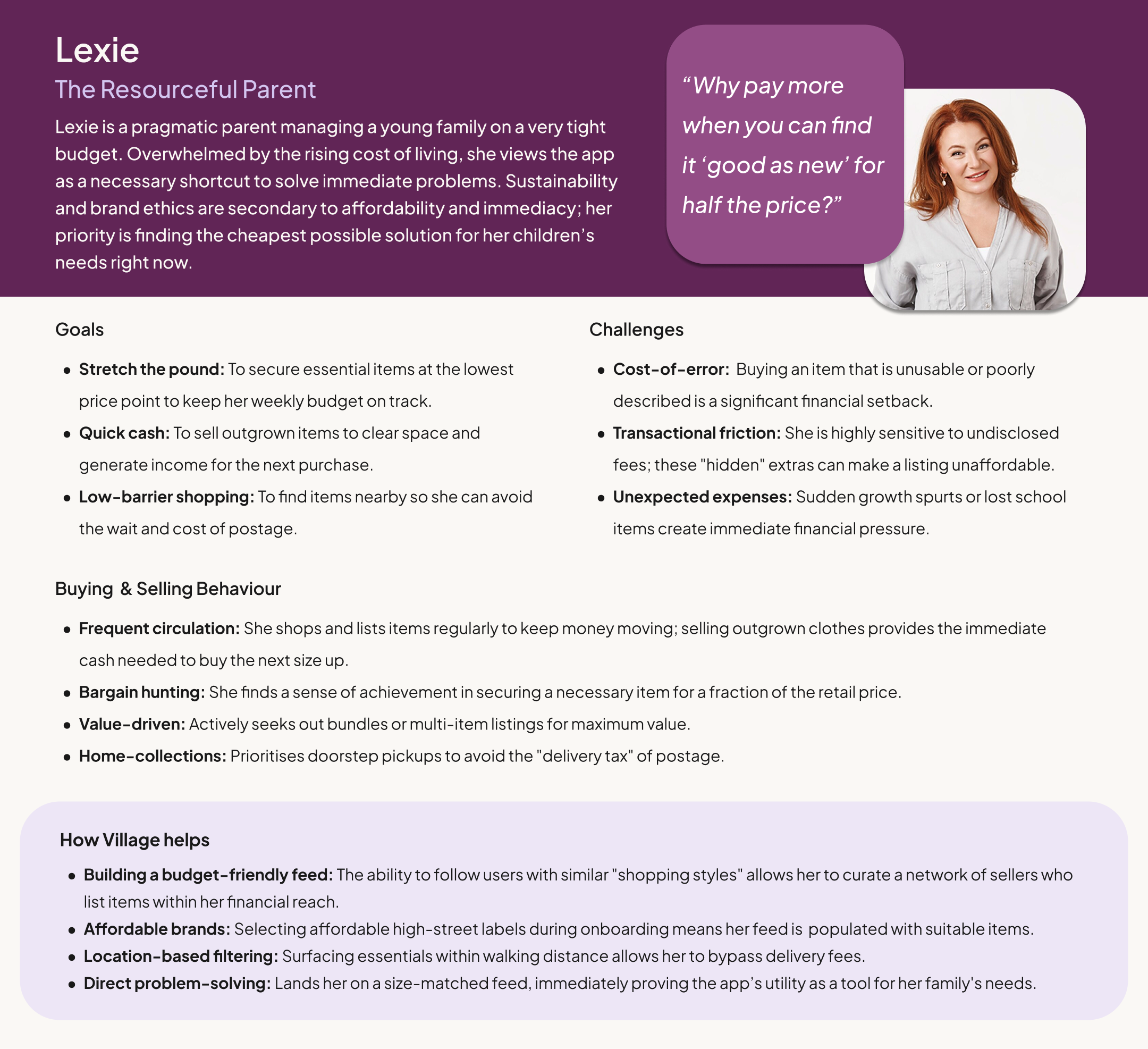
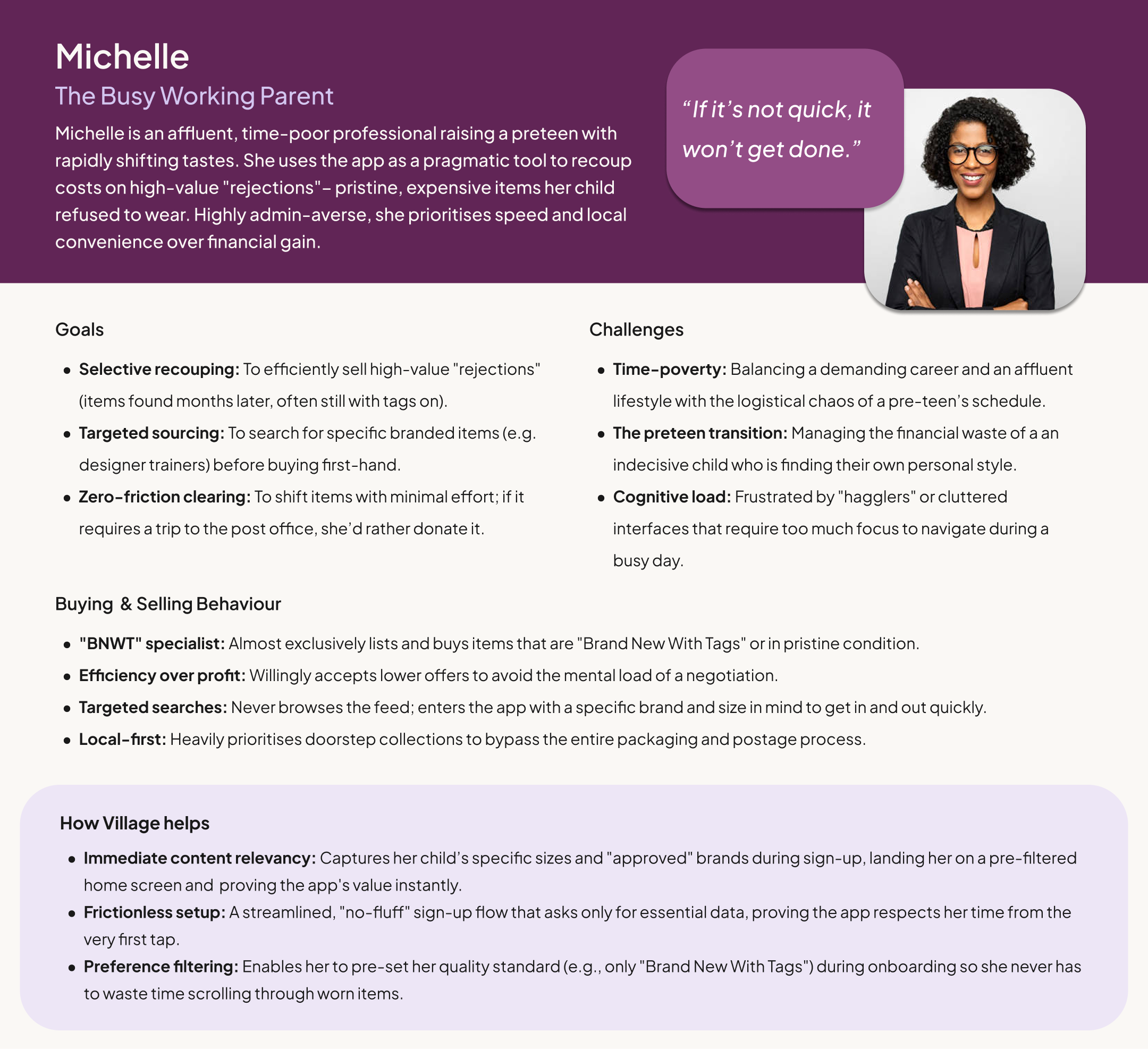
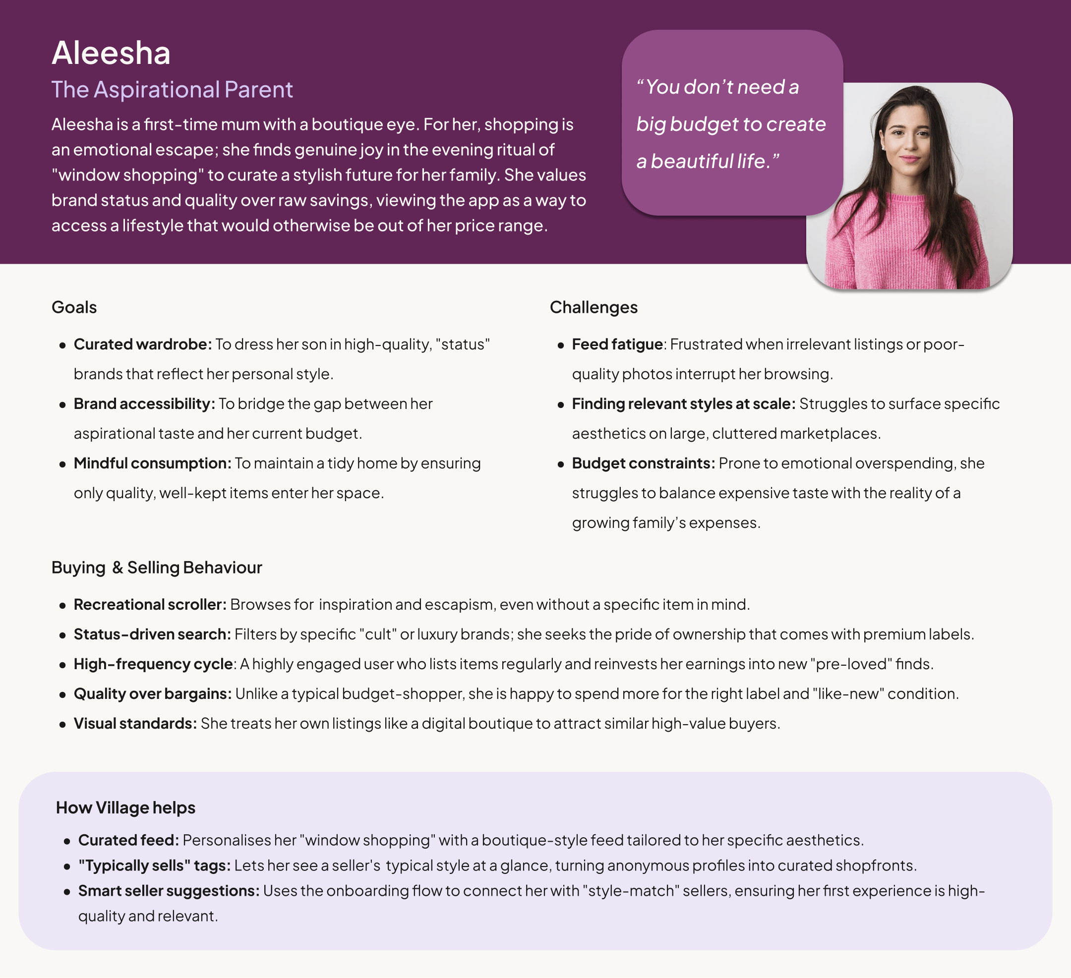
Audience Segmentation: Motivations & Problem Statements
To clarify how each persona shapes the product, I mapped them by user tier, resale motivation, and core problem statement.
Journey Maps
With my personas defined, I mapped Lexie’s current “as-is” experiences to identify exactly where the existing market fails her. By auditing her journey across current platforms, I was able to pinpoint the specific emotional lows that Village is designed to solve.
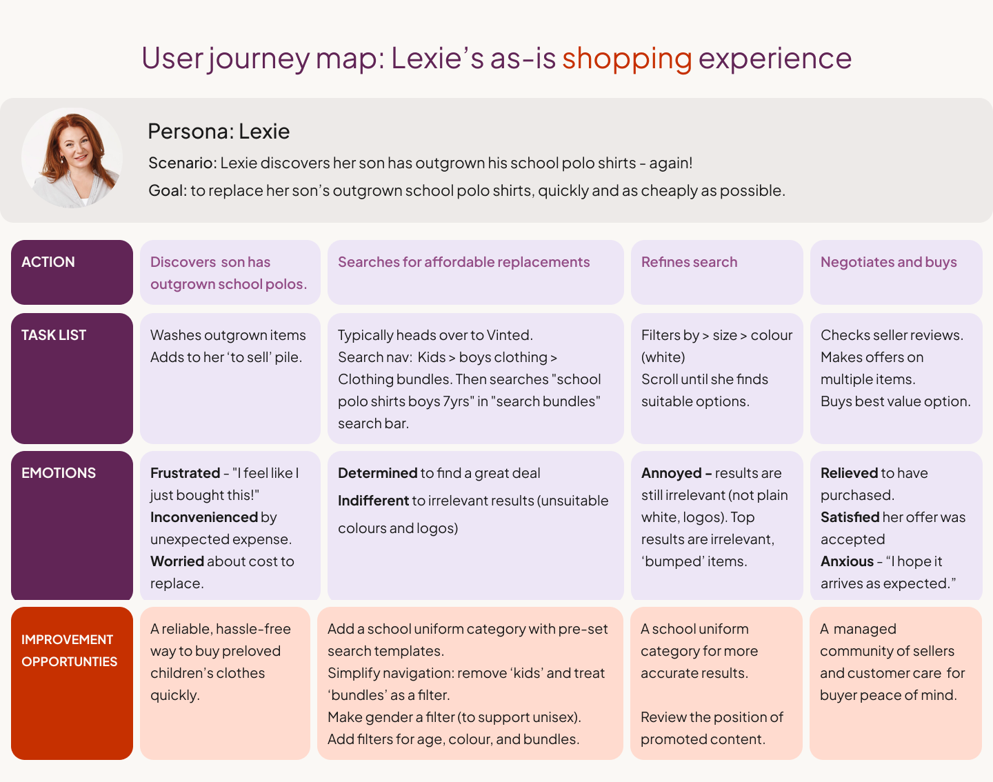
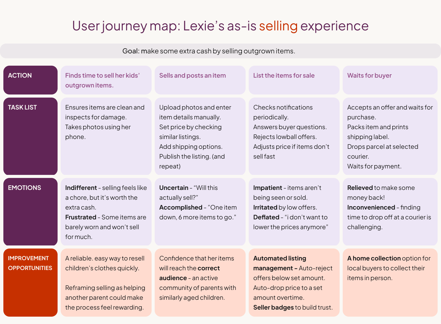
The journey maps revealed the following insights:
Market dominance sustains search fatigue: Parents default to Vinted because it’s where the supply is — not because the experience works for them. Urgent needs (like suddenly outgrown school uniforms) turn shopping into a stressful task rather than a supported moment. Speed and certainty matter more than browsing.
Insight: Convenience currently comes from scale, not suitability.
Parent shopping needs are utility-led, not exploratory: When parents arrive with a specific requirement (e.g. plain white school polo shirts), results surface loosely related items rather than exact fits, even after filters are applied.
Insight: Existing platforms support browsing, but fail to accommodate parents’ task-based shopping needs.
Selling feels high-effort with logistical friction: For time-poor parents, manual listing combined with packaging, postage, and slow or uncertain sales makes resale easy to deprioritise.
Insight: Parents need confidence that selling will be quick, local, and worth the effort.
02. Product Direction
Why search optimisation wasn’t enough: At first glance, the journey maps pointed to clear IA improvements: better filters, clearer categories, and more accurate search results. However, I identified a deeper issue: even with perfect filters, parents would still be entering a noisy, anonymous marketplace.
I realised the problem wasn't just a technical one; it was a social one:
The problem wasn’t just how parents searched—but who they were searching among.
The problem wasn’t just how parents listed—but who their listings reached.
Rather than further optimising search within a standard marketplace, I reframed the challenge as one of pre-curation. I wanted to see if discovery could be filtered socially before items ever appeared. This shift became the foundation for the product strategy: shifting the focus from the search bar to the onboarding journey.
The Initial Hypothesis: A ‘Social’ Commerce Hybrid
I hypothesised that the lack of a modern “village” could be translated into a social-commerce discovery model. Rather than improving filters, I explored whether shaping a shopping feed gradually — informed by who a parent chooses to follow — could make discovery feel more reliable and less overwhelming.
Instead of relying on search alone, discovery was shaped by who parents chose to follow, alongside their size, brand, and gender preferences. This allowed relevance to be established early, before users needed to manually search or refine results.
The aim was to move away from the volume-led, fast-fashion-first experience of existing platforms and toward a curated feed where relevance is established socially:
Lexie follows parents with similar budgets, keeping her feed affordable
André follows parents with shared standards, ensuring trusted quality
Aleesha follows parents with a similar style, creating a more tailored edit
At this stage, the focus shifted to the very first interaction. The goal was to normalise this ‘follow-to-curate’ behaviour early on, shaping discovery through social relevance rather than search optimisation.


03. Ideation & Lo-fi
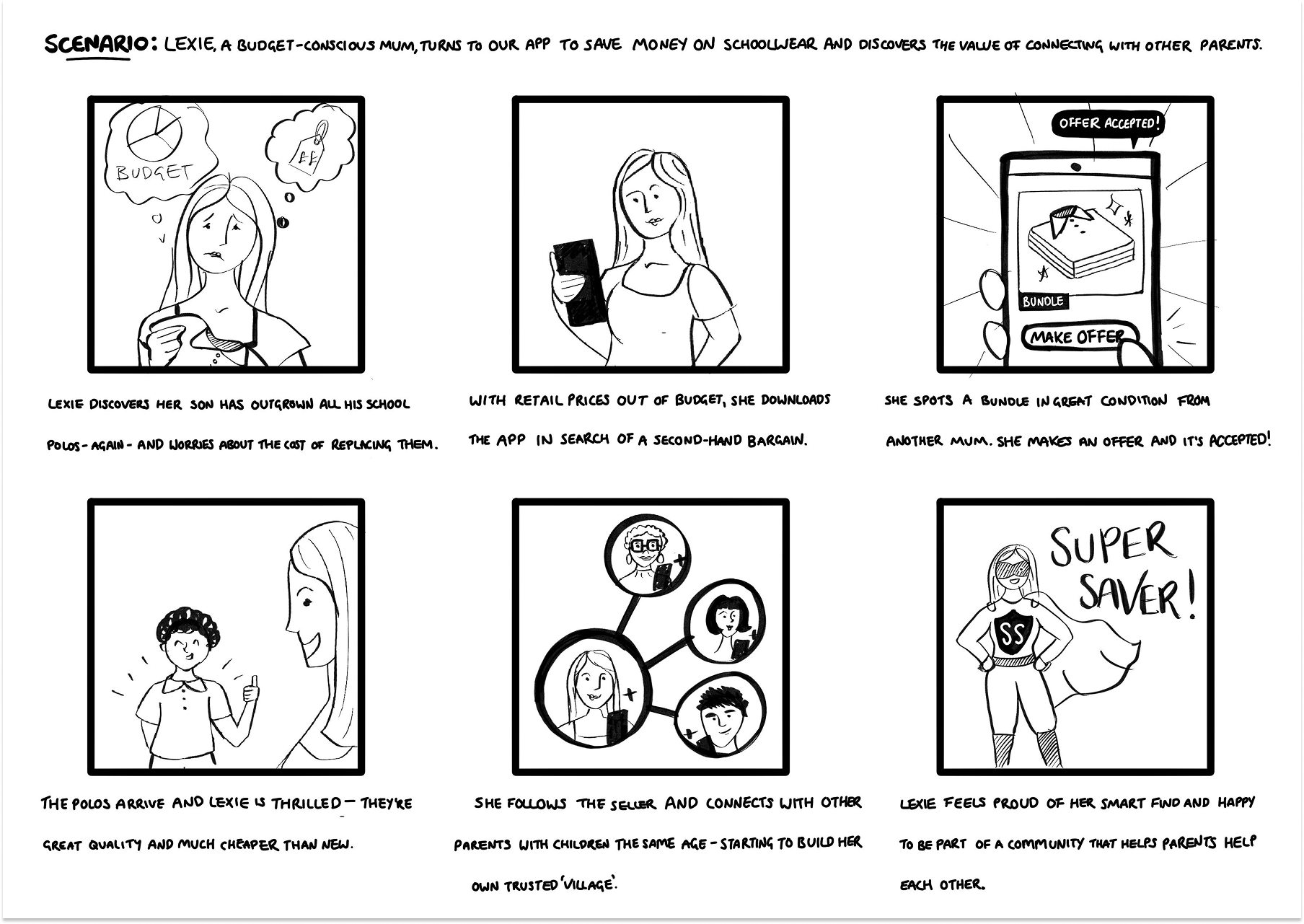
Storyboarding was used to validate both the emotional and functional arc of the Village concept before committing to detailed wireframes.
The big picture: Mapping Lexie’s journey through an unexpected growth spurt revealed that the core value wasn’t just price, but relief — finding a trusted bundle from another “school mum.” This also surfaced an early insight: users only felt motivated to follow and build their Village after a successful transaction had proven the app’s value.
The close-up: Onboarding storyboards focused on the transition from account creation to feed personalisation, exploring how to surface “compatible” parents based on a child’s age and stage from the very first session.
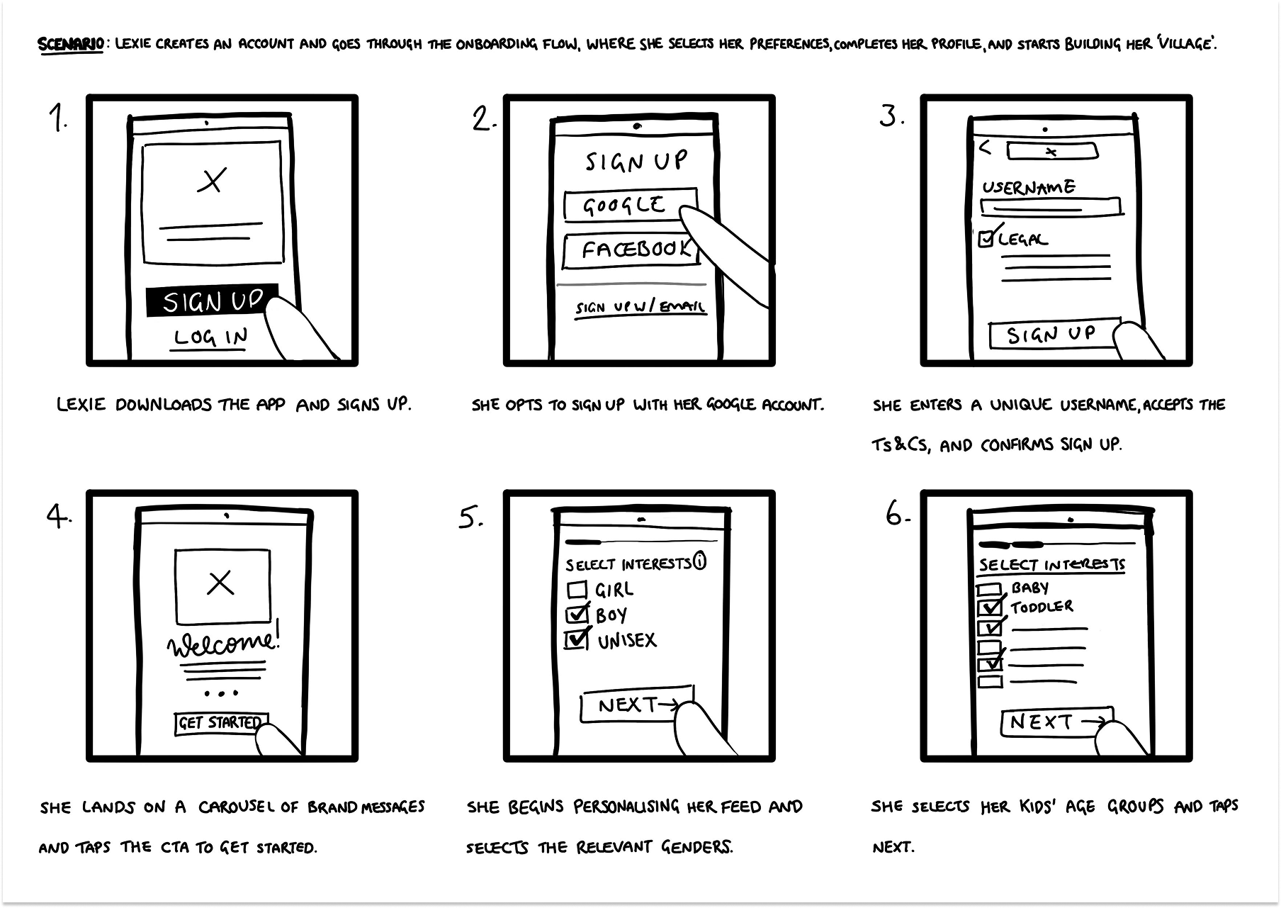
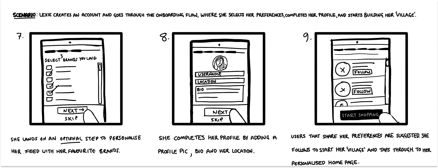
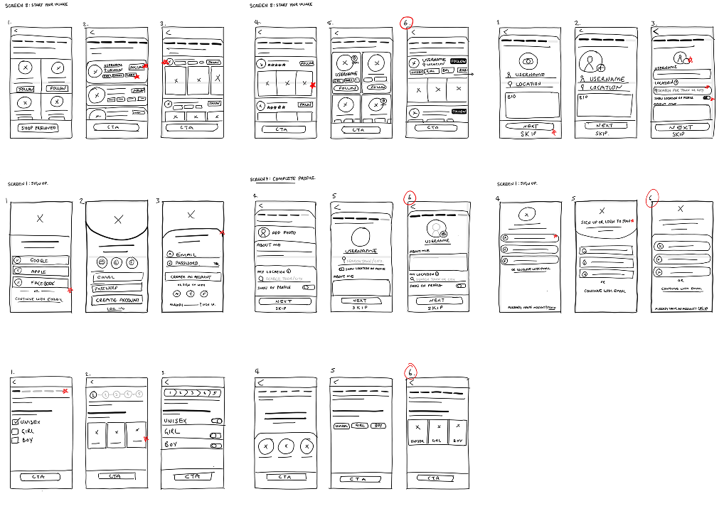
Digital Wireframes
With the concept sketched out, I moved into Figma to build and test a low-fidelity prototype of the Village onboarding flow.
Key Design Decisions
Relevance before exploration: Capturing specific details such as age and size ensured the feed felt useful before the user ever reached the home screen.
Early village-building, introduced without pressure: Suggested parents were introduced based on these preferences to establish following as a core interaction. This screen was intentionally positioned at the end of onboarding and made skippable, acknowledging that users would likely explore the app before committing to social actions.
Fast compatibility checks: Listing previews and interest tags enabled users to assess relevance and trust at a glance.
This prototype tested a core behavioural risk: Would a more detailed onboarding flow feel like a rewarding “set-up,” or a barrier to entry? In particular, I wanted to understand whether users recognised the long-term value of social curation, even if they chose not to follow anyone yet.
Usability Study (Low Fidelity)
I ran a moderated usability study with five participants, including frequent-shopping mums, occasional-shopping dads, and a tech-averse grandparent, to assess whether the onboarding flow delivered meaningful personalisation without feeling effortful.
Key Insights & Pivots
Trust precedes social commitment: The “following” mechanic felt too intimate for a first-time interaction. Participants wanted to experience value before forming social connections — reinforcing the need for progressive adoption rather than upfront commitment.
Buyers and sellers have different patience thresholds: Buyers perceived profile setup as friction, while sellers viewed it as a necessary credibility signal. I needed to rethink asking users to invest before receiving value.
Clarity needed around location: Hesitation around location sharing disappeared once it was clearly tied to a tangible benefit, such as local school-run pick-ups.
Verdict: Social features need timing, not emphasis: While parents were open to social curation, onboarding proved to be the wrong moment to introduce it. Participants were focused on reaching the marketplace and experienced follow prompts as a distraction rather than a value signal.
As a result, social features were moved out of onboarding and into the core shopping journey, where relevance and trust had already been established.
Design Changes
I translated the usability findings into three structural pivots:
Context over data collection: I replaced the generic profile setup with a dedicated location step that explicitly explains the benefit: surfacing local listings for easier collections.
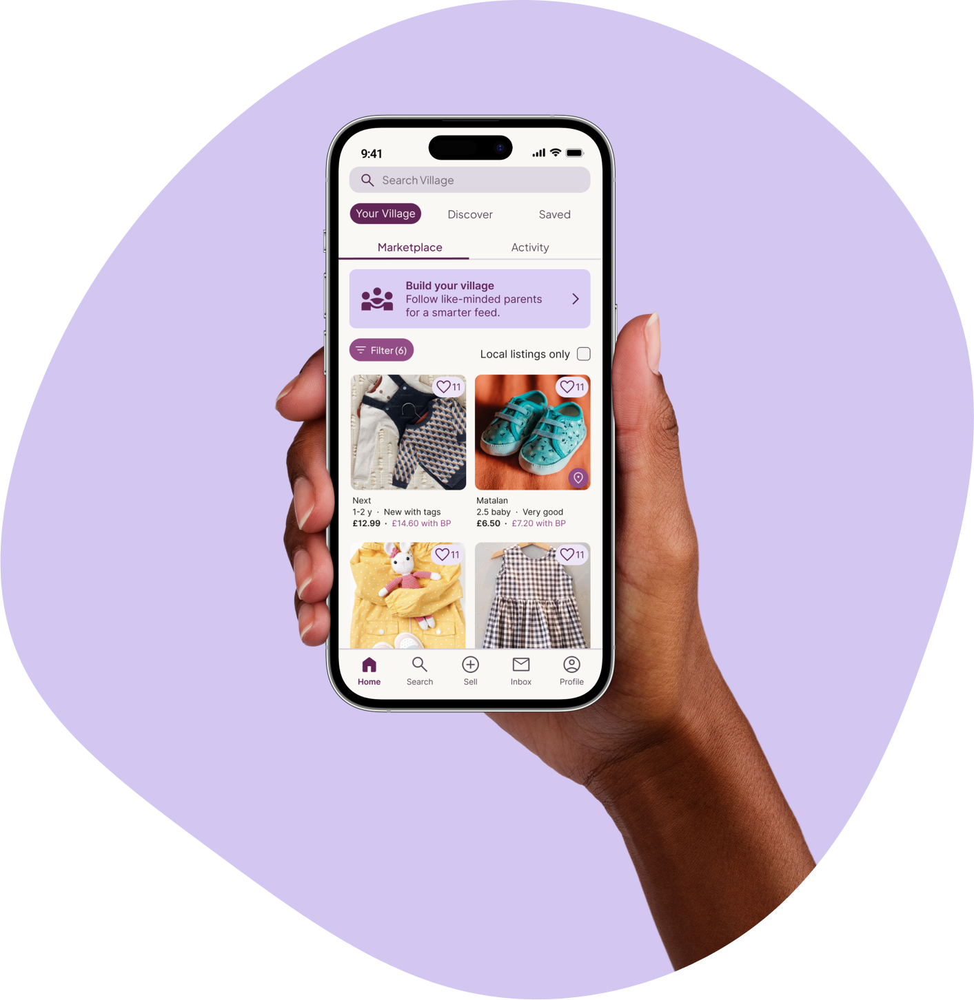
Prioritising utility: I moved "Build Your Village" from an onboarding gate to an lightweight banner on the home feed. This allows parents to satisfy their immediate goal of browsing listings before being asked to engage with the social side of the platform.
Lowering the social stakes: I reframed "following" as a curation tool. By replacing the "Follow" button with a simple "+" icon, the interaction feels lighter and less like forming a personal connection with a stranger.

04. System Architecture
The usability study proved that parents needed utility before community. I expanded the project scope to ensure the "Village" features felt like an integrated benefit rather than a hurdle.
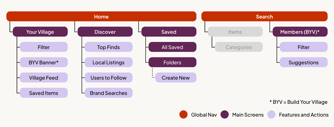
Information Architecture
I developed a sitemap to clarify how marketplace utility and social features could coexist without competing for attention.
One home screen, two browsing modes: The Home screen was designed to offer a clear choice between two ways of browsing:
Your Village — a curated feed shaped by who the user follows
Discovery — a broader marketplace view for open exploration
This allowed users to move fluidly between social curation and traditional browsing, without forcing commitment to either.
Social features are visible, but optional: Build Your Village was moved out of onboarding and into the Home feed. The goal wasn’t to prompt immediate action, but to keep the concept present without being intrusive — visible at the top of the feed, but never blocking access to listings.
This reflected an early assumption that users might not be ready to follow others straight away, but would appreciate a lightweight reminder they could return to once they felt more confident in the product.
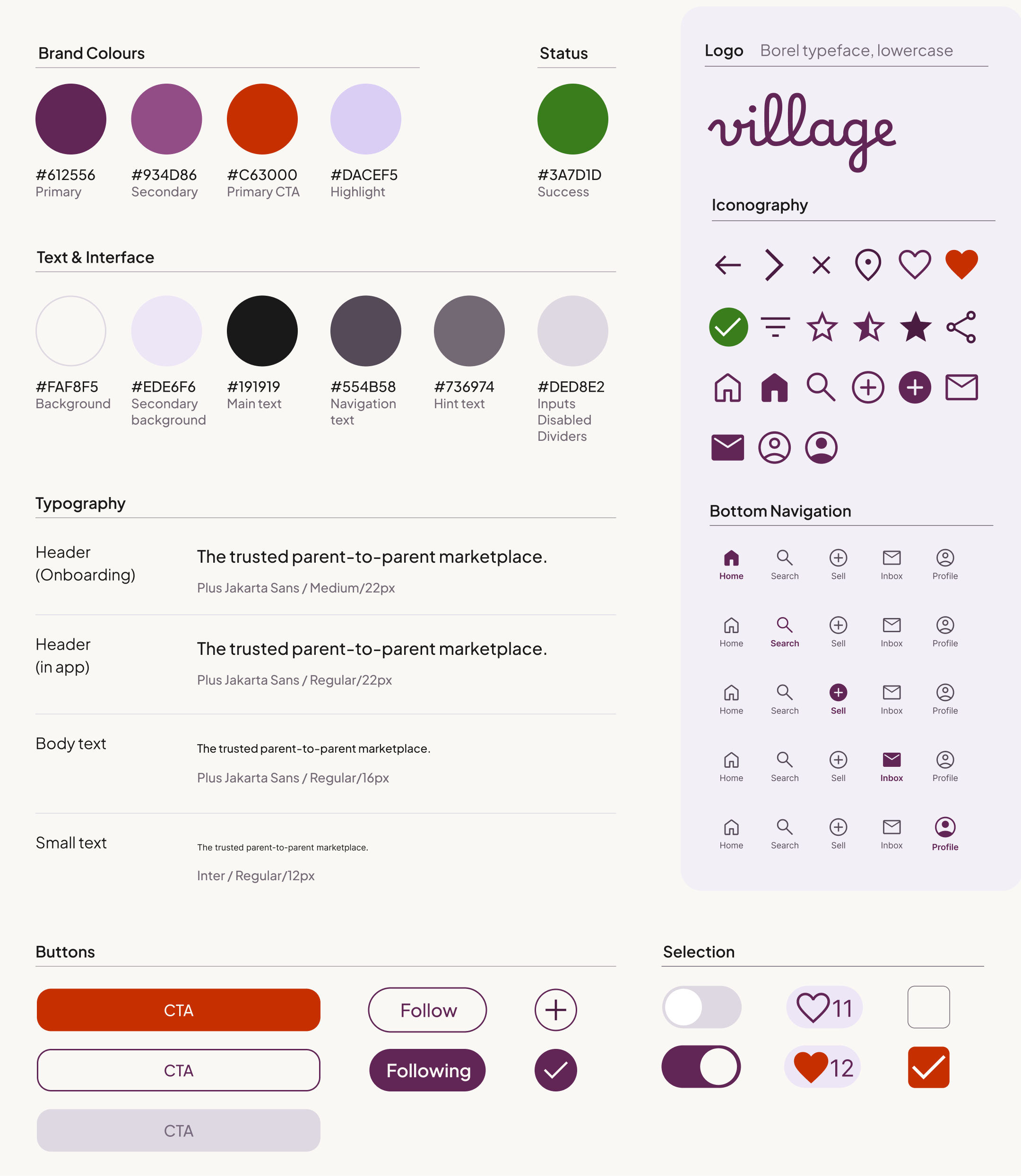
Design System
With the structure validated, I developed a high-fidelity design system focused on creating a human, trustworthy marketplace experience.
Emotional warmth over neutrality: Rather than the cold greens and blues common across competitors, I chose deep purples with warm accent tones to create a sense of emotional warmth aligned with the app’s core audience of mothers, while remaining inclusive for male users by not leaning too feminine.
Avoiding the ‘baby app’ aesthetic: The visual style deliberately avoids the playful, juvenile aesthetic typical of the “baby” category, positioning Village as a trusted, premium marketplace.
Clear hierarchy and legibility: I paired Plus Jakarta Sans for headings with Inter for UI text. This combination balances a friendly brand voice with high legibility at small mobile sizes.
05. High-Fidelity & Refinement
To bring Village to life, I developed a high-fidelity prototype and conducted a final round of usability testing with five participants to validate the full journey – from onboarding to discovery.
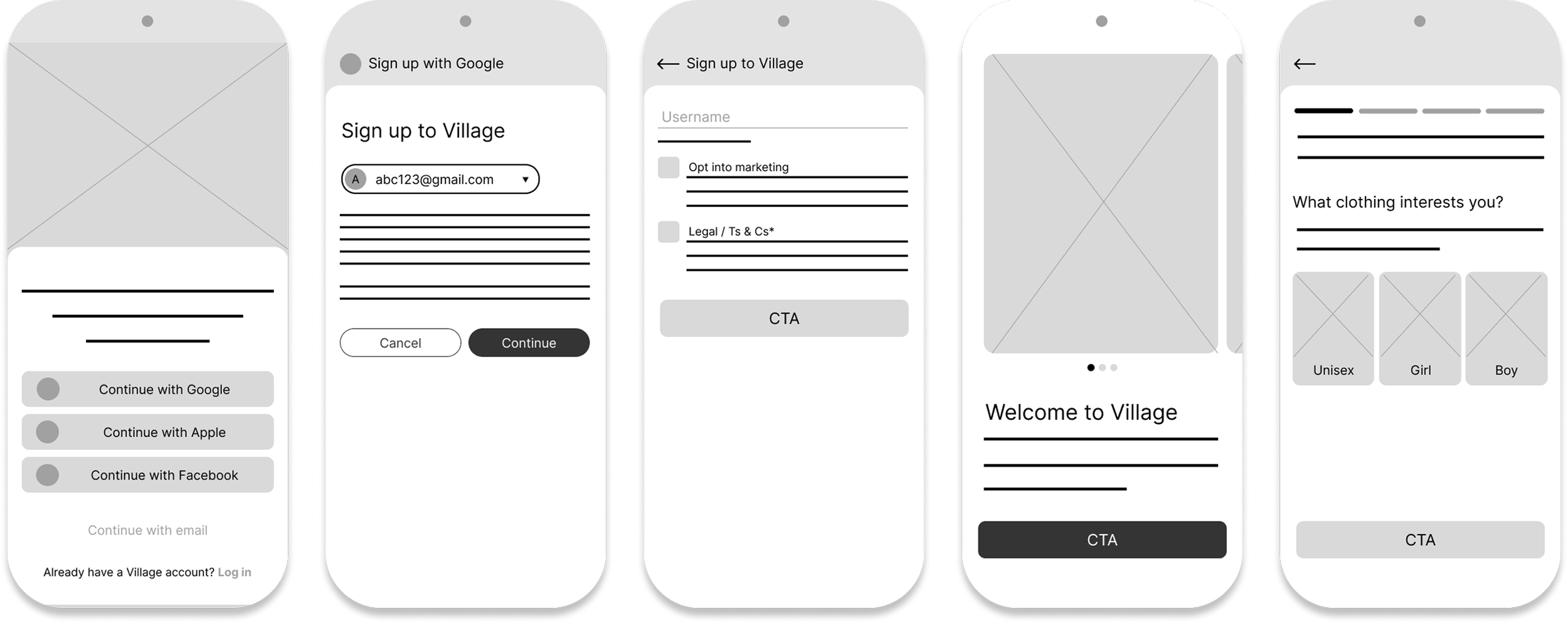
Onboarding
Goal: Create a high-value setup that collects meaningful data without overwhelming the user.

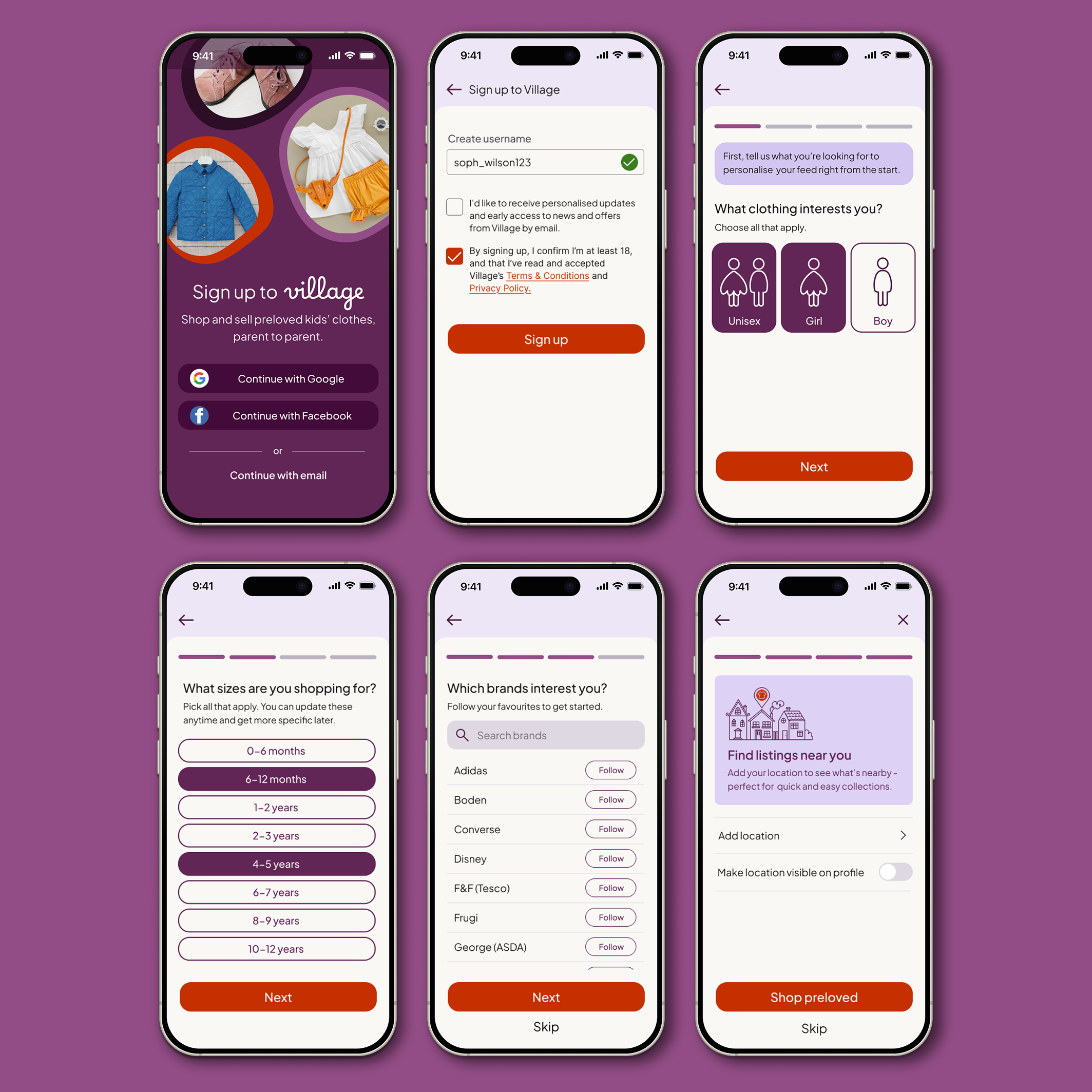
Design Decisions
Fast, low-friction entry: Prioritised "one-tap" sign-up (Google/Facebook). 5/5 users completed onboarding without support, averaging 59 seconds.
Inclusive defaults: Introduced a "Unisex" preference to bypass rigid gender filters. This reduced repetitive searches and supported parents shopping for neutral designs.
Trust-first location sharing: Made location sharing optional to reduce early-stage friction. 4/5 users opted in regardless, validating that a respectful "opt-in" approach builds trust.
Iterative clarity fix: Initial testing showed 3/5 users missed the username field. I strengthened the visual hierarchy of the input borders to clarify interactivity.
Investment logic confirmed Participants felt the setup was a "fair exchange," stating they were happy to provide data to ensure their feed remained clutter-free.
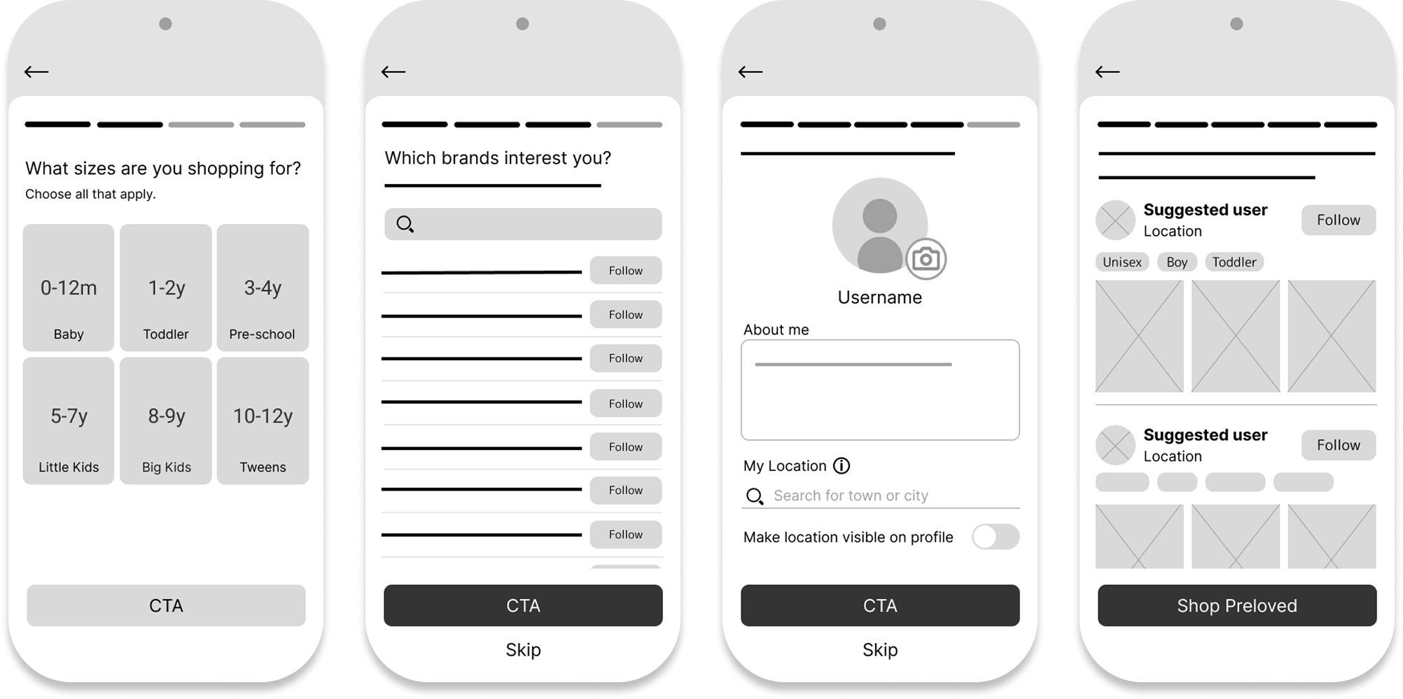
Home / Your Village
Goal: Provide immediate marketplace value while introducing the "Village" social layer as a secondary, high-value choice.
Note on Scope: While my primary goal was to test the "social-first" commerce model, I developed the Discover and Saved areas to high-fidelity. This ensured participants could experience "Your Village" within a realistic product ecosystem.
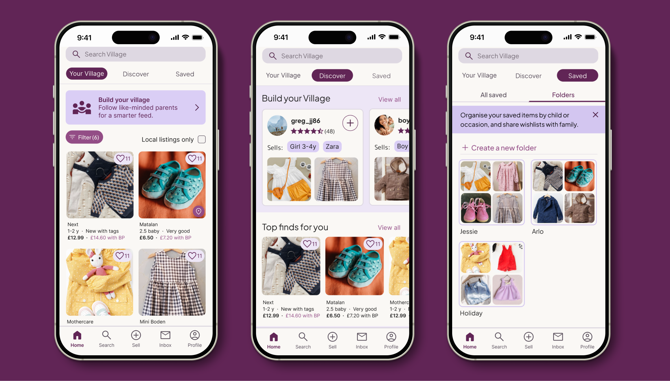
Design Decisions
Effortless dual-mode feed: I implemented a tabbed layout to toggle between your village and discover. This keeps social curation optional, ensuring it supports shopping rather than blocking it. testing confirmed this was the right balance; participants weren't ready to "build" until they'd spent time browsing.
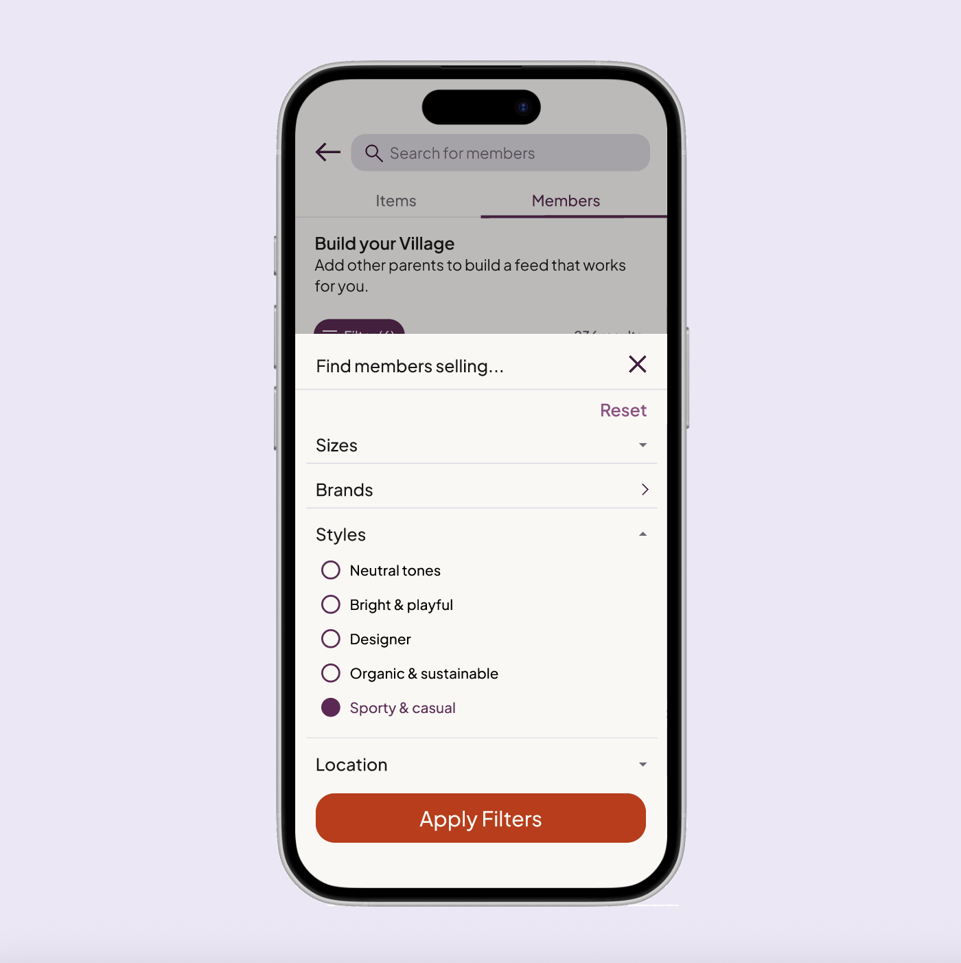
The banner as an entry point: I introduced Build Your Village as a banner with a simple intent: keep the idea visible without interrupting browsing. It links to the Members view within Search, where parents can filter compatible families using familiar product-filter patterns.
Reducing mental load through organisation: The Saved tab uses folders for individual children or occasions, functioning as shareable wish lists. This supports collaboration between partners and helps redistribute the cognitive load that research showed often falls on mothers.
Low-pressure social discovery: A Build Your Village carousel within Discover supports organic community building. In a live product, this would sit lower in the hierarchy to prioritise shopping results, but is surfaced here to illustrate the discovery logic.
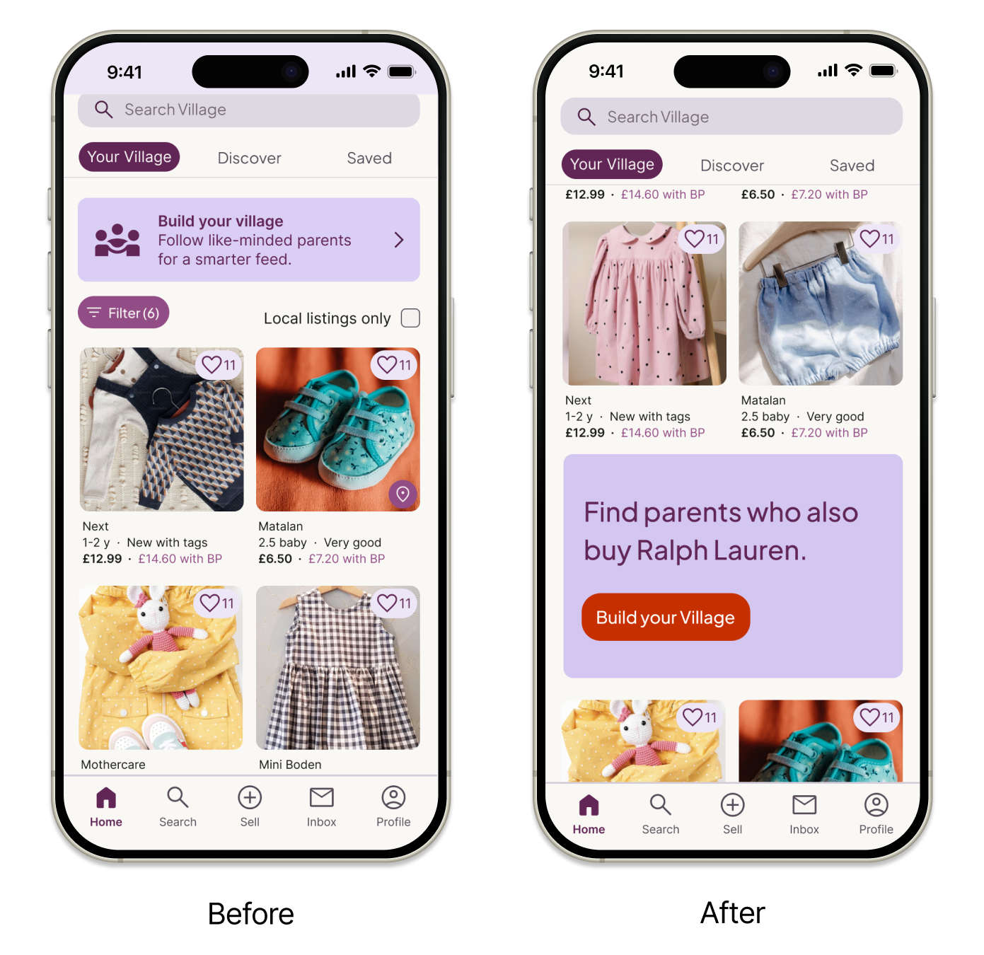
Key Refinement: Solving “Banner Blindness”
The problem: In testing, 3/5 participants ignored the static banner, screening it out as a generic advertisement.
The solution: I replaced the static banner with a dynamic, behaviour-driven hero card embedded within the feed. Personalised prompts based on browsing behaviour reposition BYV from a promotional message into a practical discovery tool, clearly surfacing the value of social curation. In a live product, placement within the feed would be tested to balance visibility and interruption.
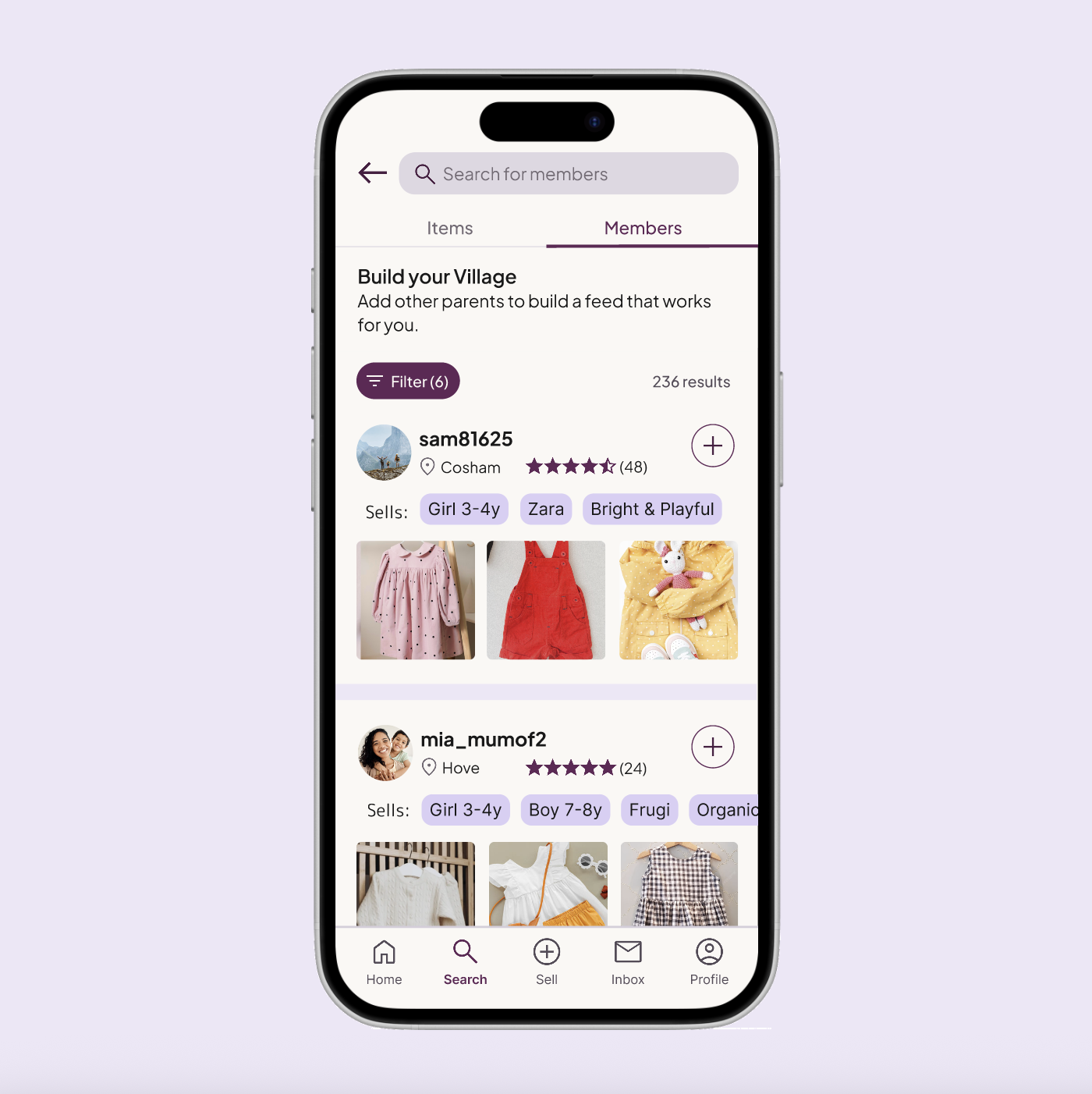
Build your Village
Goal: To move beyond anonymous transactions by allowing users to curate their own "smarter feed" through intentional following.
Design decisions
Placing discovery where intent exists: I moved 'Build Your Village' from onboarding to Search → Members. Testing confirmed that 5/5 participants preferred browsing before committing to a "Village," proving that discovery works best when users are already in a browsing mindset.
Trust and relevance at a glance: Member cards surface location, ratings, and pinned “Sells” tags. 3/5 participants specifically praised these tags for allowing them to assess style compatibility instantly without leaving the results list.
Filtering for shared taste: Research showed parents value aesthetic "vibe" as much as size. I introduced style tags (e.g., "Sporty & Casual") to act as lightweight signals of taste when deciding who to follow. In testing, 100% of participants saw their own preferences represented.
Low-pressure iconography: By replacing "Follow" with a "+" (Add to Feed) icon, 0/5 participants felt the social friction typical of networking apps. It successfully reframed community building as a utility tool.
User Profiles
Goal: To provide a transparent, high-context space where parents can confidently evaluate a seller's credibility and style compatibility before following.

Design Decisions
Familiar navigation: I used a standard tabbed structure (Listings, Reviews, About) so the interface feels intuitive and reduces the effort needed to find key information.
Rapid compatibility checks: Surfacing specific "Sells" tags (e.g., "Zara", "Bright & Playful") in the header allows parents to quickly verify if a seller’s wardrobe matches their own child’s needs.
Evidence-based trust: By prioritising verified reviews and historical data, I mitigate the hesitation often felt when interacting with new sellers in a peer-to-peer marketplace.
Usability insight: Profiles provide sufficient context. All participants found the profiles informative. The “Sells” tags and “Reviews” were highlighted as the most helpful elements for making a confident "follow" decision.
Validation: Brand & Market Fit
Goal: To confirm that the visual identity and experience resonate with a broad parent audience.
A product parents could see themselves using: All participants said they could imagine using Village in a real-world context, reinforcing confidence in the core value proposition.
Inclusive, balanced branding: Male participants specifically noted that the UI felt welcoming rather than overtly “mum-focused”. This confirmed that the visual identity successfully balances emotional warmth with inclusivity — appealing to the primary audience without alienating others.
High Fidelity Prototype
The prototype focuses on the end-to-end flow for a new user: from setting initial preferences in onboarding to discovering their first 'Village' match in the marketplace.
06. Accessibility & Reflections
As an independent designer without access to assistive technology or specialist testing groups, I focused on strong accessibility foundations rather than claiming to have solved complex needs. My aim was to design Village to be clear, predictable, and inclusive by default.
Visual clarity & contrast:I prioritised high-contrast typography and ensured key information is always reinforced through text labels or icons, supporting clarity across different visual abilities.
Ergonomic mobile interaction: Tap targets were sized for one-handed use, with primary actions placed within easy reach to support users with varying levels of motor dexterity.
Cognitive ease: Consistent layouts and plain, jargon-free British English copy were used to reduce cognitive load and make navigation feel predictable.
Motion sensitivity: Any transitions in the prototype were kept subtle and functional, avoiding unnecessary motion that could cause discomfort or distraction.
Key takeaways
1 . Evidence over assumptions: As a non-parent, usability testing was essential in uncovering hidden biases. Some of the most valuable insights came from off-script moments – casual comments that revealed real needs. I learned that creating space for open conversation can be just as valuable as structured testing.
2. Context matters as much as functionality: Even strong features fail if they appear at the wrong moment. Moving Build Your Village from onboarding to the feed reinforced the importance of designing for a user’s current mindset, not just the intended outcome.
3. Ideas must evolve with research:I began with a community-driven vision, but research showed parents prioritised utility over abstract social connection. Reframing Build Your Village from “building a community” to “building your feed” preserved the heart of the idea while making it relevant. This taught me that good design listens and adapts.
Overall reflection: This project reinforced the importance of balancing empathy with evidence; designing not for what I assume users want, but for what they actually need.
Next steps
1 . Evaluate adoption:
I would measure engagement with personalised feeds versus the broader marketplace to understand whether social curation drives long-term retention.
2. Specialised accessibility testing
I would move beyond universal design foundations by testing with screen readers and voice-to-text, ensuring the app is fully functional for parents multitasking or using one hand.
3. Enhance compatibility signals
I would explore clearer “compatibility highlights” such as shared brand affinities or selling patterns, to further reduce effort during discovery.